
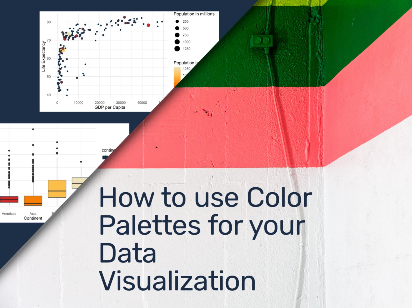
DATA VISUALIZATION — TUTORIAL — COLOR
A Step-by-Step Color Palette Tutorial for Seaborn, Altair, and ggplot2 (R)
I love to visualize data. And for this, I look carefully into practical and pleasing colors next to data and suitable graphs for any data visualization project. I literally spent hours browsing and selecting colors if these are not set in stone by the project or customer.
When it comes to choosing the perfect graph or colors, you can favor your artistic nerve or try to be very practical. Or something in between. And most often, it is not so easy to go overboard designing your graph until it is perfect.
In this article, I would like to share my resources on finding practical and wonderful color palettes, introduce you to a palette package that works with R and Python, and show you how to apply it with ggplot2, Altair, and Seaborn. Please note that I made it a bit easy for myself using the term “color” for this article, while in reality, we need to differentiate between hue, saturation, and brightness.
There are a few reasons to consider using color in your data visualization.
- Brand recognition: Your readers should automatically recognize the company or organization
- Readability: Your readers should easily distinguish between different parts of your data visualization. You want to look for high contrasting colors easily distinguishable from another. Also, remember that we do not perceive colors in the same way.
- Encoded meaning: If you want to visualize political parties often connected with specific colors. Also, if you’re going to visualize numerical values, consider a particular shading going from low with a light shading to high with darker shading. Or vice versa.
Types of Data
When using color palettes, you also want to think about the type of variable that you want to visualize. You would need a discrete color palette for categorical variables, such as city or country names.
For ordinal variables, such as customer ratings or rankings, choose a color palette that encodes low/high meaning, such as traffic light colors red, orange, and green. For numerical variables, such as Population or price, consider one color with an increasing or decreasing shading.

Resources
Please consider this list of websites to find your color palette:
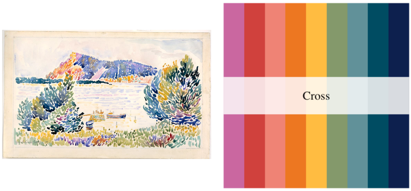
My favorite package that consists of many different color palettes is MetBrewer by BlakeRobMills.
[MetBrewer] Palettes [are] inspired by works at the Metropolitan Museum of Art in New York. All pieces selected come from various time periods, regions, and mediums. Let me know if you have any requests for a particular piece.
Gapminder Package
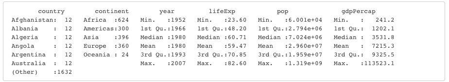
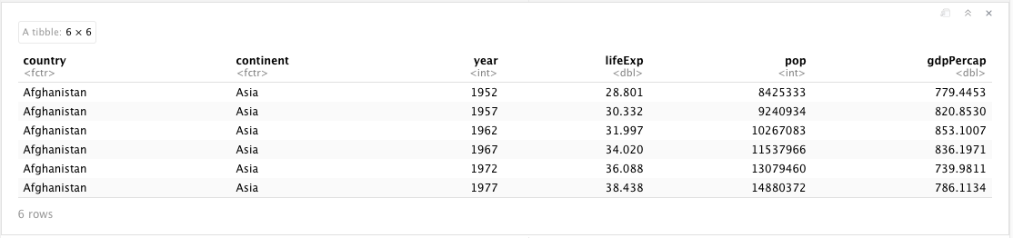
I will use data provided by Gapminder, or more practical, utilizing the Gapminder R package and python package. It consists of two categorical variables: Continent and Country, and four numerical values: Year, Life Expectancy, Population, and GDP per Capita.
Example Graphs
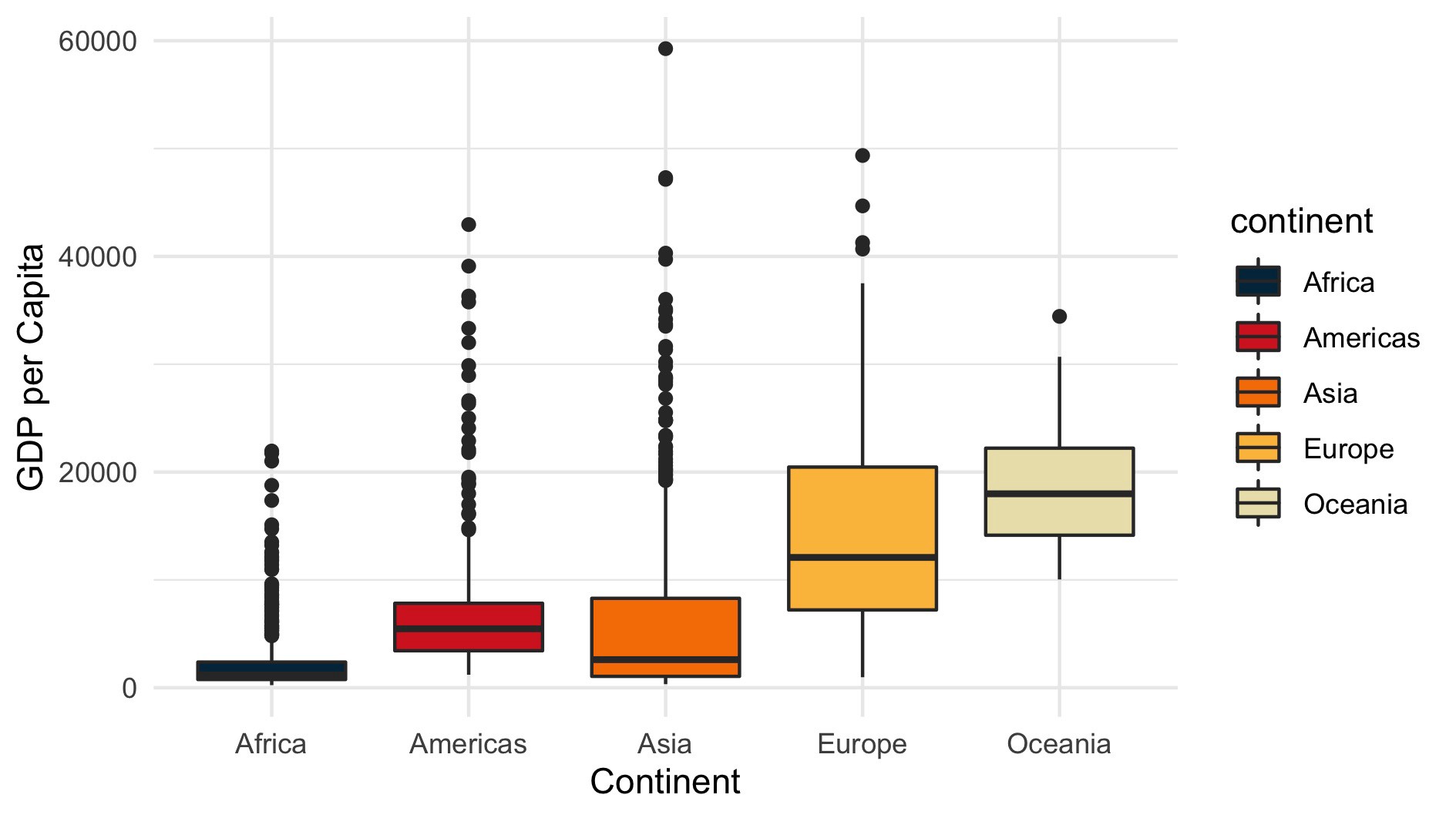
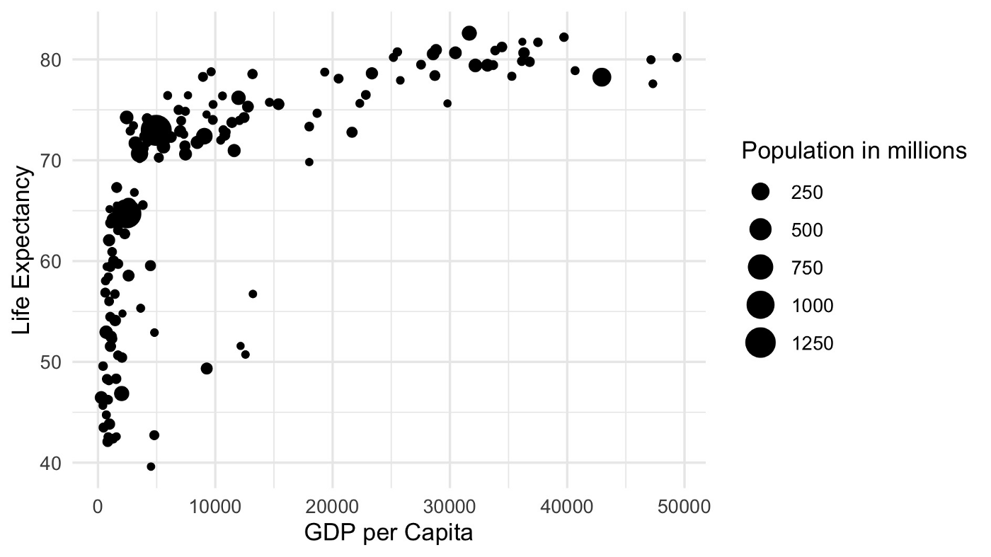
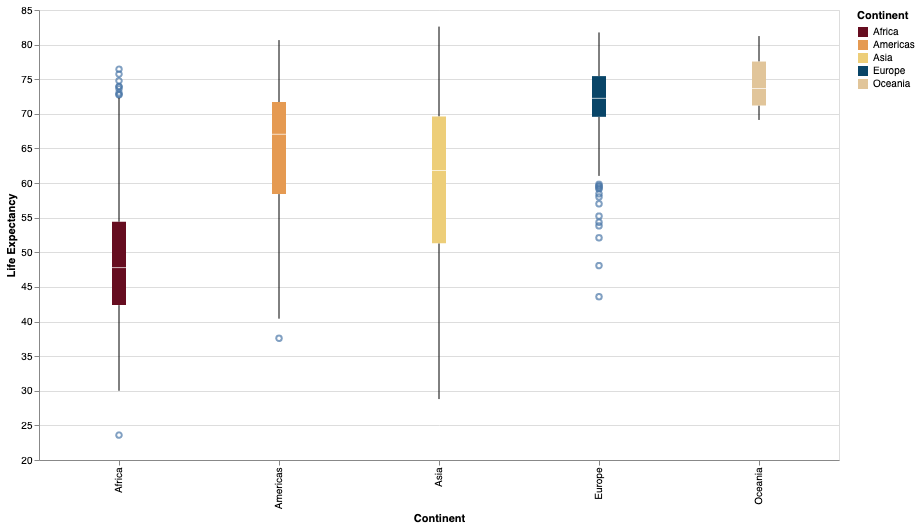
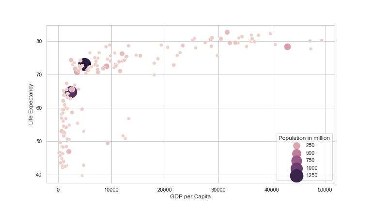
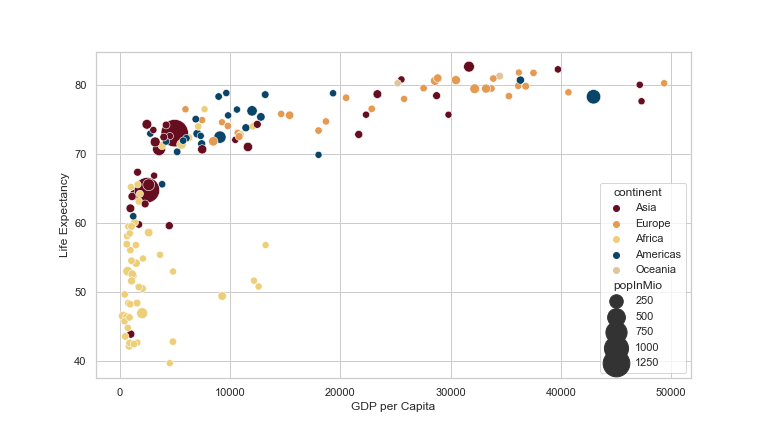
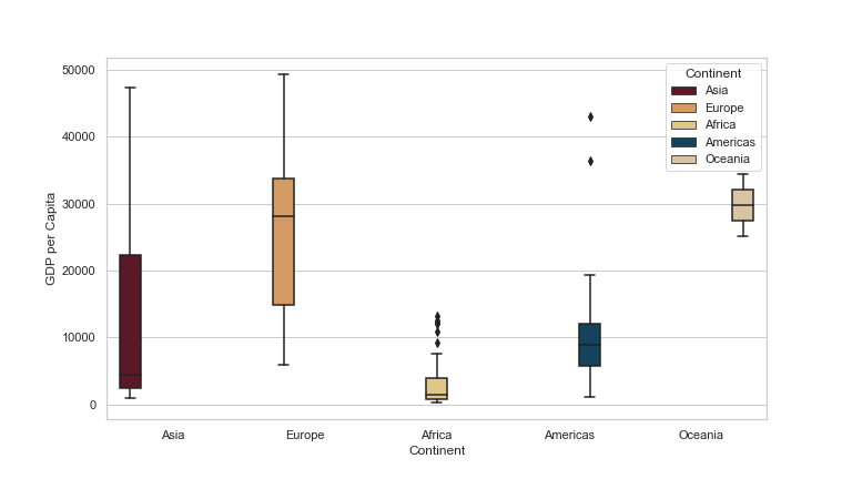
To apply the color palettes, I briefly introduce the following graphs. I prepared these with R. You will find the python code in the respective sections below. The first one shows a point plot showing the distribution of the two numerical values, GDP per Capita and Life Expectancy. The last is a boxplot that also shows the GDP per Capita data per Continent.

First of all, we need to install and load the required packages.
Then plot the point plot using GDP per Capita as the x-axis and Life Expectancy as the y-axis. I will also use the numerical variable Population to control the size of each point.
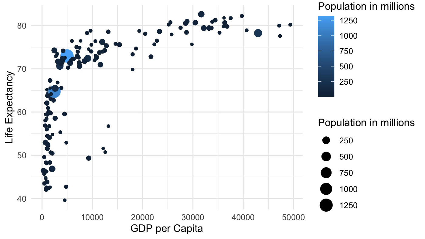
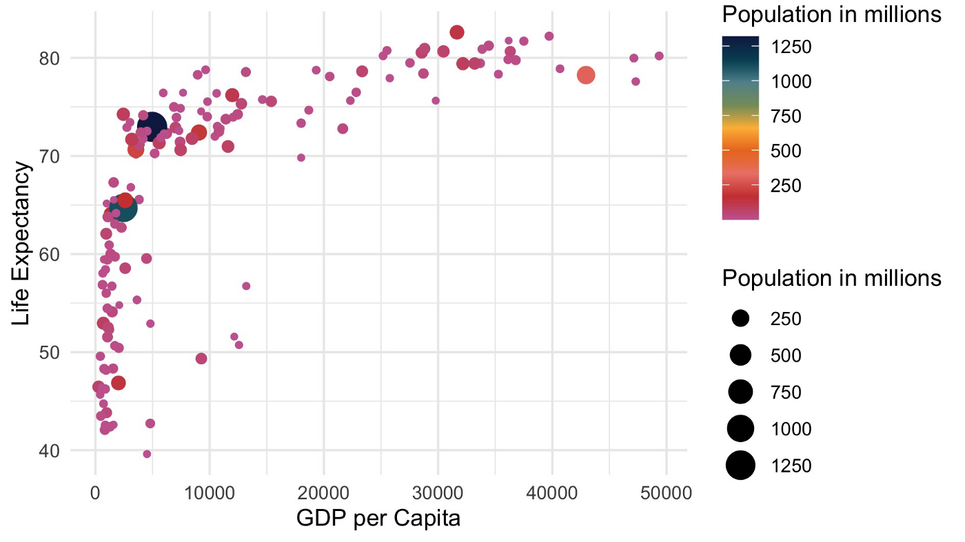
To use color in the plot, I assign the Population variable to the color aesthetic. Since I do not specify anything else, ggplot2 chooses a color spectrum for this numerical variable (shades of blue).
To control the color spectrum, we need to introduce a color scale. In the following plot, I provide a vector of hex color values. You would choose this if you got your colors from one of the mentioned above websites.
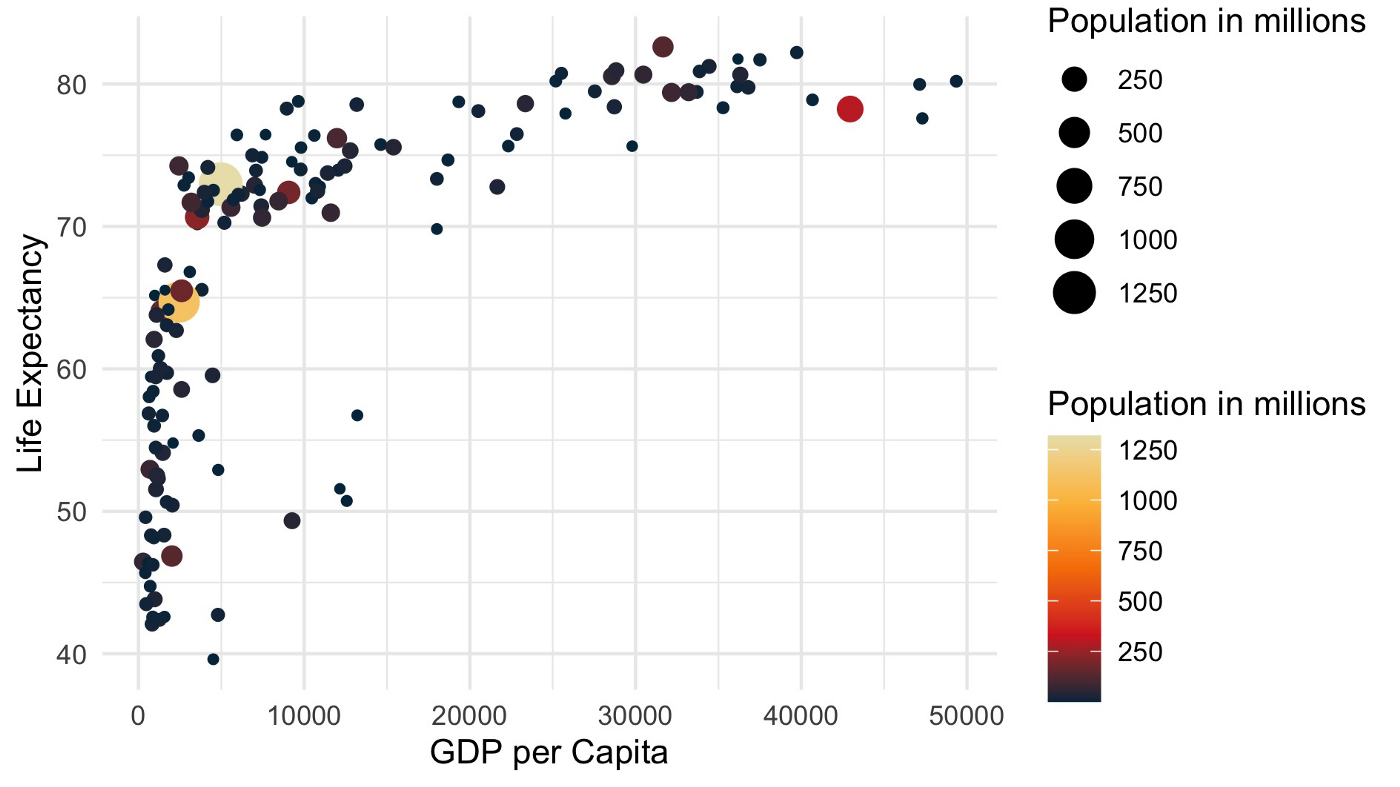
To apply one of the MetBrewer palettes, replace the hex-vector with a MetBrewer function. Within the function call, you provide the palette’s name, then several colors, and tell it that we need a continuous palette since it is a numerical variable.
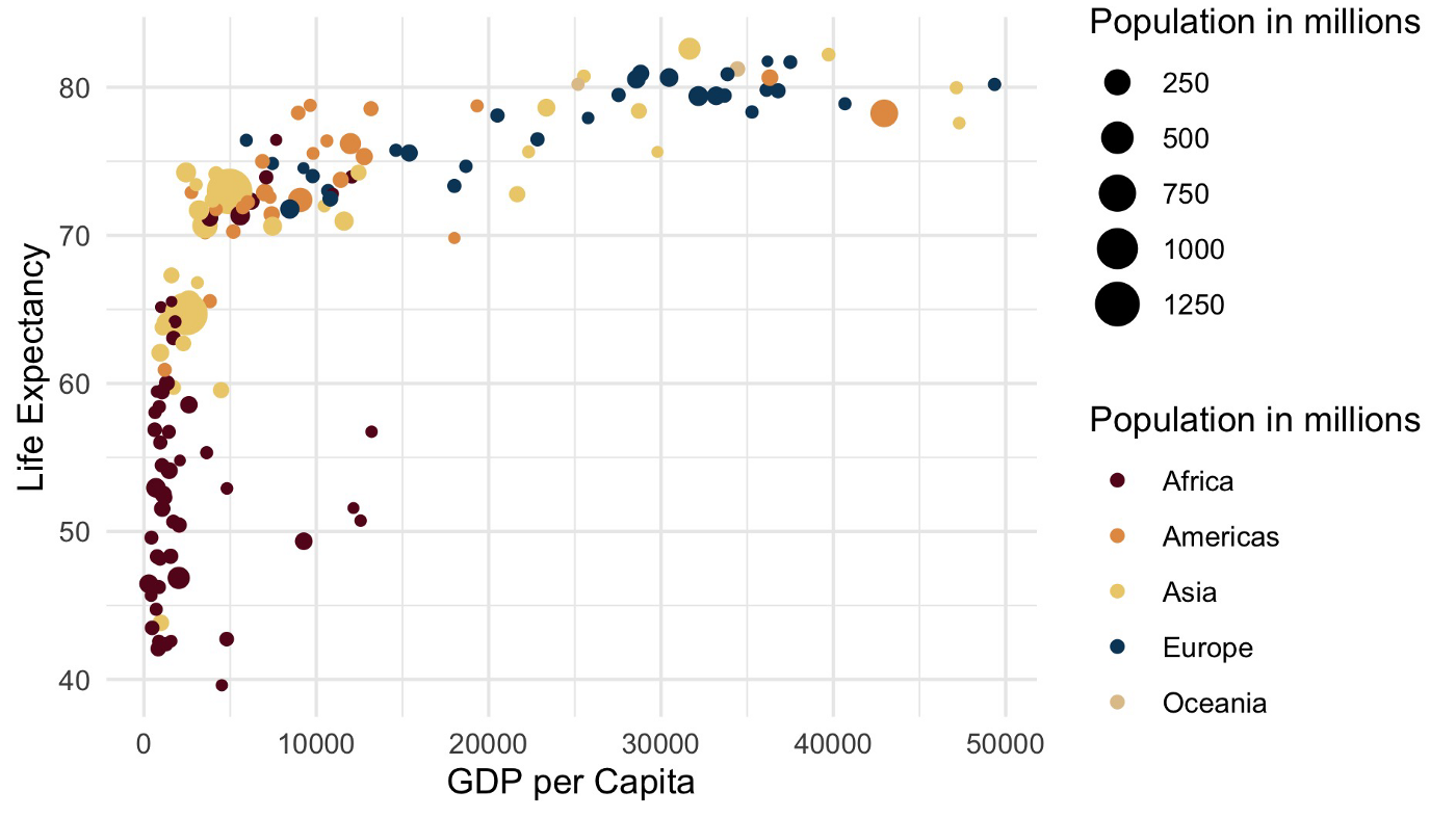
You might also want to use color palettes with non-numerical variables. Let us assume we want to apply color to the Continent variable. This implies using a manual color scale and providing a MetBrewer palette.
Please note if you want to apply color to the fill aesthetic rather than the color aesthetic, consider using the scale_fill_manuel function instead of the scale_color_manuel. This is useful for boxplots or bar charts.

I write python code utilizing method chaining. This is explained in this article: “The Flawless Pipes of Python/ Pandas”. To install MetBrewer and Altair I kindly refer to their respective websites.
Import the necessary libraries first.
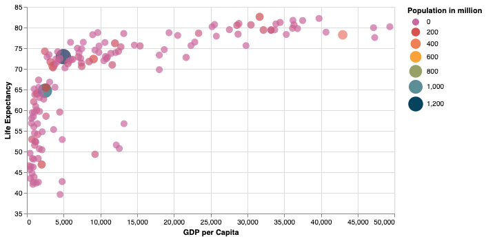
Then build the chart. Please note the last statement about color. First, I map the color to the Population variable. Second, I manipulate the legend’s title. Finally, I set the scale and it’s range attribute to a MetBrewer palette (i.e. Cross).
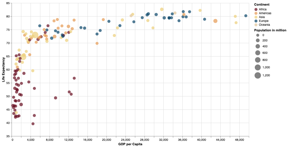
If you want to map a categorical variable to the color aesthetic, just change the scale function within the color mapping.
Using Altair, you do not need to differentiate between color and fill as in ggplot2. Here is the example boxplot.
Seaborn, a wonderful dataviz library for python, offers a vast color functionality. Read the official Article “Choosing color palettes” for more information.
Initially, let us import the necessary libraries.
Then build the chart. Please note the first statement where I set the palette to one of the MetBrewer palettes. Since Seaborn is built on top of matplotlib, we make more than one function call to build the plot, i.e., setting the label and legend texts.
Unfortunately, I was unable to reproduce the exact color palette usage as in Altair or ggplot2 despite using the same palette. The next plot shows how to use color for the Continent variable.
Finally, the code for the boxplot with Seaborn. I use a discrete color palette for the fill color of the boxes in the plot.
In this article, I would like to share my resources on finding practical and wonderful color palettes, introduce you to a palette package that works with R and Python, and show you how to apply it with ggplot2, Altair, and Seaborn.
Please note that I am a practitioner who still learns and tries to improve. So please leave me a comment with your ideas and thoughts.
If you would like to read more about my journey, please consider following me, or if you are not a medium member, please consider joining here. Very much appreciated.
Gregor