
This month brought us an eerie title sequence for a new Netflix show and a campaign that put a twist on English Heritage’s blue plaque scheme.
Carnegie Hall’s Timeline of African American Music, by Synoptic Office
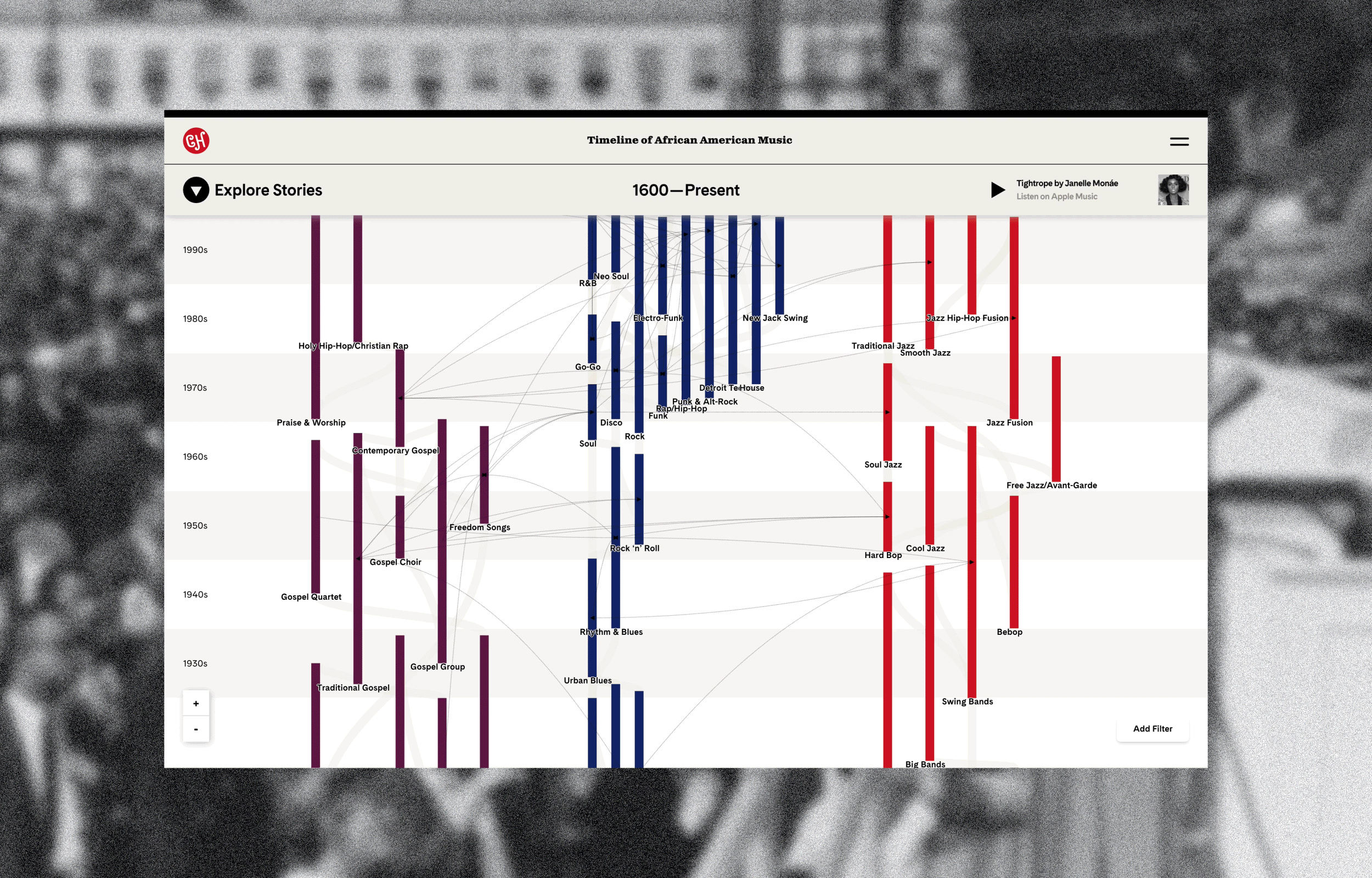
This month, New York music venue Carnegie Hall revealed an update to its timeline of African American music. New York-based design studio Synoptic Office worked on the interactive digital platform. “Our goal was for the timeline to harness the tremendous developments in digital technology and user experience over the last nine years to bring the timeline to a broader audience,” says studio co-founder Caspar Lam. The platform allows students, academics and music fans to track 400 years’ worth of music and a multitude of genres, from Christian rap to house music. An interactive feature allows you to filter the timeline by themes, music features, instruments and dates. From there, readers can learn more about specific eras, accessing images and essays from Carnegie Hall’s archives. Thanks to a partnership with Apple Music, music is embedded in the timeline. The timeline’s ultimate aim, according to Lam, is to “elevate awareness and appreciation of this extraordinary musical legacy”.
The House opening credits, from Nexus Studios
Nexus Studios directors Nicolas Ménard and Manshen Lo have crafted the hand-drawn title sequences for the new Netflix animated film The House. Described as a dark comedy, the stop-motion film tells the story of a house and its eccentric inhabitants (the film has also been produced by Nexus Studios). According to the design team, the challenge was to create a visual language that encapsulated – and also contrasted with – the film’s distinct worlds. Ménard and Lo turned to 19th century woodcuts as a starting point for the opening credits, which take the audience on a tour of a “living staircase” and a shapeshifting checkerboard. The eeriness of the film’s shape-shifting house was a prime inspiration, explains Ménard. “This gave a rather eerie quality to the spaces featured in the films; one struggles to create a mental map of the place,” he says. “So that felt like a great foundation for the theme of our intro sequence.”
Sociotype Journal, from Sociotype and Socio
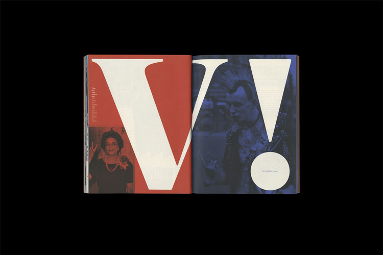
London-based studio Socio and its digital type foundry Sociotype have revealed Sociotype, a journal which seeks to explore typography and its wider applications. “The journal is a reimagining of the conventional type specimen and a new platform for thoughts on arts, culture, and society,” says studio creative director Nic Carter. “Each issue focuses on a single theme inspired by (and typeset in) a different type family designed by us.” The launch issue, named The Gesture, investigates spheres of power and politics with articles on Illuminati secret codes, NASA’s 1990s VR programme, and EasyJet flight attendants. The issue uses Sociotype’s Gestura typeface.
Ica rebrand, from Graphical House
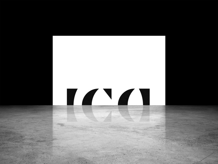
Glasgow-based design studio Graphical House has designed the new brand for architecture and interiors company Ica. Graphical House worked with Ica on brand strategy, and crafted a new visual identity for the business. The new logotype is symmetrical across the horizontal axis – a design element that reflects Ica’s two practices (architecture and interiors), explains the design team. Two typefaces – Graphik and Canela – are used throughout the new identity. Stationery was a big part of the branding; a range of debossed notelets were created for Ica staff to hand write notes to clients and suppliers. Graphical House also worked on photography guidelines and art direction.
Life Between Islands campaign, by Stink Studios
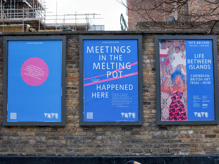
For Tate Britain’s Life Between Islands exhibition – which surveys the work of 40 Caribbean-British artists – Stink Studios has created a poster campaign, inspired by English Heritage’s blue plaque scheme. While the blue plaque scheme commemorates where famous people have lived and worked, Stink Studios asked artists and Tate colleagues from minority backgrounds to share their stories about meaningful places across London. These stories have been rolled out across clubs, bookshops and other community spots in the form of floor vinyl stickers, posters and billboards. There’s a tale from filmmaker Steve McQueen at Hammersmith’s Macbeth Centre, for example. Fashion designer Grace Wales Bonner and photographer Ingrid Pollard have also contributed their stories.
Octavio Medellin: Spirit and Form interactive map and microsite, by Fiasco
Bristol-based studio Fiasco has designed a microsite and interactive map for Octavio Medellin: Spirit and Form, a retrospective of the Mexican-American artist at the Dallas Museum of Art. Fiasco has worked with illustrator Nicolas Burrows on the project, which lets people explore key locations and artworks in Medellin’s career. “We wanted to create a map of Dallas with a curious sensibility that avoids clichés of rodeos and cowboys, in favour of a playful, celebratory take on the artist’s life and legacy,” says Fiasco digital designer Mike Frost. You can navigate the map to find out more information about where Medellin’s artwork is located – like his freestanding sculpture Prometheus at the Dallas College North Lake Campus – and learn more about the artist’s themes and inspirations. The illustration style plays on Medellin’s own visuals, incorporating “exaggerated mark-making techniques” and a “dream-like” colour palette, according to the design team.
You must be logged in to post a comment.