Created by Craig in his quest to design the perfect LEGO typeface, Brik Font is the latest in a line of high-end, brick-based creations. There are already architecture sets pitched at adults, and expensive kits where you can build anything from typewriters to Central Perk, so it’s about time typography got a look-in too. And while Brikfont is a completely unofficial project, it’s not a huge leap to imagine LEGO picking it up.
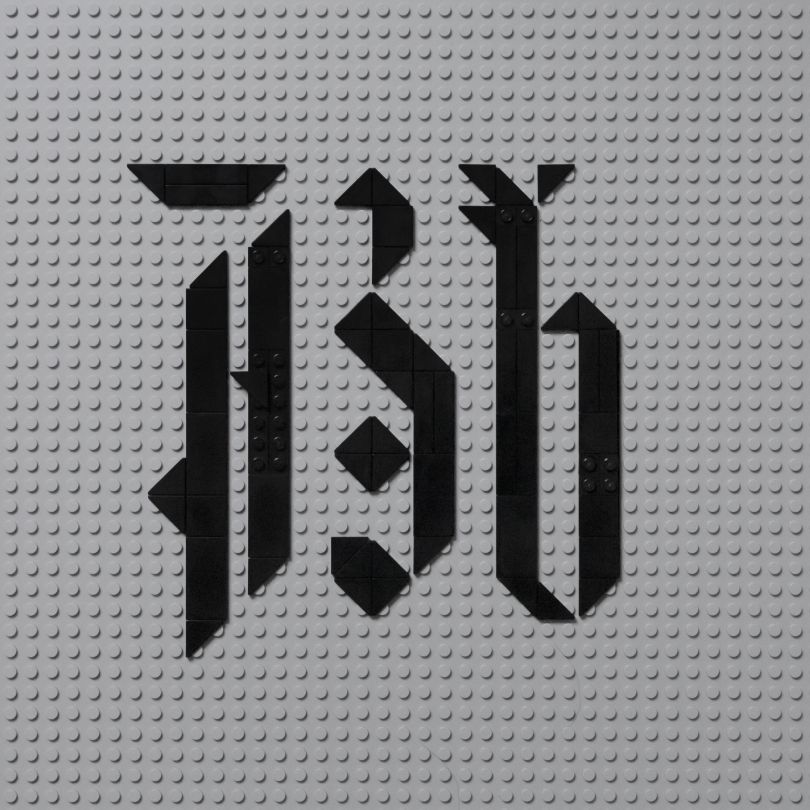
“The Brikfont project was inspired in part by the idea that creativity thrives on restriction — and I think the LEGO system is that concept writ large,” Craig tells Creative Boom. “Almost everything imaginable has been created in LEGO in some way, but the subtleties and nuance of type design often struggle with the ‘resolution’ – curves and diagonal strokes in particular – so this is kind of a quest to find the perfect LEGO typeface and bring some type designer knowledge to the proceedings.”
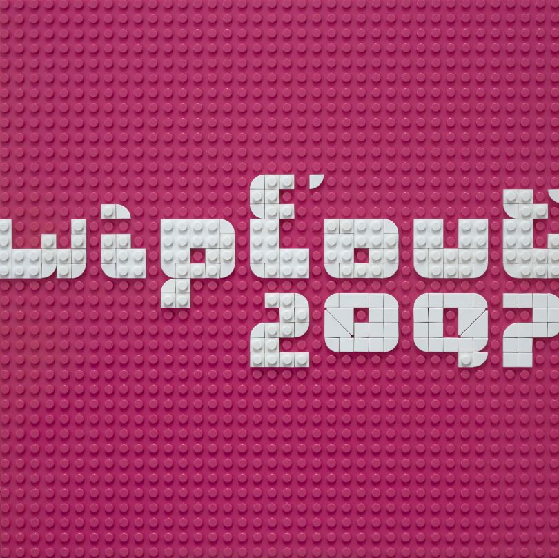
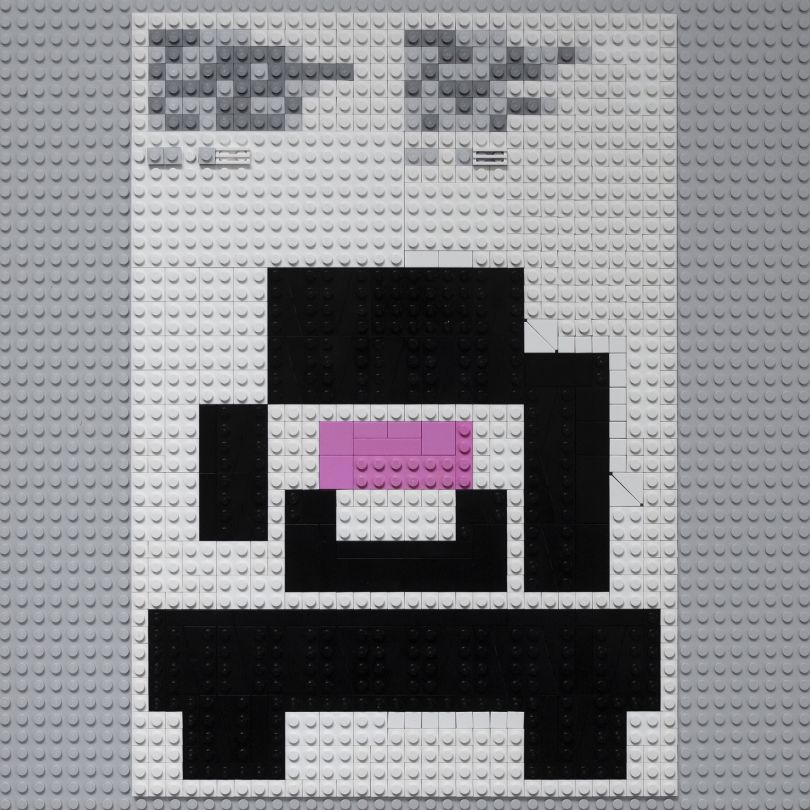
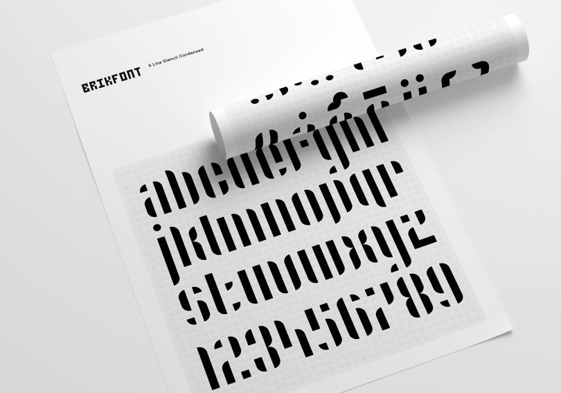
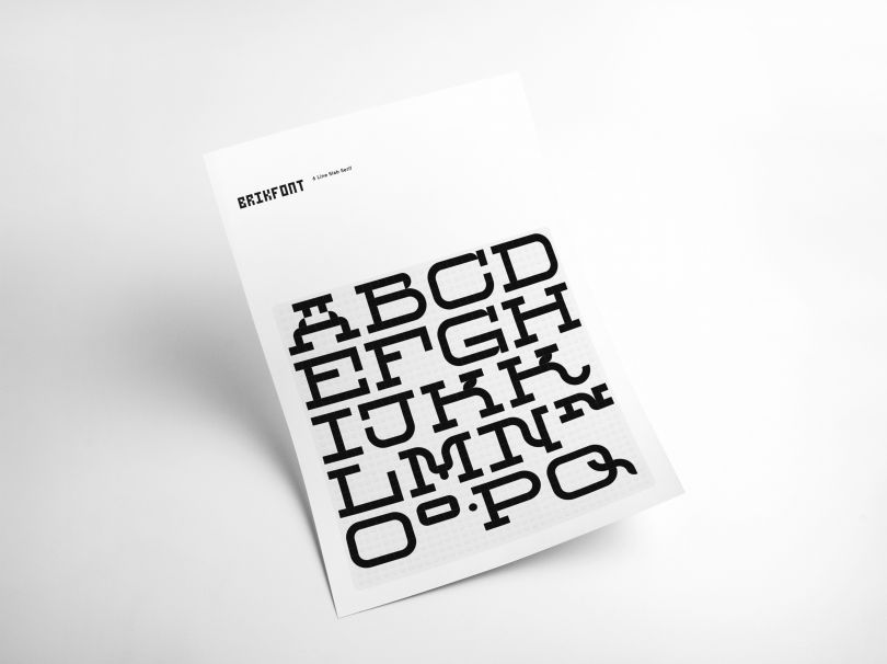
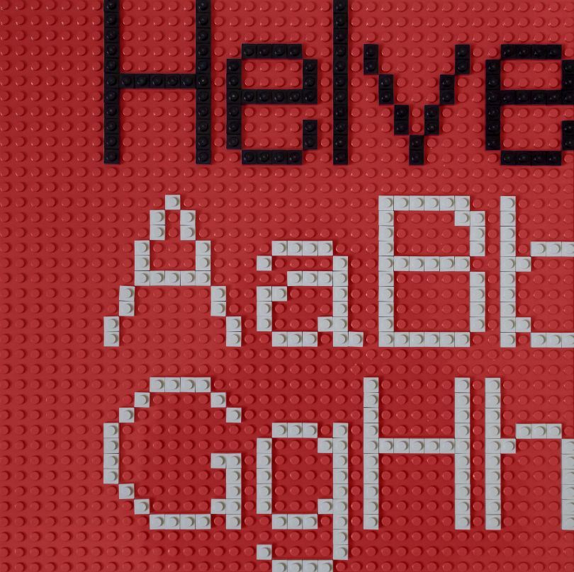
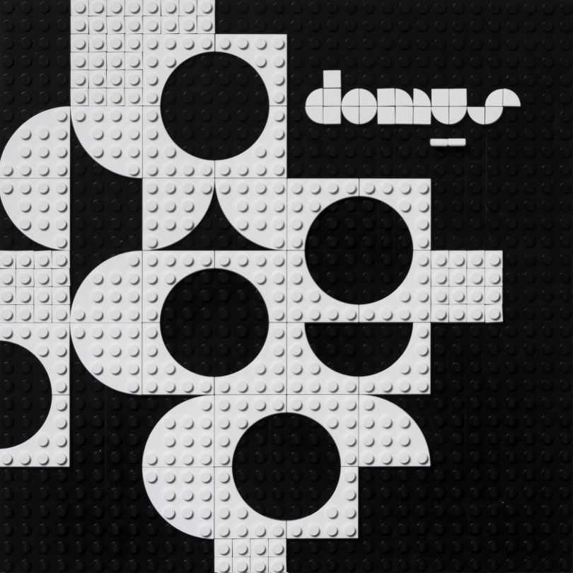
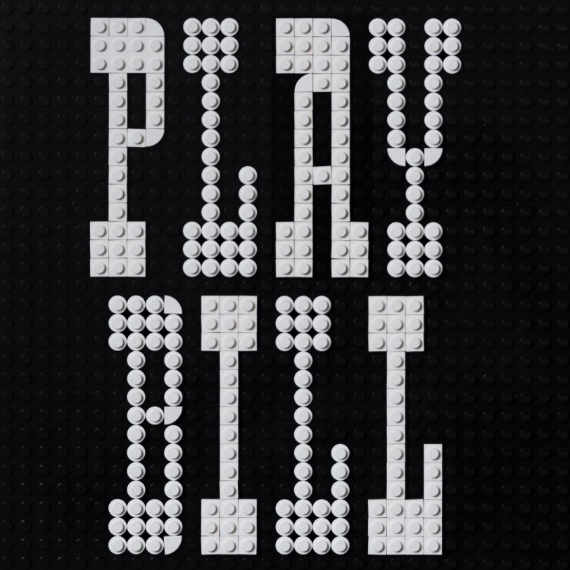
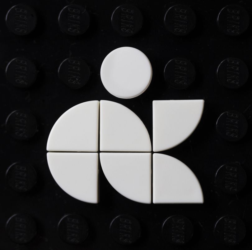
Current typefaces on the Brikfont Instagram page include Flux, a slim, curved design in the style of London-based graphic design studio 8vo, and chunky, stencil-like lettering, which evokes the bold artwork of Christopher Wool. Each example of LEGO typography is outlined with a little explainer by Craig in the captions, which reveals the influences on that particular type design and the creative choices he’s made.
“I’m not yet 100% sure on what qualifies as a success right now — whether it’s something that works in spite of the restrictions or something that embraces and celebrates those restrictive aspects,” says Craig. “But it’s fun nerdy stuff, and there’s a little learning in there to be had as well, for those not familiar with type design, I hope.”
With a lifelong interest in modular fonts – a term used to describe letters that have been made from a limited selection of distinct elements – Craig has been surprised that he did not come up with the idea for Brikfonts sooner. “On a personal level, the project has a very zen vibe to it, and the process reminds me of setting moveable type by hand, which is something I did a lot of after graduating,” he explains.
And while the primary aim of Brikfont is to create a typeface that works well in the medium of small plastic bricks, Craig doesn’t deny that it would be nice if there was another pay-off. “In terms of an end goal, if there is one, I’d love to create an alphabet kit for LEGO to actually retail that had the feel of a wood type composition, and that could be arranged and rearranged in various ways. But first, I need to create 26 worthwhile original alphabets.”
Browse all of the current Brikfont typefaces so far on the project’s Instagram page. And if you can’t wait for LEGO to release an alphabet kit, you can buy Brikfont prints from Etsy and Society6.