Our data is ready and let’s start plotting. Remember our ultimate goal is to create an interactive Plotly chart for each city and then pass each chart to its corresponding marker in the Folium map. We will need to use for-loop and HTML iframe to achieve that.
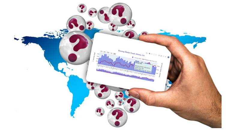
Before we get to that, let’s warm up a little bit by creating a double y-axis Plotly chart for one city only. We can choose Atlanta and plot the ‘homes_sold’ metric in a bar graph and the ‘median_sale_price’ metric in a line graph and combine the two graphs into one combo chart with dual y-axes. We’ll also add a customized hover-over tooltip to the combo chart as well as a range slider/selector.
Using Plotly Graph_Objects, we first create a figure using make_subplots() so that the figure can have two y-axes with different scales. Then we add two traces to the figure, one representing a bar graph and the other a line graph. Lastly, we update the figure using update_layout() method to customize the chart title, legend, x and y axes, etc.
If you are new to Plotly, you can read this article below to learn the basics of Plotly and Plotly Graph_Objects. By doing so, you will have a much easier time following and understanding the code that’s coming next!
For ease of demonstration, I’m going to present the whole code, then I’m going to comment part by part of the code so that you can have a good understanding of how this works.
Line 1–2: We limit our data to one city (Atlanta, GA) only and create a figure that can have a secondary y-axis using the make_subplots() method.
Line 4–23: Since we are plotting a combo chart (combination of the line and bar graphs), we will need to add two traces to the figure (a trace means a type of visualization like scatter, bar, pie, etc.). We first add the bar graph to the figure, using the primary y-axis. Then we add the line graph which uses the secondary y-axis.
Notice that the line chart was plotted by using go.Scatter(). This is because Plotly line charts are implemented as connected scatter plots. This also means that the data points are connected with lines in the order they present in the dataset (hence why we needed to sort the dataset by ‘snapshot_month’ in the data wrangling step). In lines 19–20 we also pass the customized tooltips to the line chart.
Line 25–43: We update the figure by adding a chart title and specifying its position, font size, font color, etc. In line 41 we can also adjust the position of the legend. By default, the legend is always placed on the upper-right side outside of the chart area and is placed vertically.
Line 45–55: We can also add a range selector/slider to the plot so that users can zoom in to a specific time period range which makes the visualization even more informative and interactive! This can be easily implemented with just a few lines of code by using fig.update_xaxes().
