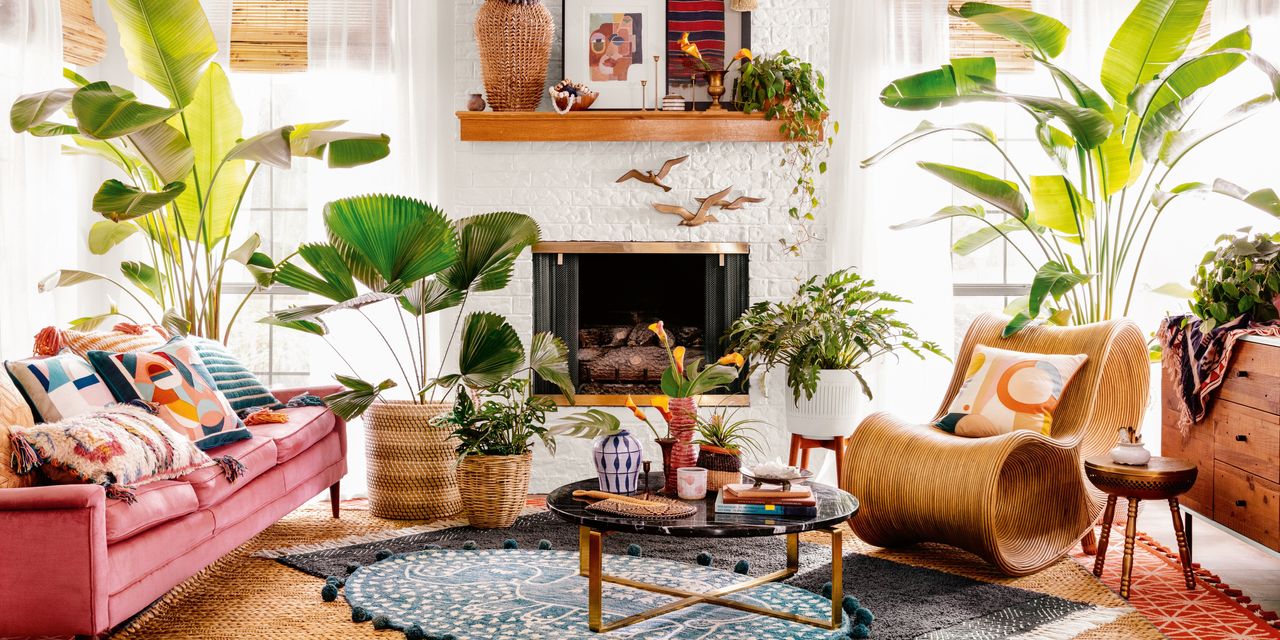
WHEN A CLIENT sent Chicago interior designer Elizabeth Stamos Instagram images as aesthetic references, some depicted encaustic-cement flooring tile in a black-and-white, four-leaf-clover pattern—a particularly trite trend. Ms. Stamos’s unspoken reaction? “Take a damn risk.”
Thanks to home-reno TV and social media algorithms, Americans’ tastes in décor have congealed into a sort of groupthink monotony. The prevailing design formula—a blend of blackened steel, white shiplap, subway tile, wood or rattan—is perpetuated by likes, sharing and targeted ads.
“If you engage with a post that has a gray couch, Instagram will show you gray couches,” said Noriko Roy, co-founder of NK Agency, a digital marketing agency in Los Angeles. To bust up the sameness, Ms. Roy suggests you purge your search history and unfollow repetitive accounts. Turning on notifications for a novel account (our suggestions at right) alerts A.I. to your shifting point of view.
Los Angeles interior designer Justina Blakeney follows the feeds of décor magazines from around the globe to find designers and artists new to her. “If I find someone whose taste I really love, I look at who they are following to see if I uncover any gems,” said Ms. Blakeney. The eclectic, charismatic results can be seen in her new book, “Jungalow: Decorate Wild.”
Here, design pros on how to upend and better three decorating clichés spawned via Instagram.
