
Reading printed text is so fluid and transparent for most people that it’s hard to imagine it feeling any other way. Maybe that’s why it took a dyslexic designer to create a typeface that optimizes the reading experience for people who suffer from that condition. Christian Boer’s “Dyslexie” doesn’t exactly make the letterforms look conventionally beautiful, but since when is that a prerequisite for well-designed? If it works, it works. And according to an independent study by the University of Twente in Boer’s native Netherlands, it does work.
“Dyslexie is not a cure, but it can be something like a wheelchair.”
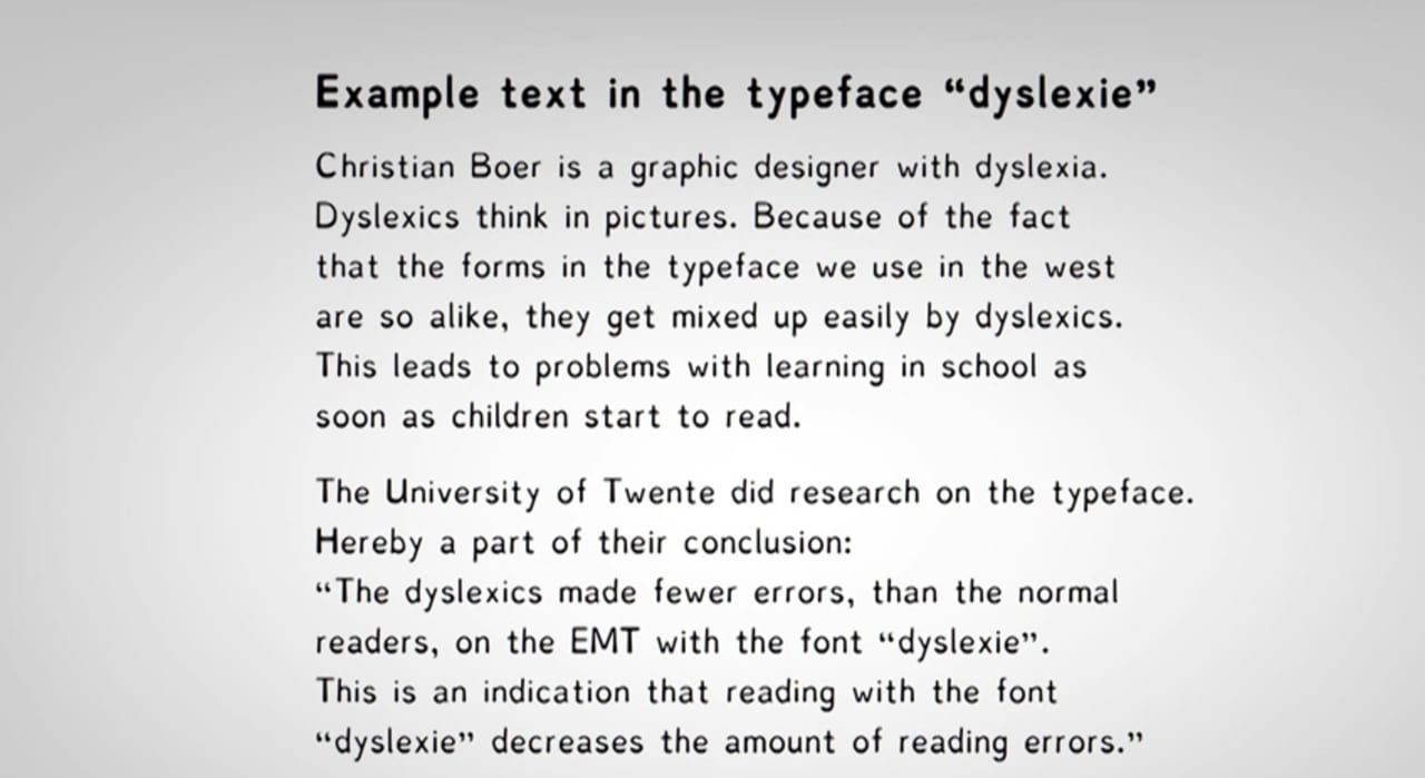
Boer began creating Dyslexie as a personal project while he was a student in 2008. He followed his own instincts about optimizing typography to fit his own eye, then recruited eight other dyslexics (whom he didn’t know) to help him iterate through four rounds of design to refine the letterforms. One of the key features of Dyslexie is the extra visual “weight” it adds to the bottom halves of the letters. According to Boer, this is to help pin the letters to the baseline, which helps make them easier to read. But like any serious typographer, Boer made serious individual tweaks to each letter to get it just right. “I can tell you that I have worked on the comma for four hours and the letter “a” for more than 12 hours,” he tells Co.Design.
Click here to see this article set in Dyslexie.
A researcher from the University of Twente contacted Boer independently in 2009 to run a study on the font’s effectiveness. The small study of 21 dyslexics showed that they made fewer errors when reading text set in Dyslexie compared to “normal” typefaces. Boer set all the text on his website in Dyslexie, and prefers to type in it as well as read. “I hope that I can help people with dyslexia so that the everyday struggle in this information society is a little less,” Boer tells Co.Design. “Dyslexie is not a cure, but I see the font as something like a wheelchair.” If Dyslexie takes off, perhaps we’ll see the rise of whole type studios and foundries dedicated to expanding the graphic options optimized for dyslexic people. After all, why should Dyslexie be the only one?