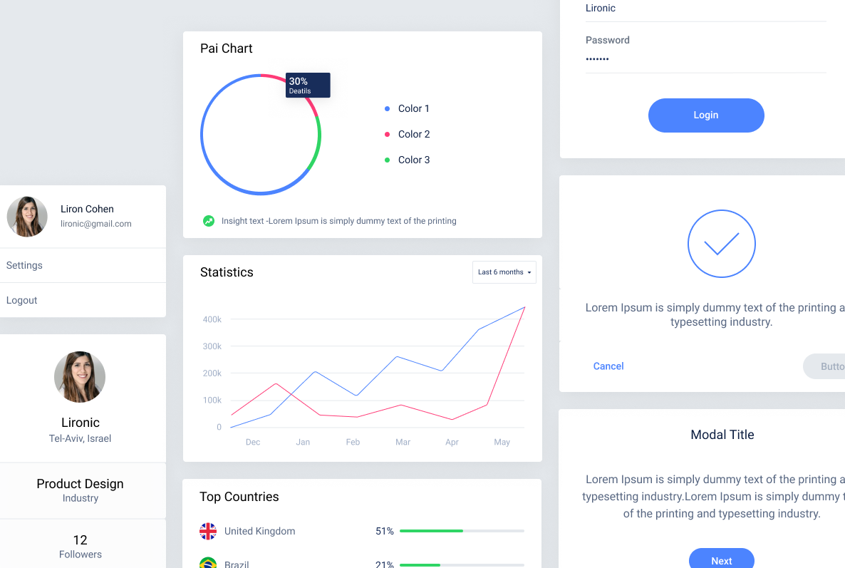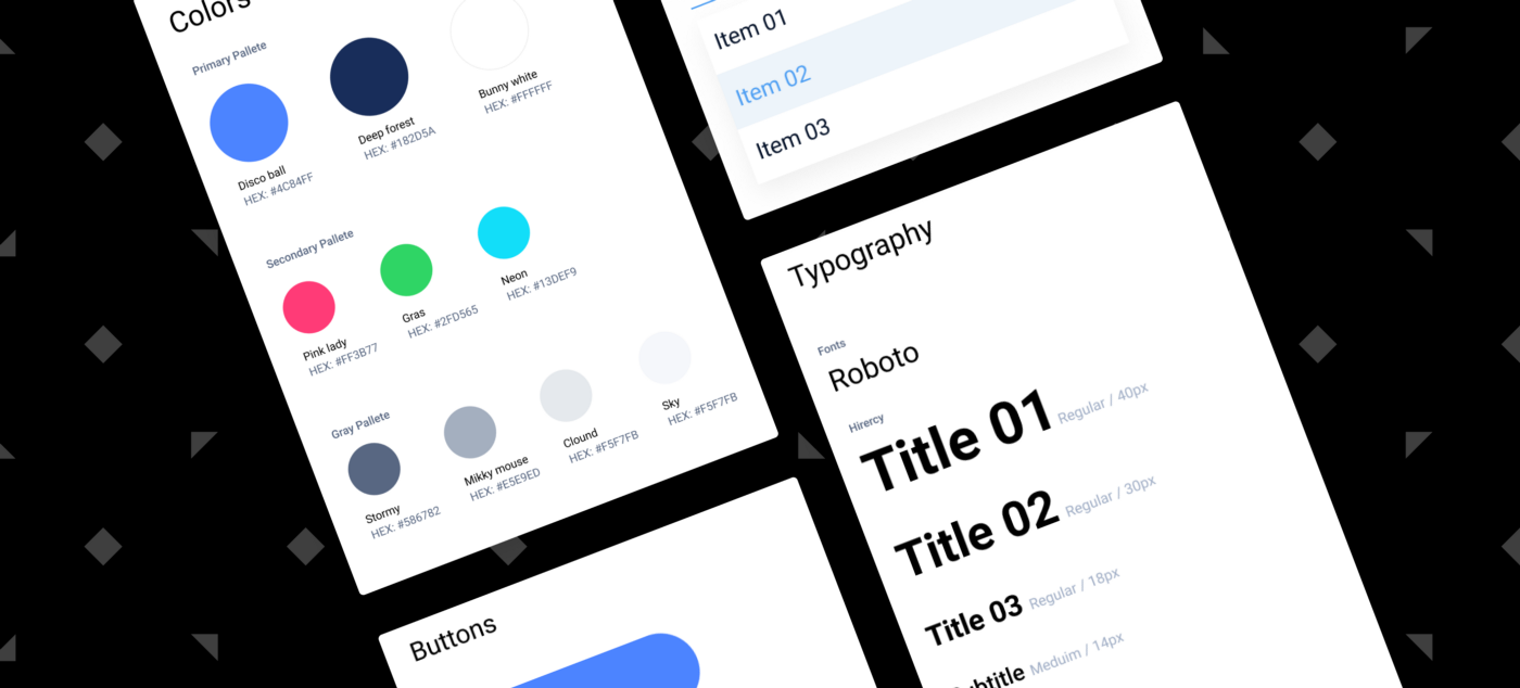
As a design system freak and a Figma lover, I’ve developed a methodology to create design systems easily & efficiently. I’ve decided to share it with you guys, with the hope that it will save you time and make your job pretty easy. Note that this example is just for the basics, and that depending on how complex your product is, your design system should include more elements.
First of all, Building a design system as an ongoing Project.
I remember the times of designing screens using Photoshop, and how I would always find myself using my last strengths right before the delivery deadline, in order to create a long and cumbersome JPG file called “Styleguide” where I would define all the elements.
Well the times have changed, and now thanks to Figma you can create a design system as part of your working process. You just need to do it right. So here are a few easy & effective steps I recommend to follow:
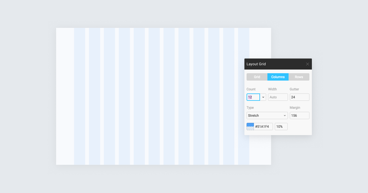
As my typography lecturer used to say “the Grid is the basis of everything”. Consistent usage of a grid system is the foundation for harmoniously and consistently positioning elements on the screen.
This really depends on your project but I usually create a palette of primary colors, secondary colors, and a grey palette. Don’t forget to add the colors to the ‘Color Style’ panel in Figma, as this way you can make sure you only use the colors you’ve previously defined and avoid mistakes.
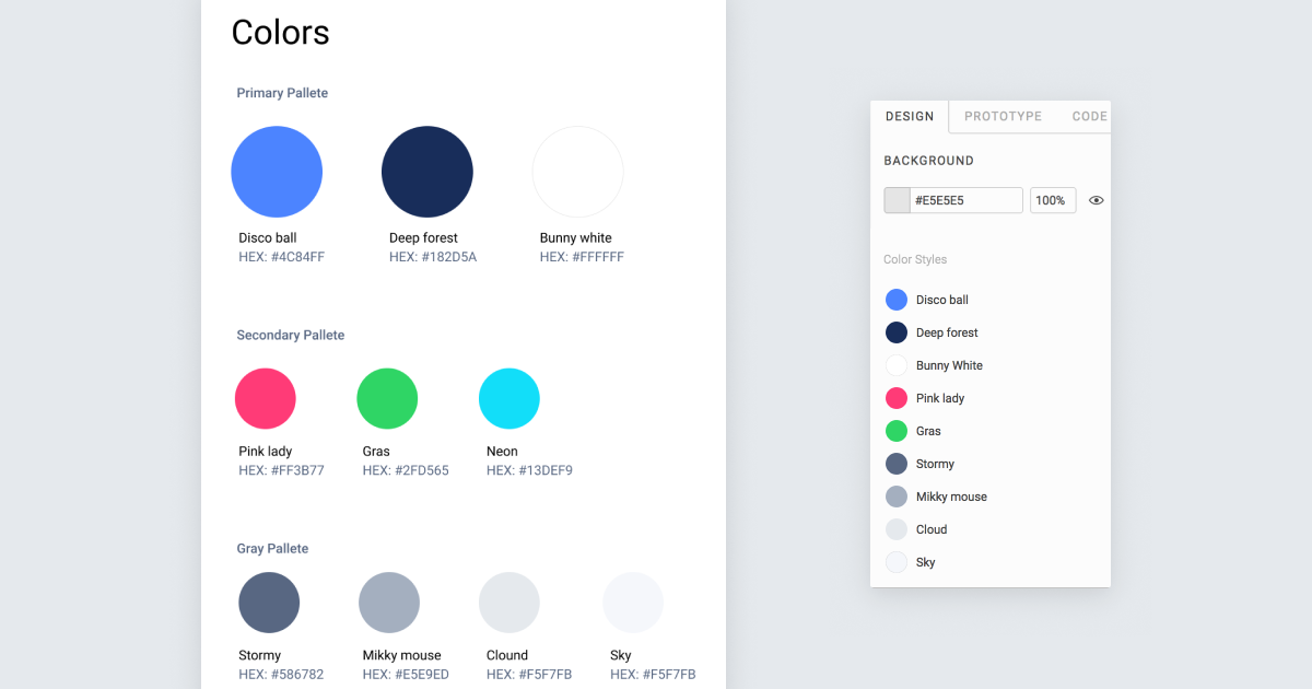
Naming your colors is not only fun, but will also improve the communication with your developer colleagues. Instead of asking them to please replace color #459879 with #387981 you can simply say “please replace Disco-ball with Gras!”
This will probably be changed later, so for the beginning I simply suggest to select a font that works well in web. If you are looking for free fonts — Google fonts is a great source. Start by creating the hierarchy and make sure to define them in the ‘Text Style’ panel as well.
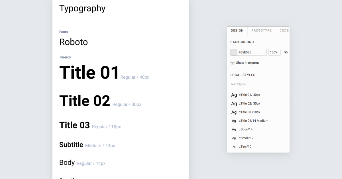
After completing the above mentioned steps you can go ahead and just start designing your screens. There’s no need to move to a different page — you can do it on the same page! Just make sure you have clearly separated the design system area and the created designs, so your file will be nice and organised.
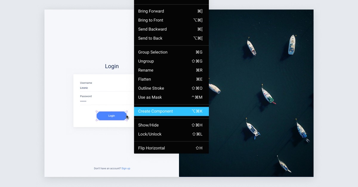
Components are the building blocks of your design system (Also referred to as ‘Atoms’ in the atomic design approach). They are basically elements that can be reused easily across different screens and pages in your designs. Components can be almost everything — buttons, list items, tabs, etc.
Creating them is easy, just right click on the element and then select ‘Create Component’.
I highly recommended this video to learn more about components
Now stop for a moment. The most important thing in order to work efficiently is to be organised.
You’ll soon notice that the components that you’ve created can be divided into Main ‘Families’ (e.g buttons, rows, text fields, dropdowns…) If you want to work efficiently you should create a Frame for each ‘Family’, name it, and then drag the component you created to the frame (make sure you drag the component itself and not the instance). Figma automatically organizes all the components that are located in the same frame to a group. This is super cool because while designing, if you ever want to reuse the element again you can simply go to the components panel and drag the element from the group.
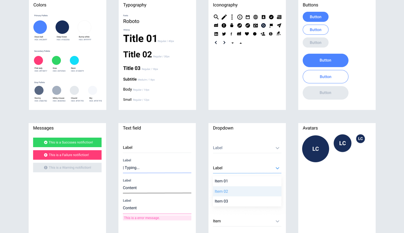
Two Tips:
- Give your components a systematic name so you could easily replace them later on (e.g — Buttom / Primary)
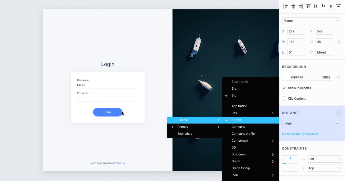
2. Make sure all the elements from the same family have the same size and configurations so you could switch them easily (e.g — all Icons should be 24px / 24px and centered)
Based on the same idea, you can create ‘Templates’ (Molecules). Templates include different individual components, and they can be models, forms, menus etc.
