
When you hear the word ‘map’, what comes to your mind instantly? Is it Google Maps? Well, maps play an integral part in the lives of everyone, be it for navigational purposes or to define geographical contours.
But did you know that a lot of countries are not as big or small as they look on a typical world map? Did you know countries look bigger in and around the Poles despite having a lesser area as compared to others near or on the equator? To show how incorrect our understanding of country sizes is, a website called thetruesize.com lets you move landmasses into different locations. This is how it is done.
The website gives you the option to place any country anywhere.
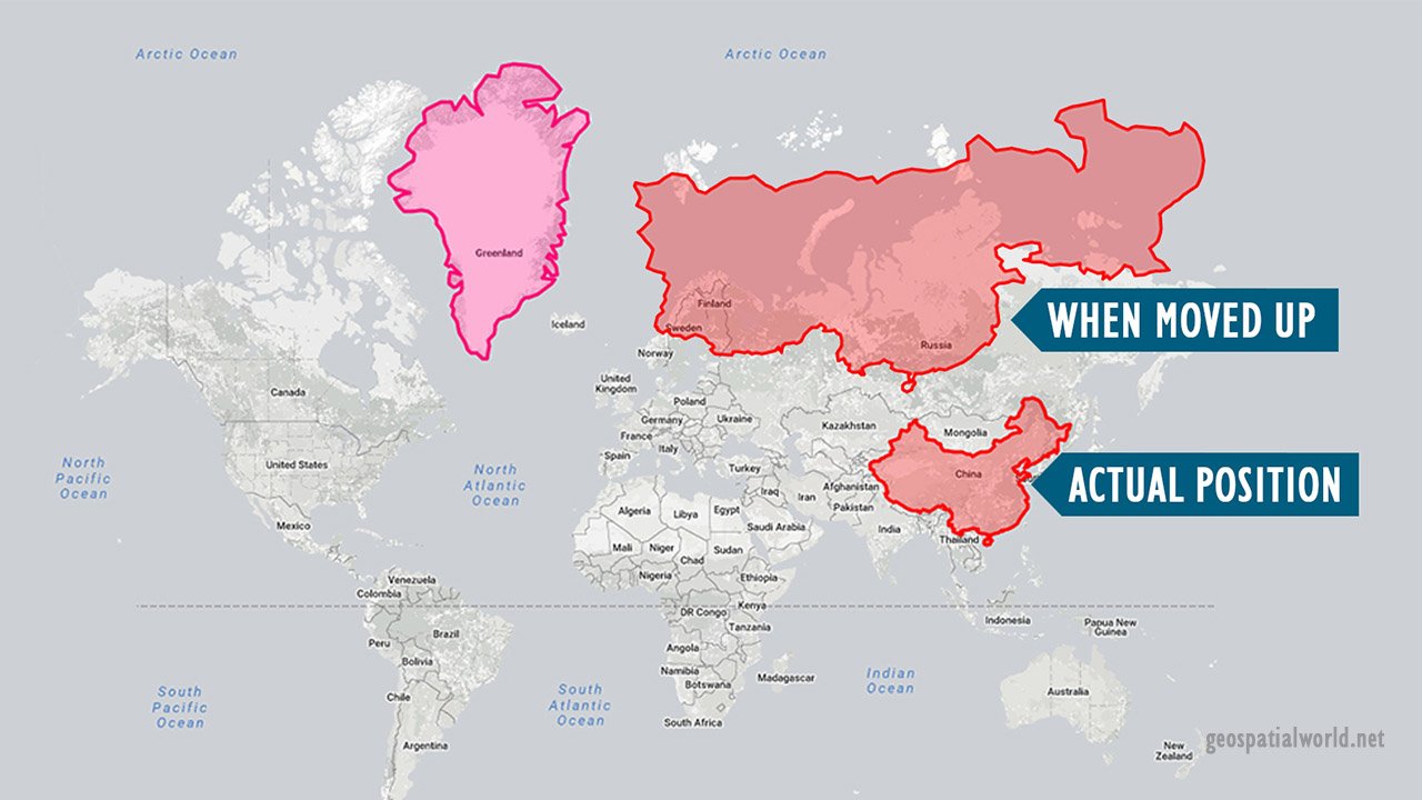
So let us say if you take the example of China, which has a total size of 9,596,961 sq km, is a much bigger country than Greenland, which is just 2,166,086 sq km in size. However, Greenland looks bigger than China because it is close to the North Pole and China being closer to the equator.
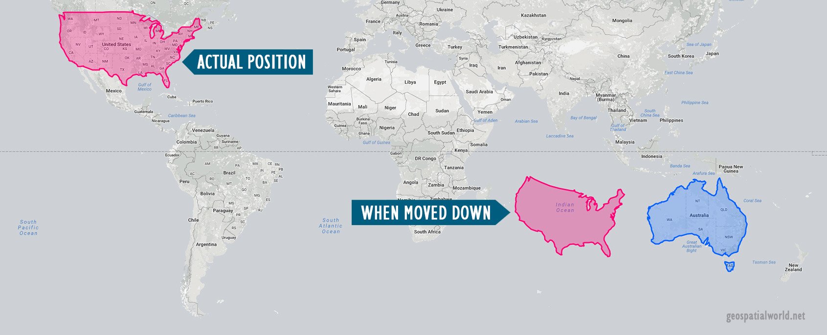
Similarly, let’s take the example of the United States (contiguous 48). Even though having a size of 9,904,670 sq km, if we place the US next to Australia, with a size of 7,692,024 sq km and near the equator, the country looks unbelievably small, almost the same as Australia.
To make things clearer and little more fun, let us see few more examples.
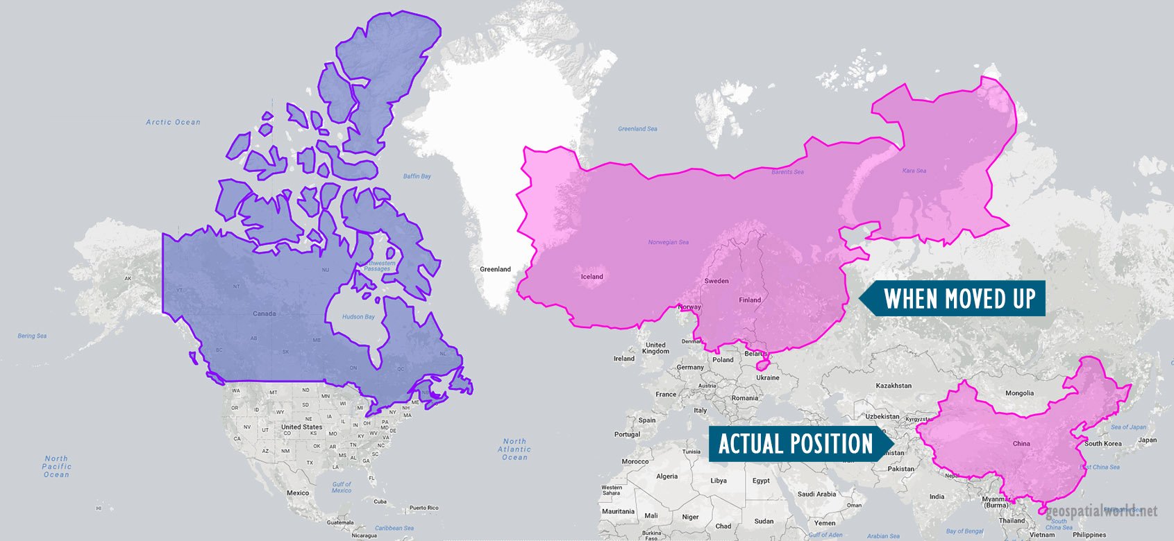
Canada, with a size of 9,984,670 sq km, has almost equal size of China (9,596,961 sq km), but its proximity to the North Pole makes it look much larger than China.
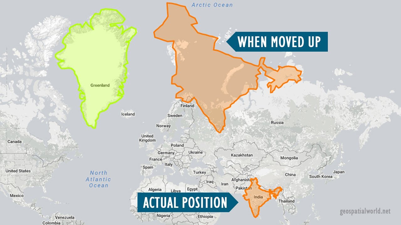
India has a size of 3,166,414 sq km, which looks tiny compared to Greenland. Now, if we take it to the North Pole, it looks way bigger than Greenland (2,166,086 sq km), which is, in reality, true according to their size. But since India is located near the equator its size look much smaller than Greenland.
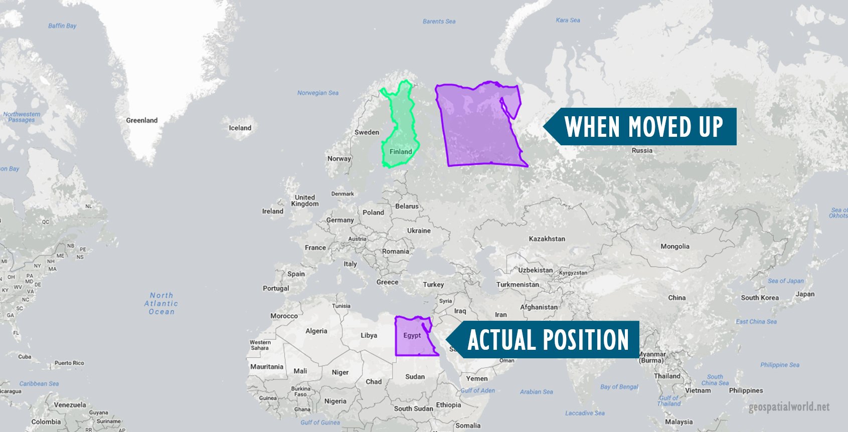
Similarly, look at an equatorial country like Egypt (1,002,450 sq km). On a normal global map, it looks almost the same size as a north European country like, say Finland (338,424 sq km). Now when you move Egypt next to Finland, you actually get to see its almost double in size.
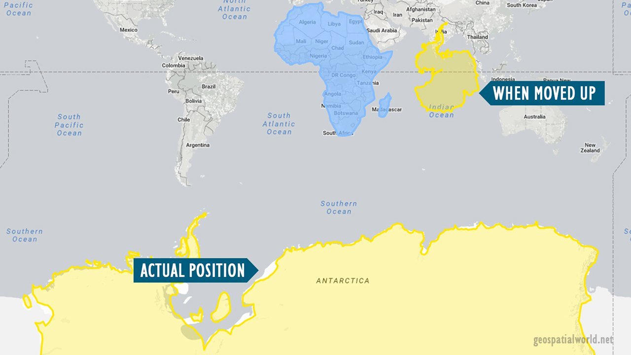
Again, Antarctica (size), which looks to be humongous in size in its actual position on the map, when moved up on the equator, looks about half of Africa (30,043,862 sq km).

In fact, the continent of Europe, which actually dominates much of northern hemisphere, when compared to Brazil (8,515,767 sq km), looks almost equal. When you take Brazil next to Europe you can see the change in size.
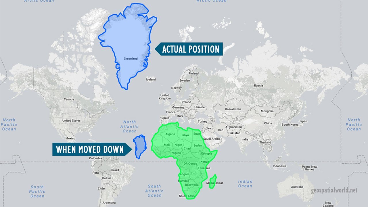
The most glaring example of this distortion is Greenland, appears to be roughly the same size as Africa. In reality, as mentioned above Greenland is just 2,166,086 sq km and whereas Africa is 30,043,862 sq km, nearly 14-and-a-half times larger.
Why does this happen?
This distortion is because of something called the Mercator Projection. Historically, maps can be traced back to the ancient times when explorations took place by using the magnetic compass and Pole Star for navigation. While traditional maps made on flat surfaces gave apt information but gave inaccurate size of countries or places depending on their position relative to the equator.
Putting a 3D planet on a two-dimensional map was something of a challenge for early cartographers and so Dutch geographer and cartographer Gerardus Mercator came up with a solution. In 1569 he designed a map that could be accurately used for navigation purposes, but the downside was that his system distorted the size of objects depending on their position relative to the equator. Because of this, landmasses like Antarctica and Greenland appeared much larger than they actually are.
Thetruesize.com gives you the true picture of the Earth, which is spherical in shape. The difference in the size at the poles and the equator is because of the 2D and 3D projection. This app was created by James Talmage and Damon Maneice. It was inspired by an episode of The West Wing (a famous US drama based on politics) and an infographic by Kai Krause entitled “The True Size of Africa”.
So go ahead, click on the link and have fun!
You must be logged in to post a comment.