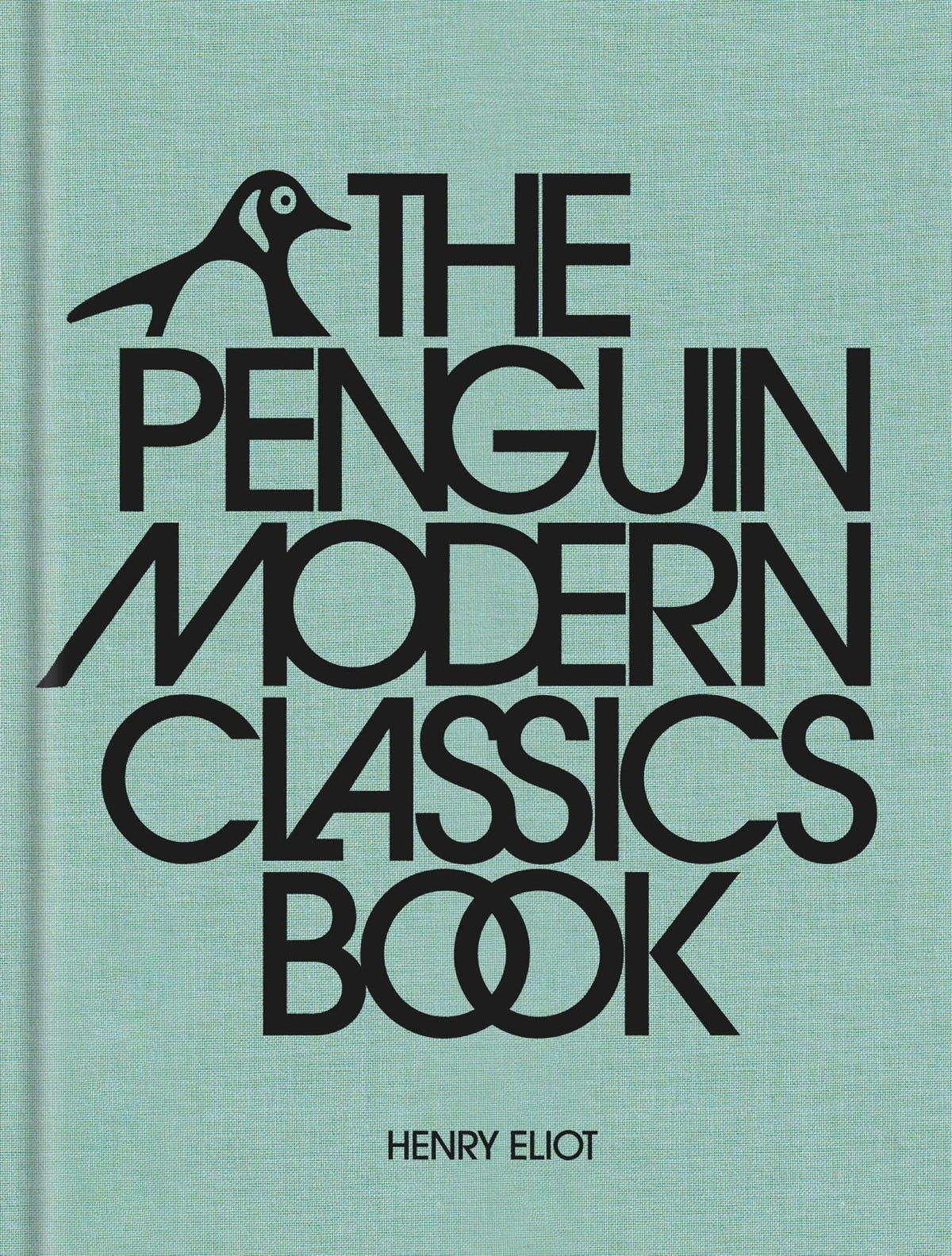
Established in 1961, Penguin’s Modern Classics series has featured a huge array of titles and authors – everyone from Carson McCullers and Vladimir Nabokov through to James Joyce and Virginia Woolf.
What defines a modern classic? According to the book’s author, Henry Eliot, it’s “a product of more recent times: it was written in response to a world we are still experiencing, and it can be all the more challenging and exciting because of it”.
Every single one of the 1,800 titles included in the series is featured in this compilation, which displays the first Penguin Modern Classics cover for each, alongside a brief summary and some background on the author. Chapters are divided into regions and countries, and helpful sidebars connect themes across different titles.
The first five Modern Classics covers were designed by Penguin typographer Hans Schmoller, who paired Eric Gill’s Joanna typeface with a grey, white and orange palette. The appearance of the series has varied over the years, as different art directors put their own stamp on the jackets. In 1963, Germano Facetti introduced the ‘Marber Grid’, which put a white, black or green panel on the cover, paired with full-bleed artwork.
Cherriwyn Magill changed things up again in 1982, with an inset artwork, and then in 1989 Penguin introduced a floating logo in a roundel and a white title box set in Jan Tschichold’s Sabon. A glossy silvery period followed in the early 2000s, and then in 2007 Penguin Press art director Jim Stoddart introduced Herb Lubalin and Tom Carnase’s Avant Garde as a typeface – which remains in use today.
“The thing with Modern Classics is that basically every book is really readable, really recommendable and really exciting – so I think designers have wanted to up their game to match the quality of the books,” Eliot tells CR. “There’s a spirit within the list of people of breaking the mould and doing something different, and I think designers have really responded to that over the decades.”
For Eliot, much of the charm of these covers is the way they function almost as a tour of 20th century visual art – something that can be credited to Facetti. “He had this principle that you illustrated and represented the book with artwork that was roughly contemporary to the text,” says Eliot.
“That was an idea that went across Modern Classics but also Penguin Classics … what that means is when you look at them altogether you’re getting basically a slice through the whole of 20th century art…. Part of the appeal of the series is holding this beautifully produced artwork in your hand, as well as obviously the text inside.”
If anything’s missing from this book – which is exhaustive in its organisation and level of detail – it’s that it doesn’t delve into the many different covers designers have created over the years for the same title. Maybe that’s one for the next compilation.
The Penguin Modern Classics Book is published by Penguin; penguin.co.uk

You must be logged in to post a comment.