
PYTHON. DATA SCIENCE. GEOVISUALIZATION
Using the Folium Package to Create Stunning Choropleths
In the past two articles in this series, we were able to create choropleths from Geopandas and Altair packages. Let us continue our learning but this time let us use the folium package.
In this article, we have introduced the folium package as well as the advantages and disadvantages of the package.
As we will see later, folium brings in a lot of customization tools that will help create our map become more interactive and professional-looking. This comes, of course, with the added cost of a few extra lines of code.
Without further adieu, let’s begin.
The coding portion is similar to the prior two articles but with this one, we need not merge the dataset (except if we want to create a custom colormap as we will see later.)
PRELIMINARIES
import pandas as pd
import numpy as npimport geopandas as gpd
import folium
LOAD AND PREPROCESS THE DATA
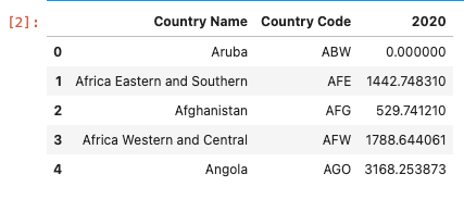
df = pd.read_csv('data/gdp_per_capita.csv',
skiprows=4)
df = df.loc[:,['Country Name','Country Code', '2020']] #Choose only 2020df = df.fillna(0) #New step df.head()
LOAD THE SHAPEFILE
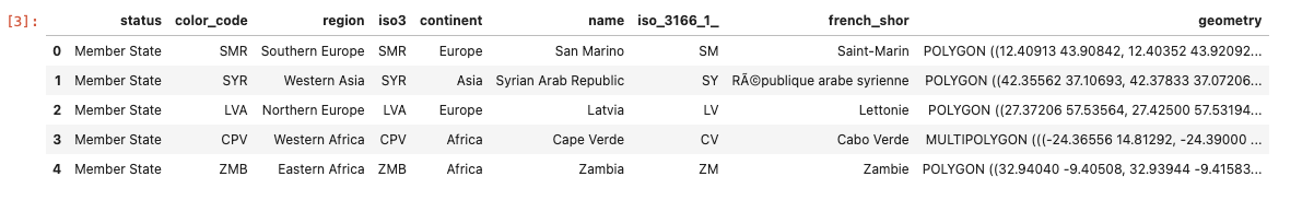
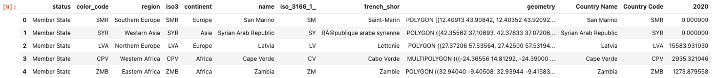
gdf = gpd.read_file('shapefiles/world-administrative-boundaries/world-administrative-boundaries.shp')gdf.head()
INITIATE THE MAP
#Folium
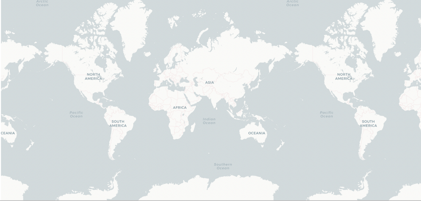
mymap = folium.Map(location=[19.0649070739746, 73.1308670043945], zoom_start=2,tiles=None)#ADDING TILES AS A SEPARATE LAYER ALLOWS FOR MORE CONTROL AND MORE SUTOMIZATION
folium.TileLayer('CartoDB positron',name="Light Map",control=False).add_to(mymap)#Calling the map
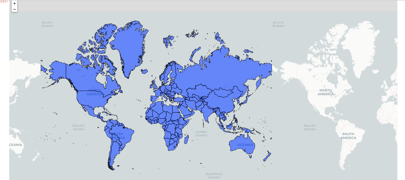
mymap
CREATING THE CHOROPLETH TO BE ADDED AS A LAYER
choropleth = folium.Choropleth(
geo_data=gdf, #the dataset merged with the geometry and the data we need to plot on,
data=df,
key_on='feature.properties.name',
columns=['Country Name', '2020'], #the first one is the 'index' which needs to be connected with the 'key_on' property of the geo_data
name = 'GDP per capita (Constant USD 2015 )',
fill_color='YlGn',
fill_opacity=0.7,
line_opacity=0.5,
).add_to(mymap)
mymap
Let’s discuss the parameters of the code:
geo_data— the shapefile datasetdata— this contains the values which is the basis for the choropleth’s colors.key_on— this refers to the column found in the shapefile (orgeo_dataparameter) which will be used to merge values with the one in thedataparameter. The reason we skipped the merge portion of data is because of this: folium will do the merging using this parameter..add_to—to add the choropleth layer to our initialized map.
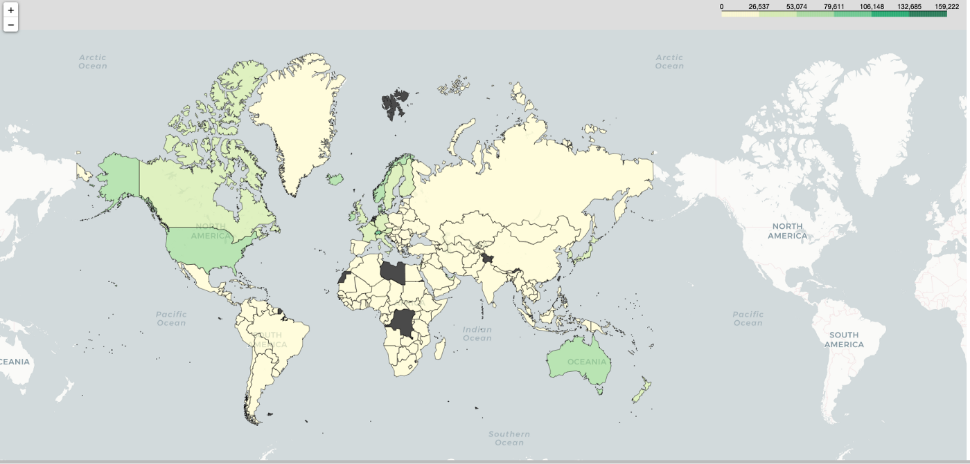
One potential weakness of the Choropleth class of folium is that it has a limited color palette. We used Yellow-Green for now but there’s a way to customize this later.
Let’s customize our choropleth by doing two things:
- Add tooltip for interactivity
- Create a customized colormap — red-yellow-green.
ADD TOOLTIP
To add a customized tooltip, we need to call on the GeoJsonTooltip class of the folium. This provides a way for us to interact and view our data which is handy especially when we are doing some reporting.
# Display Region Label
choropleth.geojson.add_child(
folium.features.GeoJsonTooltip(['name'], labels=True)
)
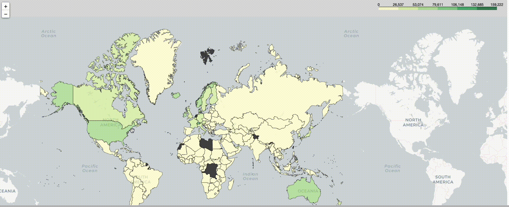
mymap
CREATE CUSTOM COLORMAP
To try to replicate the color scheme for the first series, it is necessary to create a custom color map. As mentioned earlier, the color palette available in folium is limited, and to create a customized one, we need to add in more lines of code.
In our original article, we used the “Red-Yellow-Green” colormap. To use this here, we need to do several things:
1. Create a customized colormap using the branca library. The colormap available in Folium is limited and if we want to create a customized one, we need to use the branca library.
2. Merge the data with geodataframe. This has now become necessary because, in order to add in a layer where the color depends on the value, geometry data should be present.
3. Add in a separate layer with a customized colormap.
import branca
import branca.colormap as cm#First determine your maximum and minimum values - this becomes the basis for the steps in the map
vmax = df['2020'].max()
vmin = df['2020'].min()colormap = cm.LinearColormap(colors=['red', 'yellow','green'],
vmin=vmin,
vmax=vmax)
MERGE THE DATA
merged = gdf.merge(df, left_on='name', right_on='Country Name' )
merged.head()
ADD AS A SEPARATE LAYER
# First create a function that would call on these values
style_function = lambda x: {"weight":0.5,
'color':'black',
'fillColor':colormap(x['properties']['2020']),
'fillOpacity':0.75}#Add the colormap as a legend
colormap.add_to(mymap)#Save it as an object so you can add it
folium.features.GeoJson(
merged.fillna(0),
style_function=style_function,
).add_to(mymap)mymap
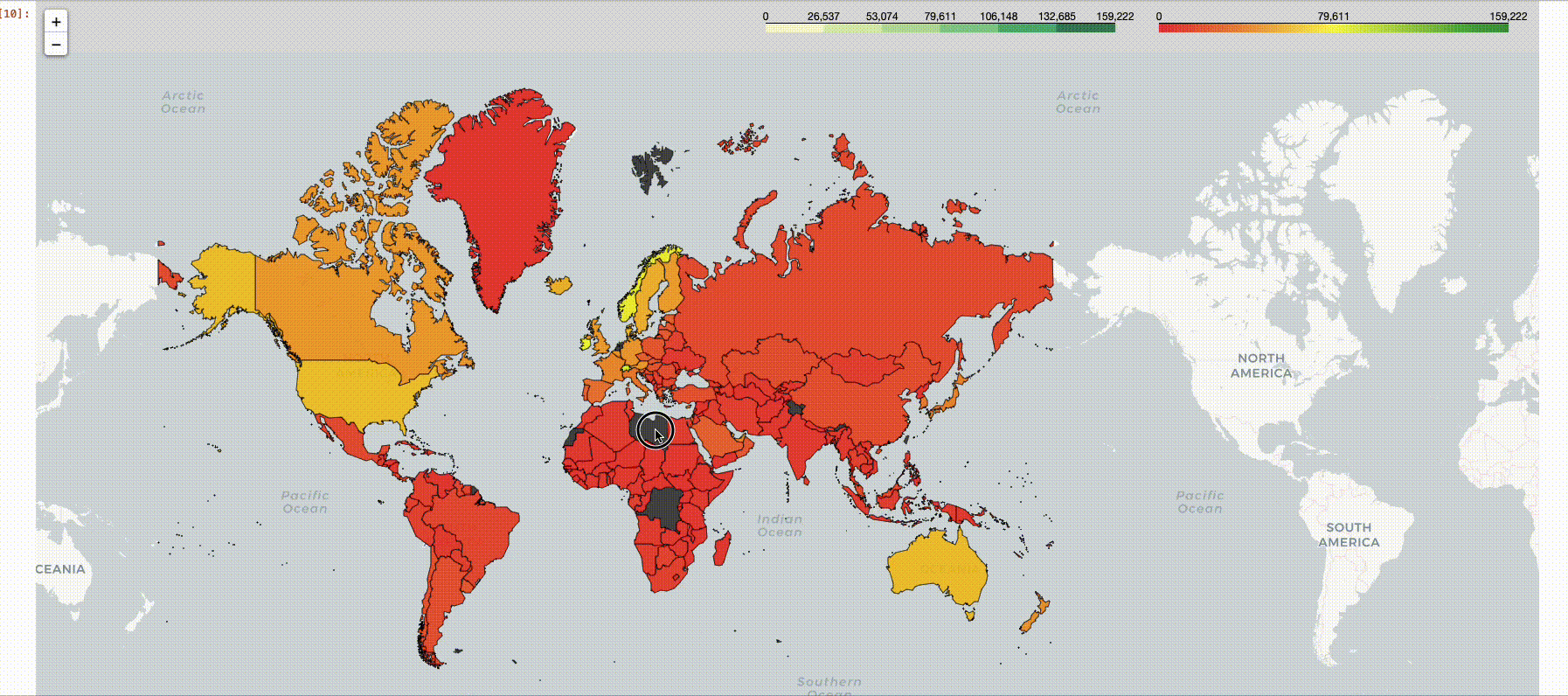
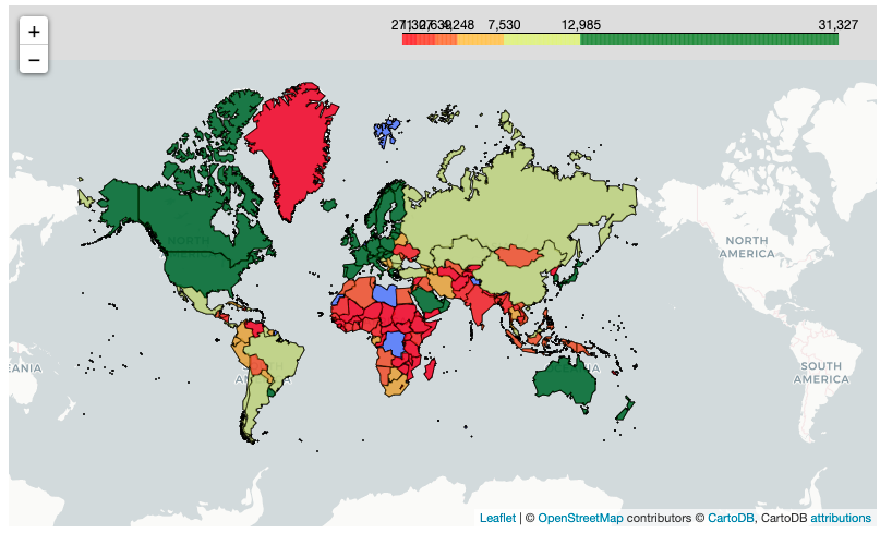
This one now resembles the original Altair map we have created. Hooray!
To make the color more even, that is ignoring outliers, as what we have done using the quantile method, we need to add in more codes.
To fully replicate the maps we have created in the first two articles, we need to ensure that the values are divided into several steps (ignoring outliers for which a caveat was posted in the last part of the article).
Note, however, that as you continuously add layers to the map, it gets cluttered so it might be cleaner to just start a new one. But if you plan to create a customized color map, it may be simpler to not keep the choropleth portion clean as follows:
# My Map
#Folium
mymap = folium.Map(location=[19.0649070739746, 73.1308670043945], zoom_start=2,tiles=None)#ADDING TILES AS A SEPARATE LAYER ALLOWS FOR MORE CONTROL AND MORE SUTOMIZATION
folium.TileLayer('CartoDB positron',name="Light Map",control=False).add_to(mymap)choropleth = folium.Choropleth(
geo_data=gdf,name = 'GDP per capita (Constant USD 2015 )',
).add_to(mymap)
mymap
The code below shows our proposed steps:
- We make use of the index (which manually dictates the cut points of the colors. This first requires that we know the maximum and minimum values of the series.
- We linearized the colormap so values can fall into bins in the index.
- As you can see, we repeated the hex code
#c7f6b6twice. This is not by accident. Folium seems to have trouble cutting the last color in the list so adding in more colors ensures a more linear transition before the last color which is green. Of course, that color should be a gradient of the last one so that the hex code is that of the light-green one. - We manually cut the index and in the original one, there were only five cuts used. However, for this map, it seems 7 is better (Recall that in indexing through the range of numbers, the last value is ignored anyway in Python).
#First determine your maximum and minimum values - this becomes the basis for the steps in the map
vmax = df['2020'].max()
vmin = df['2020'].min()colormap = cm.LinearColormap(colors=['red','yellow' , '#c7f6b6' ,'#c7f6b6','green'],
vmin=vmin,
vmax=vmax)# We add this in extra step to emulate the coloring scheme of the prveious articles
n_steps = 7 # Quantiles
list_of_values = df['2020'].sort_values()#Remove all 0's as the geopandas version did not count 0 on the count of merging
list_of_values = [i for i in list_of_values if i != 0]length = len(list_of_values)index = [list_of_values[int((length/n_steps)*i)] for i in range(n_steps)]print(index)colormap = colormap.to_step(index=index)
Final touches:
Note that in this one, the tooltip needed to be added as part of the last layer in order to be used so we incorporated it in the last layer we used.
# First create a function that would call on these values
style_function = lambda x: {"weight":0.5,
'color':'black',
'fillColor':colormap(x['properties']['2020']),
'fillOpacity':0.75}#Add the colormap as a legend
colormap.add_to(mymap)#Save it as an object so you can add it
folium.features.GeoJson(
merged,
style_function=style_function,
tooltip=folium.features.GeoJsonTooltip(['name'], labels=True)
).add_to(mymap)mymap
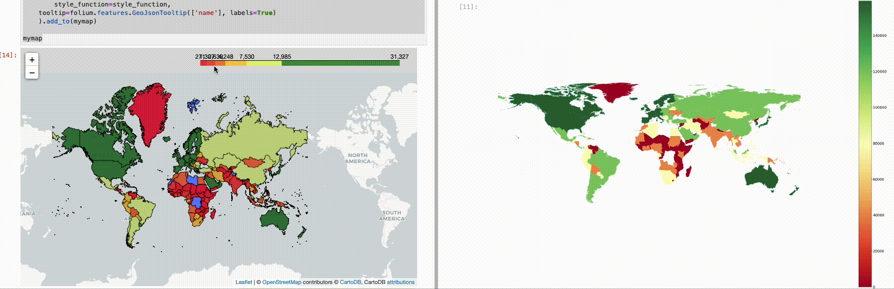
Voila! We were able to closely replicate the map we had in the first two articles, though not easily.
As we have seen with folium, the ability to customize comes at the cost of convenience. To recreate the entire map in the first two articles that we have created, we needed to add more code.
This cost may be worth the trouble for some who intend to deploy the map as folium output can be saved as HTML. On top of that, other features such as the ability to add in a customized tooltip, create a visual radius around certain areas, and many more make folium a good package for choropleths.
Full code on my Github page.