
Bring dead worlds to life with imagination and a clever use of colourmaps
The best way to learn something new is to solve interesting or unusual problems. In this article I will show you how to generate and manipulate highly advanced colourmaps in order to generate topographical maps of everyone’s second favourite planet, Mars. Thanks to hype generated largely by a certain American billionaire, Mars is increasingly in the news and it is now highly likely that humans will walk on its surface sometime this century. With that said, few people actually know what mars looks like, beyond imagining a big red ball in the sky. Mars has actually got quite a rich array of features on its surface, from canyons and craters to volcanoes. Thanks to many unmanned missions over the years, its topography has been mapped in exquisite detail and can be viewed without too much trouble to get a real sense for what the planet is actually like. If you ask this author, topographical maps of planet Earth have been done to death so it is time to try them out on another planet. In this article I will outline how to generate Martian topography maps and, through the magic of colourmaps imagine what a terraformed Mars would look like, what its Oceans would like and where its rivers would flow.
This is mainly an exercise in understanding how colourmaps actually work and in particular how to correctly use them to solve specific problems.
As usual the first thing is to download the Mars topography data to wherever you like to do your data visualisation experiments. The data is available from the US government here and is not subject to any user constraints. It should be noted now that the data is huge, measuring in at 2.3GB, so be warned.
The data is in the form of a tif and is loaded via rasterio into a np.array. The array is large with dimensions of 23040 x 46090. The range in values map to the altitude values on mars. Mars has no oceans so there is no “sea level” reference point for altitude. Without going into detail, “sea level” on Mars is defined as the average altitude on Mars. So negative topography values are areas below the average altitude and positive topography values are areas above the average altitude. Olympus Mons is the largest mountain on Mars, with a height of 21241m (relative to the average Martian altitude) and Hellas basin is the lowest point on Mars, with a depth of -8201m (relative to the average Martian altitude). Interestingly, this means that the difference between the highest and lowest points on Mars (~30 km) is greater than that on earth (~20km) between Mount Everest and the Marina trench.
Plotting the data gives us a sense of what we are up against. A warning that applies throughout this tutorial, if doing this on a standard laptop, run the code, go make a cup of tea and by the time you are back the code will be close to completion. The data source is massive and there is not really any way around the long execution times associated with large datasets and matplotlib plotting.
Using the default colourmap reveals a problem, mapping the topography values to a colourmap linearly results in quite a bland map and most of the features are lost. The reason for this is that the majority of the Martian features lie somewhere between -8000–12000m. This should be evident from the average altitude being so skewed towards the Hellas basin and away from Olympus Mons. The four mountains which show up in yellow occupy a tiny portion of the planet (in terms of area) but because they are huge (in terms of altitude), a quarter of the colours in the colourmap exist just for them. So the rest of the features are mapped onto a small range of colours and clarity is poor.
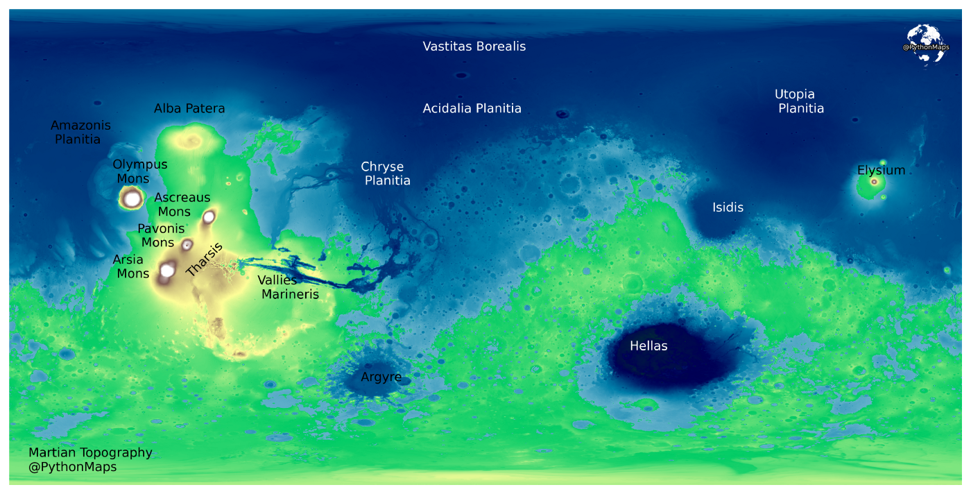
To get around this we are going to create a colourmap and break some data visualisation rules. Strictly speaking we probably should have a linear colourmap normalised between the lowest and largest values in our data. However because in this case there are only four features above 14000m and a lot of features beneath 14000m, we are going to create a colourmap to map colours between -8201m (the lowest point in our data) and 14000m, with everything above 14000m being mapped to the last colour in the colourmap. Unfortunately matplotlib does not really have particularly good colourmaps to show topography. NASA uses this as their colourmap to show topography on Mars and we will do the same.
Below is a section of code that will create a colourmap loosely based on the one NASA uses, normalised between -8210m and 14000m in bands of 10m. The LinearSegmentedColormap method takes a list of colours and generates a colourmap with N colours spaced linearly between the colours in that list. The BoundaryNorm class allows you to map colours in a colourmap to a set of custom values. In this case we are creating a BoundaryNorm object which will map colours in bands of 10m between -8210 and 14000m. An example for clarity, values between 0–10m will be mapped to one colour, values between 10–20m will be mapped to the next colour and so on. Anything taller than 14000m will be coloured with the final colour in the colourmap.
To get a sense for what our new colourmap looks like, it has been plotted below along with labels outlining roughly where each Martian feature is.There is now much more of a variety in colours to differentiate the massive range in values that we are trying to capture.
The Martian topography map can now be replotted with the new colourmap and the values normalised. It is quite amazing how different two plots can be simply by changing the colourmap and tweaking the way colours are mapped to values.
We can go a step further and add labels to the plot to point out where all of the various features are.
Obviously we are not actually going to terraform Mars. However in this section we will imagine what a fully terraformed, wet Mars would look like by generating some “Earth” like colourmaps. This author defines an “Earth” like colourmap as a colourmap with deep — light blue colours for values below sea level and green — brown values for values above sea level.
Matplotlib has a colourmap called terrain which is meant to accomplish this however I think the blue part of the map is not dark enough. Luckily there is another colourmap called ocean and by combining them we can generate an “Earth” like colourmap. Our goal here is to combine the two colourmaps together and create a BoundaryNorm object to map values below sea level to the ocean colourmap and values above sea level to the terrain colourmap.
When a colourmap is generated, the colours within are indexed linearly on a scale between 0 to 1. It is possible to extract a list of colours from a colourmap and exclude part of the colourmap by providing a list of indexes. For example, below we use plt.cm.ocean(np.linspace(0.2, 0.8, 821)) and this returns a list of 821 colours from the ocean colourmap, excluding colours in the portion of the colourmap below 0.2 and above 0.8. The same thing has been done for the terrain colourmap but 1400 colours are being returned. The two lists of colours are then combined into one colourmap using the LinearSegmentedColourmap method.
The reason for 821 ocean colours and 1400 terrain colours is due to the way we want our colourmap to map topography to colour. The BoundaryNorm class allows you to map colours in a colourmap to a set of custom values. In the code below we are creating a colourmap with 2221 colours (821 ocean + 1400 terrain) and a BoundaryNorm object which will map the values in our data to the colourmap according to the pre-defined levels. These levels are set so that there are 821 levels below 0 and 1400 above zero. So all values in our data that are below 0 will be coloured using the ocean portion of the colourmap and all values above zero will be coloured using the terrain portion of the colourmap.
Plotting the data using this new colourmap and colour boundaries gives an almost earth like planet.
We have chosen an arbitrary value for our hypothetical sea level by just using the average altitude of Mars as sea level. However using the method for generating colourmaps outlined above, it is possible to change where the sea level is. Recall, we generate our colourmap of 2221 colours, with 821 coming from the ocean colourmap and 1400 coming from the terrain colourmap. By changing the number of colours from each colourmap, without changing the total number of colours in the overall colourmap it is possible to change where our sea level is. Or in simpler terms, where the blue stops and the green starts.
Below is a function to take a sea level value and generate a colourmap and colour boundary object to be used in plotting. To use a hypothetical sea level of 3000m as an example, each 10m is mapped to a colour so we need to increase the amount of ocean by 300 colours and decrease the amount of terrain by 300 colours.
This can then be put to use. Below is an example of what Mars would look like if the sea level was set to being 1500m above the average altitude. Which vaguely corresponds to Mars with a 70% coverage of water, which is what we have on Earth.
The final thing to do is to add some hillshade to mimic light shining on the topography in order to make the plot look a little more 3D. A hillshade is a 3D representation of a surface and is generally rendered in greyscale. The darker and lighter colours represent the shadows and highlights that you would visually expect to see in a terrain model. Hillshades are often used as an underlay in a map, to make the data appear more 3-Dimensional and thus visually interesting. We will use the earthpy hillshade function to generate our hillshade data. There are two parameters that can be tuned and they give significantly different results depending on your dataset. The first is the azimuth value which can range from 0–360 degrees and relates to where the light source is shining from. 0 degrees corresponds to a light source pointing due north. The second is the altitude that the light source is at and these values can range from 1–90.
The result is largely the same map but with a slightly more exaggerated features, particularly in the northern oceans.
There we have it, a beautiful map showing the how to generate eye catching data visualisations outside of the confines of planet Earth. This is the first of many articles planned to show how to make geospatial data look amazing with Python, please subscribe so you don’t miss them. I also love feedback so please let me know how you would do it differently or suggest changes to make it look even more awesome. I post data visualisations every week on my twitter account, have a look if geospatial data vis is your thing https://twitter.com/PythonMaps
Full list of citations — https://astrogeology.usgs.gov/search/map/Mars/GlobalSurveyor/MOLA/Mars_MGS_MOLA_Shade_global_463m