
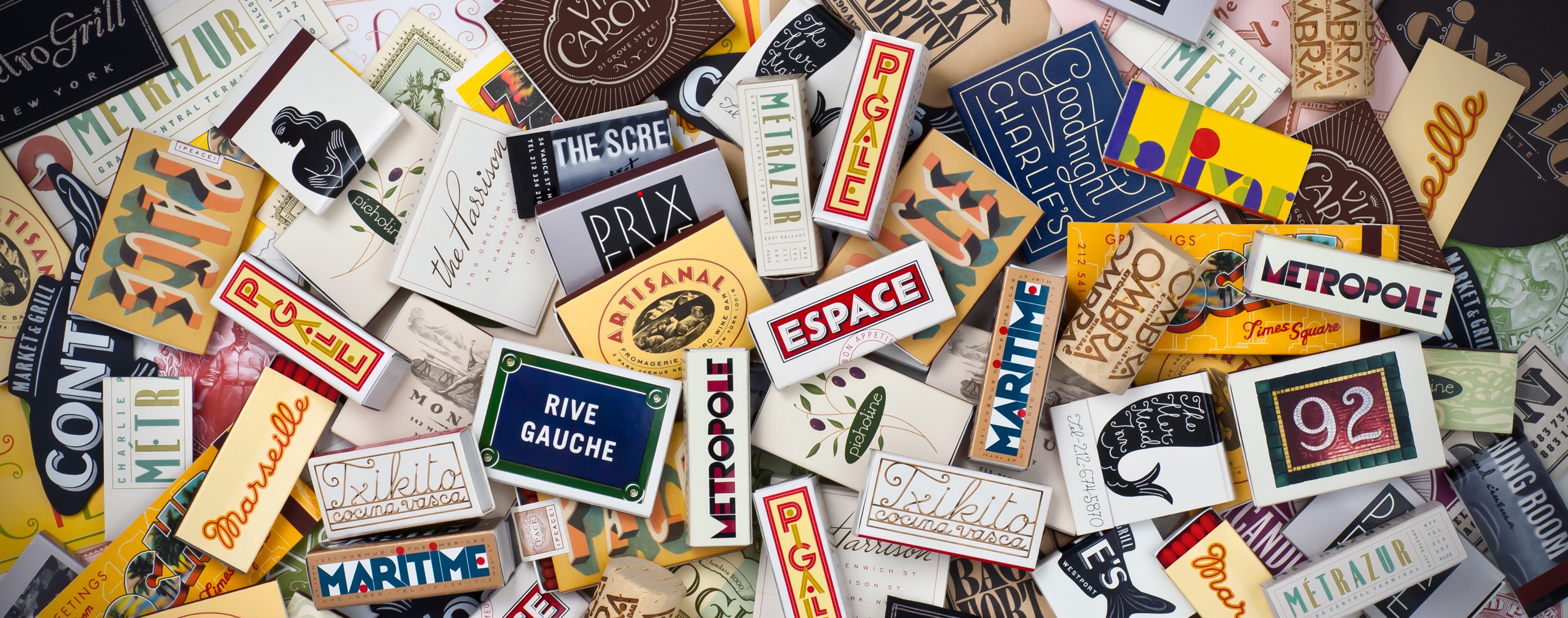
Few artists have brought as much visual delight to our everyday lives as much as graphic designer, typographer and longtime BFA Design faculty member Louise Fili. Scan your cupboards, your bookshelves, the postage stamps on cherished letters, or that bowl of restaurant matchbooks you’ve been collecting, and chances are you have a Fili original in your midst. The illustrious designer was recently bestowed the Frederic W. Goudy “Excellence in Typography” award by the Rochester Institute of Technology. Fili is only the fifth woman to receive the accolade in its 52-year history.
Named after the American printer and type designer, the prestigious honor has been awarded to “an outstanding practitioner in the field of typography” annually since 1969. Past recipients include titans of type designs like Hermann Zapf, Matthew Carter, and Adrian Frutiger. Female awardees are Gudrun Zapf von Hesse, Edna Bielenson, Kris Holmes and Claire von Vliet. “For a designer to be mentioned in the same sentence with Frederic W. Goudy is an honor in itself,” Fili said during an April 30 ceremony, held virtually due to ongoing COVID-19 concerns. “How could I have known when I was four years old and surreptitiously carving letterforms into the wall above my bed at night that this could lead to a career in typography?”
True to her trademark acuity for detail, Fili noted the significance of her award’s design. “The certificate was typeset using Goudy’s border designs and Bertham typeface, which was named after his life partner, Bertha and is considered to be his 100th type design,” she noted.
In the hour-long lecture via Zoom, Fili gave a dazzling overview of a multi-faceted career as a graphic designer, business owner, typography archivist, longtime College faculty member and recipient of the 28th annual Masters Series Award and Exhibition. Though Fili had only formally released her first typeface five years ago—Mardell, a display font created with The Hamilton Wood Type & Printing Museum—she has devoted a lifetime to drawing, perfecting, and collecting letterforms. The obsession began on her first trip to Italy at age 16 when she was instantly charmed by the beautiful pasticceria papers and charming bits of graphic ephemera. Fili then taught herself calligraphy and trained her skills by making “illuminated manuscripts” of Bob Dylan’s lyrics for her schoolmates. (Fili has also designed two other typefaces: the French Art Deco-inspired Marseille and Montecatini, a font that evokes the romance of vintage Italian travel posters.)
Eschewing the efficiency of computers, Fili has always championed a hands-on approach. “When I would design a cover, I did everything I could to avoid using standard typefaces,” she explained. “Instead, I would take a tracing pad and take the title of the book and write it over and over, page after page after page, letting the words speak to me and fill the rectangle. It would go from a jumble of letters to something more precise, which was a letterform that didn’t exist, so I would have to figure out how to create it. This is how I learned to design logotype,” she said.