From the time he joined Macmillan Publishers as art director in 1966, Nicholas Thirkell, who has died aged 79, did much to overhaul the conventions of book design. He did this by using hardcover jackets to raise “questions which can only be answered by reading the books”, as the Guardian put it in 1970. The observation was prompted by a Design Council exhibition of book covers by Thirkell and his competitor at Heinemann, and future business partner, Mike Dempsey, displaying “a richness and variety in hardback covers which puts posters, for example, to shame”.

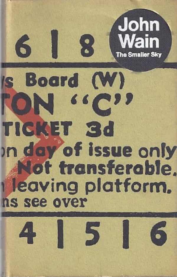
Thirkell’s jacket for The Smaller Sky (1967) was a facsimile of a railway ticket, front-and-back, which hurled readers into the brain of John Wain’s protagonist, a suburban clerk who takes up residence in Paddington Station. For a 1969 biography of the first world war naval commander Lord Jellicoe, Thirkell blocked five bands of gold foil on dark blue. A loop in the top stripe instantly called to mind the admiral’s signature coat sleeve.
Though he was a thinker more than a draughtsman, Thirkell possessed an uncanny eye for illustration. In the course of overseeing the production of hundreds of covers, he scouted illustrators who were conversant in the possibilities of colour offset printing and eager to make a splash against traditional photographic and typographic jackets.
This primed him, in 1970, to assemble for his own firm, Nicholas Thirkell Associates, a quartet of young illustrators, all but one fresh from university, that would dominate British graphics for the next decade. They were the machine-precise George Hardie; Malcolm Harrison, a typographer who excelled in caricature; a surrealist, Bush Hollyhead, working in graphic puzzles and puns; and Bob Lawrie, an Australian expat who married comics to the visual world of Wassily Kandinsky.
Plying a combination of pop art, abstraction, and formal design elements, they brought gallery-level rigour to a commercial industry. And they were versatile – equally suited to Penguin paperbacks and glossy monthlies as to counterculture rags and the LP sleeves at Hipgnosis Studio, the photographic firm that challenged listeners to interpret rock music visually.
Throughout the 1970s, memorable graphics for Led Zeppelin, Pink Floyd, Paul McCartney and Kevin Ayers were produced by the four illustrators Thirkell had dropped into an open-plan workshop in Victoria, central London.

Macmillan continued to rely on his group for jackets. “We were lucky to have this assured income, and it gave us the freedom to be adventurous,” Thirkell wrote in a special issue of Illustrators magazine marking 10th anniversary of the group, which renamed itself NTA Studios after Thirkell left. “We could afford to turn down boring work and take creative risks.”
These risks included memorable partnerships with Radio Times, Tommy Roberts’s pop art emporium Mr Freedom, and men’s magazines such as Club International, where – in that heyday of illustration – art directors had the budgets to distinguish editorial content with cutting-edge graphics.
Thirkell’s departure came in 1973, after he had grown restless in what had become a managerial role. For 15 months he travelled round India with Priya Kuriako, a colleague from Macmillan. On their return to Britain in 1975 they got married, and he worked as art director at WH Allen. In 1979 he went independent again, this time setting up Nicholas Thirkell & Partners. There he employed a broad array of artists from the burgeoning illustration scene he had helped set in motion. One project was Penguin’s Lives & Letters, a paperback series with evocative period covers.
Throughout the 1980s, Thirkell’s thought-driven book design, in which content and packaging worked mutually, earned him awards from and jury placements at industry competitions such as Design & Art Direction and European Illustration.

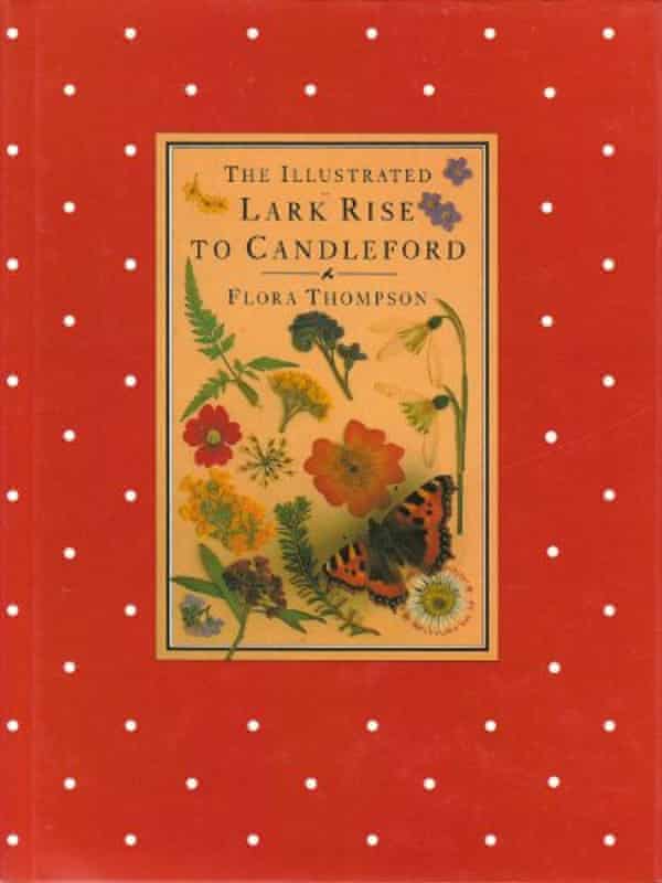
For the bestselling Illustrated Lark Rise to Candleford, Flora Thompson’s trilogy of Victorian Oxfordshire published in a luxury edition in 1983 by Century, four decades after its original publication, Thirkell was invited to go for broke. He did the boards in English polka-dot kerchief, without spine text. A researcher tracked down period photographs, ephemera and flowers to be pressed in the style of a herbarium and photographed in-line with the text. All of this lent Thompson’s pages the feel of an anonymous country scrapbook rather than a carefully wrought hybrid of memoir and fiction.
In 1986, with Dempsey and fellow designer Ken Carroll, he formed Carroll Dempsey & Thirkell (CDT). Specialising in corporate identity, they designed for Royal Mail, Our Price, the Barbican and WH Smith.
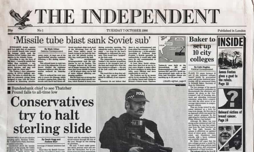
Thirkell’s first job at CDT was looking at the layout for the launch of the Independent newspaper. The editors wanted the impression of longevity and newness at once, what they called “classic with a twist” – clear, authoritative and conservative.
Crushed between a deadline and a harried team of editors including Andreas Whittam Smith and Stephen Glover (whose book Paper Dreams documented the frenzied launch and Thirkell’s role in it), he ditched the blocky masthead of the mockup he had been given. Instead, in his mockup chose a neoclassical flag based on Bodoni, with chiselled inlines giving it both elegance and heft – a feel echoed by his choice of Oxford rules (thick and thin) for the column framing. Bucking purists, he mixed different typefaces for the page layout: Century for its novelty and warmth in the headlines, and Times for its clarity in the columns.

After refinement from an in-house committee led by the paper’s executive editor of design and pictures, Michael Crozier, Thirkell’s basic design informed the graphic identity of the paper, which became a case study in successful news layout. Glover gives Thirkell credit for the eagle logo, which – after in-house illustrators had brought its wings from a roosting position to flight – stayed with the paper throughout major redesigns and the cessation of its print edition in 2016. In 1990, he returned to design the Independent on Sunday.
“One of the greatest attributes of a good designer,” Thirkell wrote after the Independent proved a success, “is an understanding of how people think and how they respond to images portrayed by type.”
This sensitivity to viewer response was a signature of his career. His talent lay in arranging existing visual realities – and the artists around him – without appearing to make a mark himself.

“Nick would sit at his desk, creating tiny sketches with equally tiny written instructions,” recalled Dempsey. “He would wander down the studio in his favourite Savile Row suit, which used to belong to his father, lean over one of his assistants and have a quiet chat; he would then return to his desk, roll up a cigarette and go outside for a smoke.”
Born in Epping, Essex, Nicholas was the son of Barbara (nee Baker), who before her marriage was a dancer in stage productions, and John Thirkell, an advertising copywriter. Nicholas left Forest school, Walthamstow, in 1960 after his A-levels. Rather than receiving formal design training, he took a trainee position at Service Advertising, London, and an advertising course at the College for the Distributive Trades (1961-62).
In an initial spell of three years with Macmillan he worked as a copywriter and subdesigner. Before returning to the firm as art director he worked at the Planning Unit design studio (1965-66). From then until his retirement in the late 1990s he remained a leading light in the field.
Priya survives him, along with their daughters, Nisha and Maya.
Nicholas John Vyse Thirkell, graphic designer and art director, born 7 June 1942; died 9 November 2021
