
Wes Anderson’s stunning films are such visual feasts that it can be easy for the details to pass viewers by. The French Dispatch is no exception. The 2021 romantic comedy about the death of a French magazine editor set in the fictional town of Ennui-Sur-Blasé won over audiences and critics alike thanks to the director’s flair for whimsical storytelling. Still, there’s a hidden language of typography bubbling away beneath the surface.
This will come as no surprise to fans of Wes Anderson, who are all too familiar with his eye for detail. But while publications such as The New Yorker have been frequently touted as huge influences on The French Dispatch, the typographic references found within the film run deep and tap into the broader application of typography in general.
At once nostalgic, artistic, and practically a character in themselves, the typefaces and letterforms in The French Dispatch also provide a window into the country’s rich history. To help unpack all of the film’s typographic splendour and reveal what we can learn from it, Creative Boom caught up with type expert Marie Boulanger to find out more.
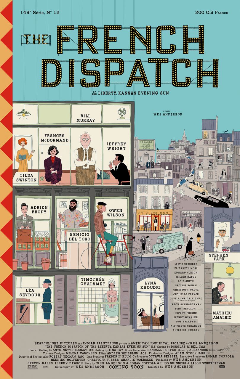
The French Dispatch movie poster. Courtesy of Searchlight Pictures. © 2021 20th Century Studios All Rights Reserved
What separates the typography in The French Dispatch apart from Wes Anderson’s other films?
I’m just speaking for myself, but I recently rewatched all of his films in chronological order. You can see typography become a more and more prominent component over time – it’s quite fascinating. In later films like Isle of Dogs and the French Dispatch, it almost becomes its own character rather than a visual or narrative flourish. Especially in a story about writers and publishing, every book, every page, every shop sign, every poster.
Even thinking about the three stories contained within the film, graphic design and typography are really at the core of each one: exhibition posters, protest signs and even menus. You piece a lot of key information together just through certain objects from the set, as well as emotional nuance: humour, joy, sadness. With such a huge part of the narration depending on typography, you have to expect a high level of detail.
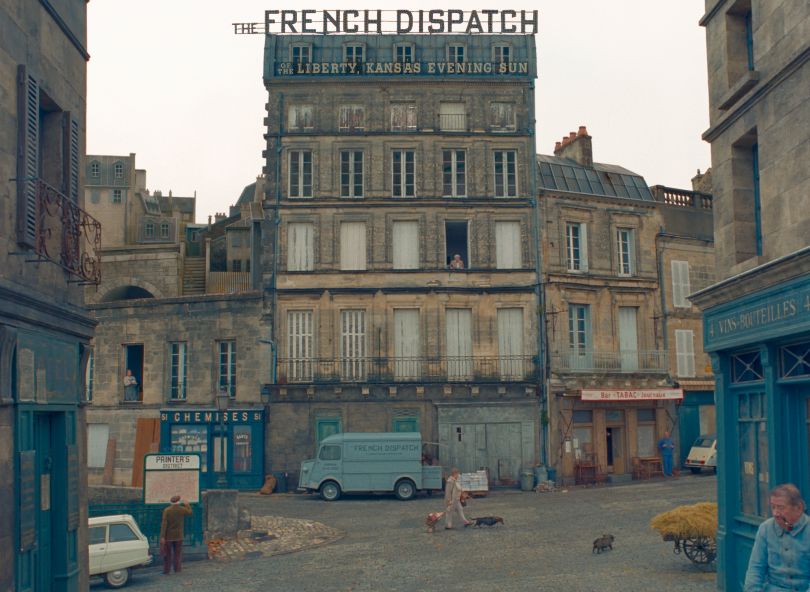
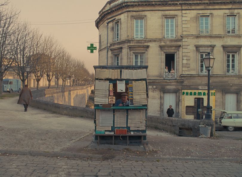
The French Dispatch. Photo Courtesy of Searchlight Pictures. © 2021 20th Century Studios All Rights Reserved
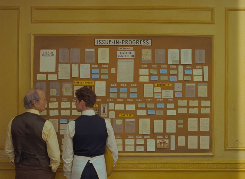
Bill Murray and Pablo Pauly in the film THE FRENCH DISPATCH. Photo Courtesy of Searchlight Pictures. © 2021 20th Century Studios All Rights Reserved
Can a typeface be inherently nostalgic, or does it depend on the context?
In the film, there is an interesting sequence where Herbsaint Sazerac, one of the writers, gives a tour of the city of Ennui, comparing past and present versions of places throughout the city, simultaneously showing that nothing and everything has changed.
Much of the type we use is heavily connected to the past; letterforms were coined hundreds of years ago. Even relatively contemporary type styles (like, let’s say, geometric sans serifs) were popularised around a century ago. That’s long enough for most people to have some kind of nostalgic connection to them. But type design is not immune to innovation, and letters don’t live in a void. Cult typefaces undergo major facelifts to fit new uses, like Futura Now in 2018 and Helvetica Now Variable in 2021. Are you being nostalgic if you use Helvetica Now Variable in a motion design piece? You tell me.
Helvetica Now Variable, image courtesy of Monotype
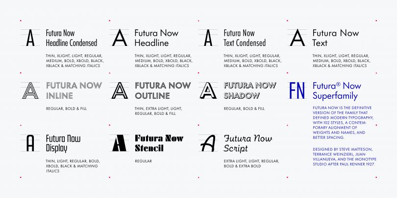
Futura Now, image courtesy of Monotype
What are the most notable instances, in your opinion, of nostalgic typefaces in the film?
The uses of typography that immediately struck me were the ones closely tied to French culture. At first, I was surprised to see Gill Sans where I might have expected cult French typefaces like Banco, Mistral, Peignot. Still, I noticed many wonderful details that made me think about what nostalgia actually is.
The series of hand-lettered posters based on the Mai 68 riots are a notable callback. The real posters from the protests are arguably one of the most famous pieces of lettering in contemporary France; the slogans from the movement are still famous thanks to those posters. The lettering style and colour palette were very similar to the original ones, but the copy and slogans have a softer, more adolescent quality.
In the opening scene, a waiter carries a platter with several objects, including a pack of cigarettes from the fictional Gaullistes brand, based on Gauloises cigarettes. The Gauloises packaging is iconic in France, with its original logo designed by Marcel Jacno, one of the most important designers of the 1960s. There is a clever political pun here (Gaullistes were supporters of Charles de Gaulle), but I think it says a lot about where the film stands on nostalgia. It goes further than pastiche. It gives you actual nostalgia, an idealised, dream-like version of a past reality.
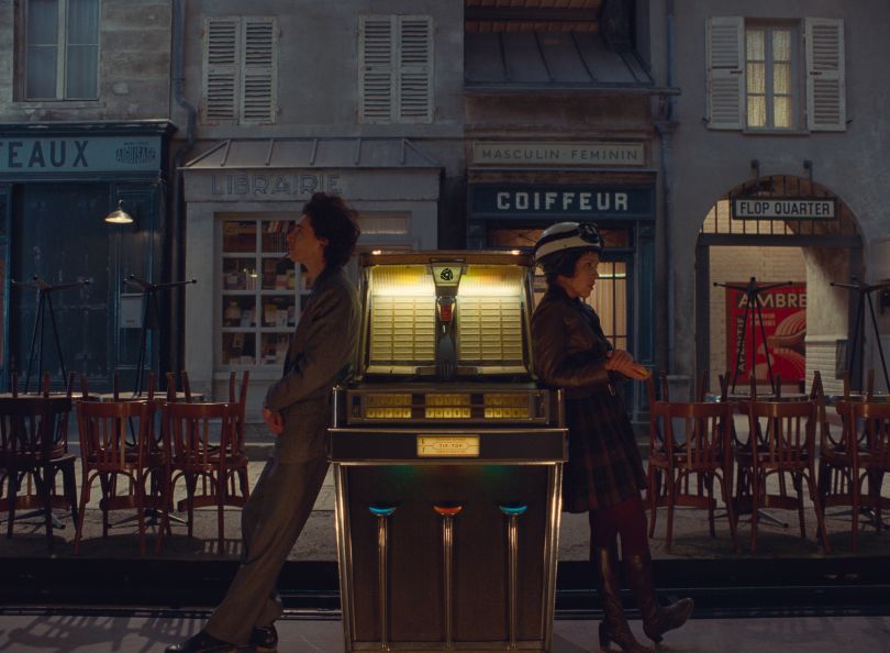
Timothée Chalamet and Lyna Khoudri in the film THE FRENCH DISPATCH. Photo Courtesy of Searchlight Pictures. © 2021 20th Century Studios All Rights Reserved
What can other filmmakers learn from the typefaces in The French Dispatch?
Type is art. Type is culture, and just like any component of culture, it is part of storytelling. Of course, some filmmakers might be more sensitive to colour, music, or dialogue, but type is more than just text on a screen. Yes, a specific typeface can call back to a time and place, but it can do much more. There is infinite depth to be found in typographic detail and not just for aesthetics.
What inspirations can you see behind the typographic choices in the film?
I loved the blend of Wes Anderson’s trusty favourites alongside some more tailored choices – what a comeback for Futura. There are definitely specific typefaces calling back to French culture and the typographic scene in France at the time of the film.
I noticed quite a lot of shaded typefaces (Gill Sans and Umbra mostly), which was a popular style in France from the late 1930s onwards. I thought it was a nod to a typeface first published in 1934 called Film (also by Marcel Jacno), specifically made for cinema, posters and titling. This typeface, alongside many other 1950s and 1960 classics, was published by French foundry Deberny & Peignot. Funnily enough, they were one of the only foundries to acquire rights for Futura and release a version tailored for the French market called Europe, so I guess it’s a nice full-circle inspiration moment.
Can you guide us through the different ways fonts achieve their desired effect in the movie?
It’s rare to see a film where typography plays such an important part in the storytelling. I think there are two main ways this is achieved: by anchoring the events of the film in a time and place (real or fictional) and using the cultural dimension of type and lettering to add extra meaning.
I’ve spoken a bit about 1960s France already, but there are other ways in which fonts cement what’s happening on screen. An interesting moment that comes to mind was the use of Futura on the exhibition cartons for Moses’ exhibition (and, more generally, the Cadazio Gallery branding). It contrasts a lot with Moses’s doodling, and you understand that he is being manufactured into this internationally-renowned artist: the use of Futura gives him that authority and credibility instantly. I don’t think it’s just an aesthetic obsession, and in this specific instance, it makes total typographic sense to me.
THE FRENCH DISPATCH. Photo Courtesy of Searchlight Pictures. © 2021 20th Century Studios All Rights Reserved
What is your favourite piece of typography in the film, and why?
There are many, but I’ll keep myself honest here and try to remember what I felt the first time I saw the film. This is oddly specific, but in the third story, there are a lot of police officers, and you get a glimpse of their uniforms. The word Police is spelt out using a heavily shaded typeface, and it’s such a beautiful way of adding depth to a sequence shot in black and white. I remember noticing it among many other pieces. Also, an honourable mention to the La Brique Rouge neon sign of Ennui-Sur-Blasé because neon typography is always delightful.