In addition to introducing a new logo last year, Google Fonts added support for open source icons. Google’s Material Symbols are now available leveraging variable font technology.
Many of these 2,500 glyphs should be familiar to Google app users, and follow last year’s release of the “Material Icons” collection (2,000 distinct icons in five styles), which remains available in Google Fonts.
Google categorized the Material Symbols by: Activities, Android, Audio & Video, Brand, Business & Payments, Common actions, Communication, Hardware, Home, Household, Maps, Others, Photo & Image, Privacy & Security, Proprietary, Social, Text Formatting, Transportation, Travel, and UI actions.
Available under Apache License 2.0, symbols are offered in three styles (outlined, rounded, and sharp) with the ability to adjust fill, weight, grade, and optical size.
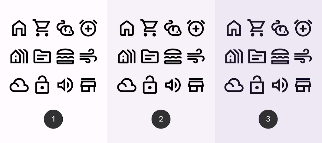
- Outlined Symbols are a light, clean style that works well in dense UIs.
- Rounded Symbols use a corner radius that pairs well with brands that use heavier typography, curved logos, or circular elements to express their style.
- Sharp Symbols use corners and straight edges for a crisp, rectangular style that remains legible even at smaller scales.
They can be used by web, Android (Vector Drawable format), and iOS (Apple Symbols) developers, while “Flutter support for Material Symbols is planned.” A Figma plugin is also available.
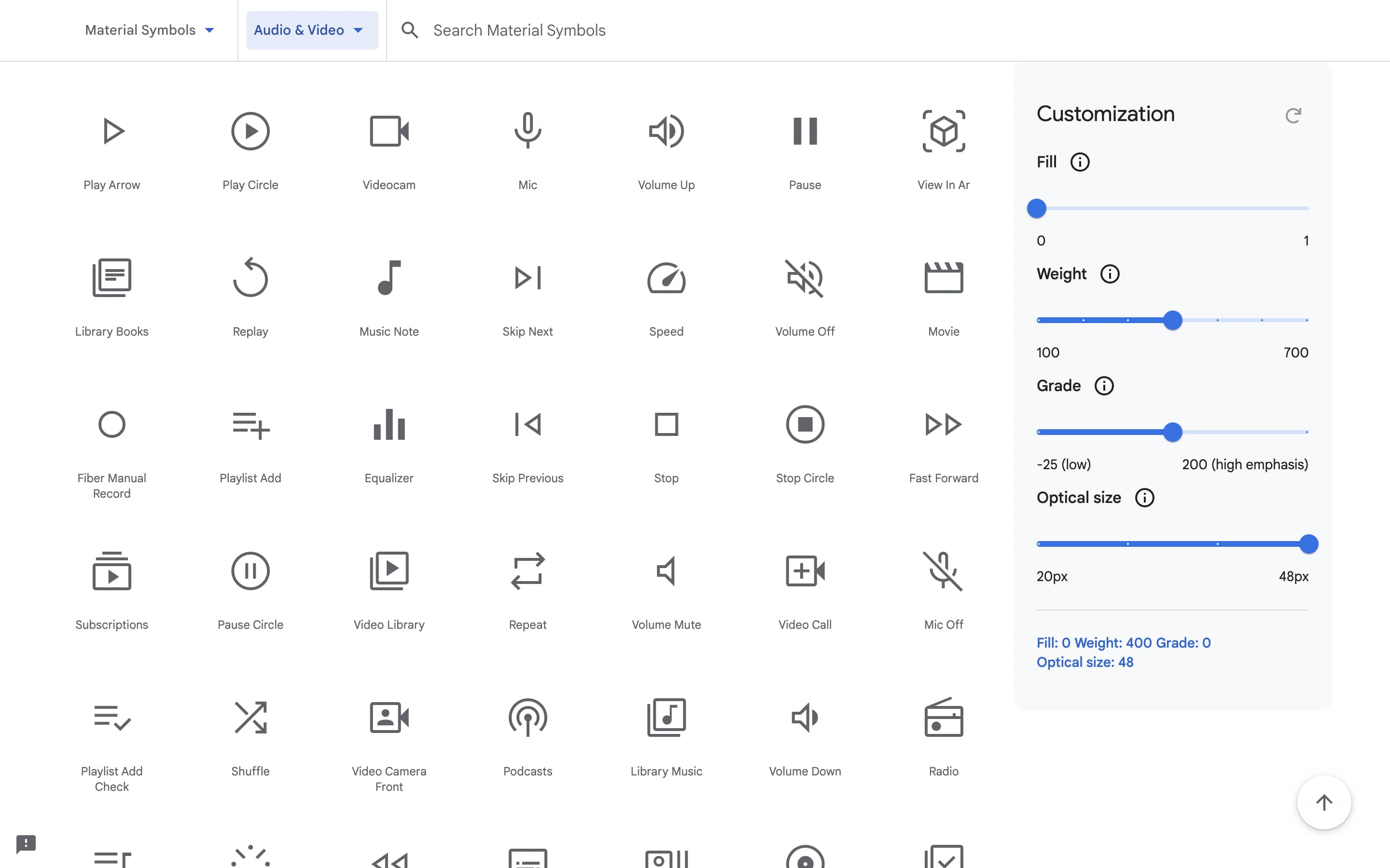
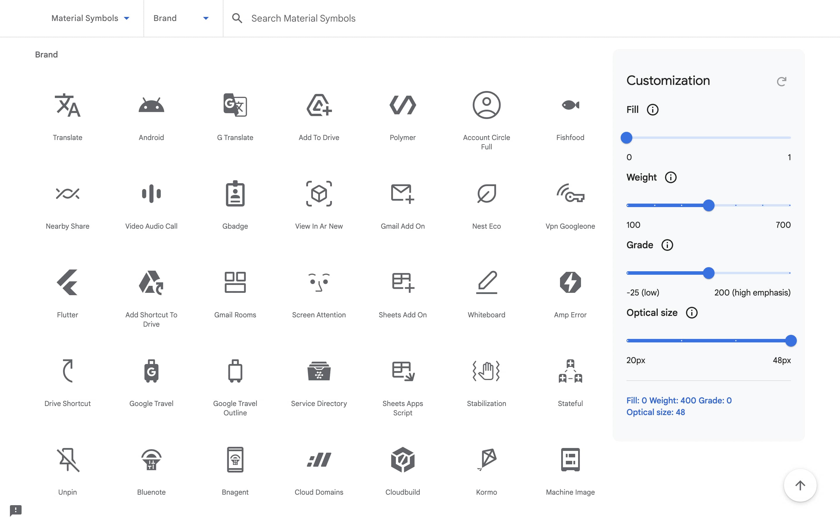
Fill gives you the ability to modify the default icon style. A single icon can render both unfilled and filled states.
To convey a state transition, use the fill axis for animation or interaction. The values are 0 for default or 1 for completely filled. Along with the weight axis, the fill also impacts the look of the icon.
Weight defines the symbol’s stroke weight, with a range of weights between thin (100) and bold (700). Weight can also affect the overall size of the symbol.
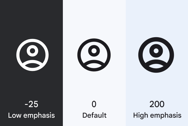
Weight and grade affect a symbol’s thickness. Adjustments to grade are more granular than adjustments to weight and have a small impact on the size of the symbol.
Optical sizes range from 20dp to 48dp.
For the image to look the same at different sizes, the stroke weight (thickness) changes as the icon size scales. Optical size offers a way to automatically adjust the stroke weight when you increase or decrease the symbol size.
Update: Additional details from Google’s announcement blog added.
FTC: We use income earning auto affiliate links. More.
You must be logged in to post a comment.