
Instagram rolled out a big “brand refresh” today, which is mostly a fancy term for freshening up some marketing materials and making big hand-wavy statements about logos. And there’s plenty of that here, too. (Can I interest you in a long digression about illuminated gradients?) But there’s also one much bigger change: Instagram created its own typeface, called Instagram Sans, that it plans to use broadly going forward both in marketing and in the app itself.
Instagram Sans was inspired by Instagram’s logo, the company said, and “reflects the shape of the glyph and our commitment to simplicity and craft.” (Like I said, hand-wavy.) It’s inspired in large part by the combination of squares and circles, or as Instagram lovingly calls them, squircles. And, as Instagram has always tried to do, it’s a mix of pixel-perfect and hand-made with a few details, like the not quite straight terminal at the bottom of the “t,” that make it look more human. In some places, you can see the evolution from the cursive logo Instagram used for years.
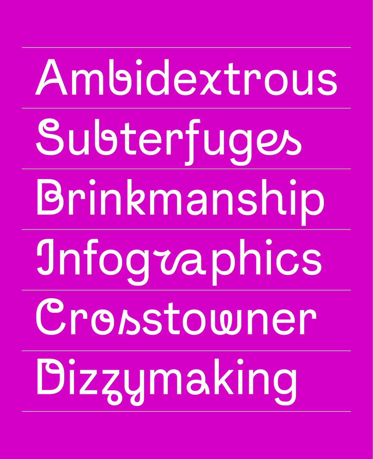
Most of the Instagram Sans fonts are fairly straightforward sans-serif lettering, which makes sense for a brand with such a global and diverse set of users. Instagram said it worked with linguists to make sure the typeface works in as many languages as possible, including script languages like Thai and Japanese. In some fonts, only a small hump in the tail of the uppercase “Q” gives away that it’s an unusual font. But then there’s Instagram Sans Script, which adds broad brushstroke-y flourishes to practically every letter, sometimes to cool effect (the uppercase “W” looks like the logo of a super hip yoga studio) and sometimes to deeply strange results (the lowercase “r” doesn’t even look like a letter).
What the wackier fonts give Instagram, though, is a much more distinct identity. One place the company is hoping users try out Instagram Sans is in Stories and Reels, where a caption written in Sans Script is going to look nothing like a ripped TikTok video. As vertical video becomes the norm, there’s a certain sameness permeating the social landscape, and while a needlessly wavy “x” may not change everything, it’s something.
The real question, though, is how users will feel about the new look. Meta knows better than anyone how resistant users can be to change; remember all the “10,000 against the new Facebook!” groups? That may be why Instagram is starting small rather than totally overhauling everything about the app on day one. But don’t be surprised if you see squircles start to appear more places before you know it.