
What is it about orange and teal? Critics have observed for years that Hollywood seems to have a strange preoccupation with the two colors, which show up with unusual frequency in the composition of films, not to mention movie posters and – videogame covers.
After making similar observations, Stanford University statistics student Edmund Helmer decided to paint a more analytical portrait of the cinematic love affair with the orange-teal combo by examining hundreds of movie trailers and transforming the color data into a dramatic spherical infographic.
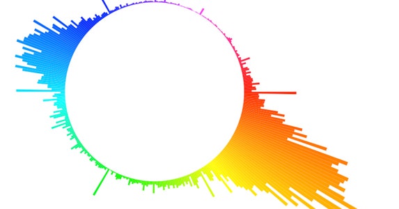
Pictured above, the image represents the distribution of color data – hue, saturation, and brightness – extracted from 312 movie trailers, which Helmer compiled using his own code and the as well as Python programming language.
Besides “Oranges and Blues: Hue Densities Across Film Trailers,” Helmer also designed an interactive piece, below, that ranks movies by brightness on a vertical axis. Click at the top spot and you’ll see Rango rules as brightest movie in recent history – not surprising for a movie filmed in the desert.
Helmer, who regularly posts eye-popping charts and graphics on his Box Office Quants site, told Wired that the reasoning behind the color combination lies within the the color wheel and its theory of complementary relationships. “Cinematographers tend to favor colors at the opposite end of the color wheel, so if they picked red, the opposite complementary color would be green, and then you’ve got a Christmas movie,” said Helmer.
The predilection for orange and teal extends beyond the content of films to their marketing materials in Movie Poster Hues 1914-2012, an an interactive infographic by Vijay Pandurangan that distills the hues of 35,000 movie posters released between 1914 and 2012.
Pandurangan, a New York City software engineer and former Google employee who now works at a start-up called mitro, got started on the project after a colleague challenged him to prove his casual observation that posters have tilted toward blue in recent years.
“Since my evidence was mostly anecdotal and qualitative, I decided to see if I could automate the process of analyzing these posters and get more quantitative data,” Pandurangan told Wired via e-mail. He wrote his own open-source image analysis code for the project, and created and presented data culled from posters he found online with the HSL and HSV infographic tools.
The result was a striking interactive graphic allows users to drill down into the data by year for a chromatic pie chart, and also one that indicates a modern preference for – you guessed it – orange and teal.