
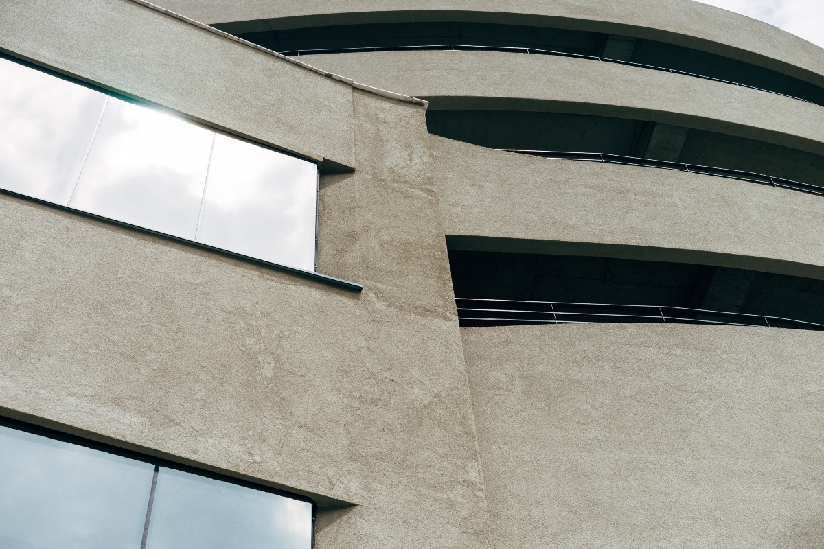
Brutalism is an architectural style that was very popular from the 1950s up until the 1980s. In particular, institutional or civic buildings adopted this style. There are many reasons for its popularity, but the main one is associated with World War 2. After the devastation created by the war, there was a need to build offices, schools, churches, and other buildings and quickly. Because of the war, cheap concrete and steel were abundant, which are the primary materials used to build brutalist buildings. The affordability and practicality were crucial elements, and so Brutalism slowly took over the big cities of the world. In particular, UK and Eastern European Communist countries.
The main characteristic of these buildings is the celebration of the quality of construction materials and the structural elements used. Look at the National Theatre in London, one can see the inside structure of the building without even entering it. There is something very sincere and honest about it.
The term ‘brutalism’ comes from the French phrase, béton brut which means ‘raw concrete’. These buildings are seen by most people as very unfriendly, ugly, and intimidating. (Does this remind you of something?) For this reason, brutalism is perceived to be one of the most divisive styles in architecture due to the strong emotional response it elicits from people. Also, the fact that it was associated with communism, does not make things any better.
Interestingly, recently there has been a resurgence in interest in brutalism. In the last 5 years, numerous books about brutalism were printed like, How to Love Brutalism, Atlas of Brutalist Architecture, Brutal London, The Art of Brutalism, and many others. On social media, Instagram pages like @brutal_architecture have almost 200,000 followers. Clearly, something is happening. It would be outside of the scope of this article to go into the reasons behind this resurgence, but Brad Dunning from GQ has put an interesting hypothesis which I quite like:
“Brutalism is the techno music of architecture, stark and menacing. Brutalist buildings are expensive to maintain and difficult to destroy. They can’t be easily remodeled or changed, so they tend to stay the way the architect intended. Maybe the movement has come roaring back into style because permanence is particularly attractive in our chaotic and crumbling world.”
I like to think of this resurgence as part of a cycle. There is definitely a reactionary element to it, which means that being surrounded by modern corporate buildings made out of a glass makes these concrete monsters stand out more and maybe even be appreciated.
So, armed with knowledge from architecture, we can put brutalist web design in perspective. Firstly, it is clear why this style of web design is named after the architectural style that literally translates to ‘raw or unfinished concrete’. These websites can evoke very much the same emotions that a brutalist building can. Secondly, the strange appearance of these websites can be also attributed to reactionary attitudes among younger people. I’m going to go even further and suggest that there are even practical reasons for their appearance. Just like brutalist buildings stand out from the rest of the buildings in big cities and therefore garner a lot of curiosity from people, brutalist websites stand out from the rest of modern websites. You’d have to agree that most conventional websites today all look the same. One of the reasons for this is that they are all copying each other and following the same popular trends. There is nothing wrong with that, but this means that it becomes more and more difficult for individual websites to stand out. So this reaction could be fuelled by what I would refer to as a punk attitude of complete disregard to conventional rules to make a statement.
Okay, now you’re probably wondering which features define a brutalist website and how can I spot one in the wild? Matt Stewart of the Creative Momentum has put together a comprehensive list of features which I am going to borrow.
- Black or white backgrounds
- No gradients or shadows
- Overlapping elements
- Lack of symmetry
- Crowded design
- No distinct hierarchy
- Monospaced typography
- One font used throughout
- Contrasting color palette
- Lack of animation
- Sparse imagery
- Simple or non-existent navigation
- Single-page website design
I would say that these are not hard rules that one has to follow to make a brutalist website and a website certainly does not have to check all of these points to be considered a brutalist website. In fact, if we consider the reactionary and punk nature of brutalist websites, making a list of rules would be unwise.
Pascal Deville himself distinguished between three different micro styles within brutalist web design, purists, UX minimalists, and artists:
“The purists reference strongly to the architectural characteristics of Web Brutalism, such as the concept of ‘truth to materials’ and the use of the purest markup elements available. The UX minimalists, in contrast, see efficiency and performance as the main driver of Web Brutalism and even believe that the radical limitation of possibilities can boost conversions. The ‘anti-ists’ or artists see web design as an (still) undervalued form of art and don’t show much respect the status quo and mostly get bad press.”
One might argue that these categories are limiting, but in my opinion, they will allow each style to flourish on its own and develop further. Especially because people who champion them are from very different crowds. To illustrate these styles I will provide one example from each and maybe you can make up your own mind about them.
Purists
If you know anything about brutalist web design this one was probably expected. I would say that Craigslist is probably brutalist web design in its purest form. It has very minimal CSS and stays very true to the ‘core materials’ so to speak. Just like in brutalist buildings concrete and steel are used as the primary construction materials, purist brutalist websites focus on using as few elements as possible. Surprisingly, a lot of people would probably be unhappy if craigslist was to change and modernize all of a sudden. So, from a UX perspective, I would argue it could be a bad idea to redesign it. In Nir Eyal’s famous book Hooked he explains just how important habits are and even if a new design might be better in theory, the need to relearn the interface would lead to people just getting annoyed and frustrated. Don’t fix problems that don’t exist.
UX minimalist
Okay, this was a difficult one to pick. There are a lot of websites today that utilize a minimalist UX/UI approach. I decided to go with the American fashion designer’s website because I think it’s just underappreciated and unlike many website owners that utilize brutalist web design, Rick Owens himself is a big fan of brutalism. So, it just seems like his own aesthetic views perfectly align with the design of his website. The first thing that one can observe is that it’s not much different from the craigslist example, except that Rick Owens’ website has a lot more CSS and some JavaScript. The color pallet is still very minimal including primarily black and white. The links aren’t blue, which is a deviation from the purist style. The reason for these differences is that the point of this style is not to stick to the basic HTML elements religiously, but to focus on efficiency as well. Marc Schenker at Web Designer Depot argued that the minimalist approach leads to an increase in conversion rates. In fact, citing a study by Soasta he argues that mobile websites that load 1 second faster result in 27% higher conversion rates. Rick Owens’ website is not only a brand showcase website but also an online store. This means that higher conversion rates are directly impacting sales. I personally see the minimalist UX/UI approach as a middle ground between fully artistic style (which we will explore next) and the purist approach which we looked at previously.
‘Anti-ists’ or Artists
There were a lot of contenders for this category, but Yves Tumor’s website is just a perfect combination of brutalist simplicity and artistic self-expression. Sean Bowie who is known as Yves Tumor is an American producer who specializes in experimental electronic music. Just looking at his website, probably already makes your eyes hurt, but I have a feeling he doesn’t care. With artistic websites like this one, it is important to remember who your audience is. You can kind of get away with implementing previous styles even if your customers aren’t thrilled about it, but with crazy epilepsy-inducing designs like this, you really have to think long and hard before going with it. Obviously, I am not even going to mention UX here because it is clearly not even considered. With regards to code, artistic web design is very different from a purist in the sense that it has no intention of sticking to basic HTML elements. It often features experimental JavaScript that is there to create a certain mood or feeling. This website, for example, used a decent amount of JavaScript and CSS, but the goal is artistic self-expression, not purity. Experimental website for an experimental artist.