
Creating Styles, Components & Documentation
“A design system acts as the connective tissue that holds together your entire platform.”― Drew Bridewell, Invision
The design system is the source of truth for designers and developers, is a live and centralised document where you can find all the necessary styles and components to build a new screen for the product.
A design system consists of visual components and styles that guide the team. The aim of the design system is to create a cohesive experience for everybody, but especially for the customer.
The design system is live, new styles and components will be added to it or old ones will be updated. It’s really important that one person or a team are in charge of approving new entries, documenting and publishing those changes once the design system is created.
Sometimes existing products do not have a consistent design system, designers and developers are extracting resources from different places, which leads to inconsistencies throughout the site. There is no centralised system for designers and developers to access resources.
Creating a design system requires the efforts of everyone in the team, from designers to developers to stakeholders to brands. The job of the designer in charge of the design system is to help collect all this information and design a place to hold all the information.
- First Sprint: Locate all the Styles and Components of the existing product.
- Second Sprint: Build the final styles and components in Figma. Here is a good place to define the layout and the spacing.
- Third Sprint: Document the information in Confluence or other documentation software to share it with stakeholders and developers.
- Fourth Sprint: Create the different screens of the product with the new design system styles, components and rules in Figma.
*A sprint consist in two weeks of work.
As you could read the design phase lasted four sprints until we reach the maturity we were looking for. After that phase is necessary to pair with front end developers to create a story book with all components and styles, and lastl but not least apply them to the app and website.
10 steps process:
Design & Development phases:
- Find all styles of the existing product.
- Find all the components of the existing product.
- Define the layout and the spacing.
- Creation of Styles: colours, text styles, shadows, etc.
- Creation of Components: input field, drop-downs, buttons, modals, etc.
- Build Screens: mobile, tablet and responsive desktop. (This is not properly part of a design system, but is important to update the current screen with the new approach).
- Document the usage of styles and components.
- Developers to create Styles and Components on the storybook
- Developers to implement styles and components to the existing product.
- Test and launch.
Colours:
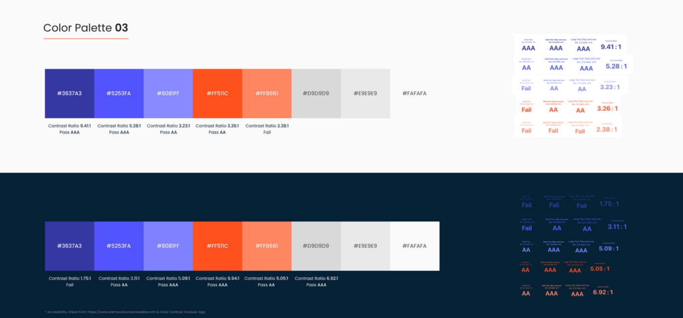
- Primary Colours: Choose two or three primary colours that will be highly used throughout the product in places such us buttons or illustrations. These colours will have different shades on the dark and light spectrum.
- Secondary Colours: Chose up to five secondary colours with its shades. Can be used as a background or on styling elements. A secondary dark colour can be used as the default colour for text on typography
- Greys: Chose up to seven or eight grey colours from pure black to pure white. They can be used as a background colour and light styling elements.
- Gradients: Chose up to three gradient. These colours will help decorate illustrations and backgrounds.
- Status: Three status colours to indicate success, warning and error.
*All colours got a triple AAA for accessibility in white mode as well as dark mode. Check here.
Typography
Fonts have their own identity, find bellow the most important rules:
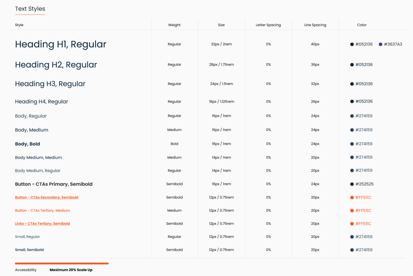
Font Family: Pick one font or even two fonts, but never more than two. There are hundreds of free fonts on top of the paid ones.
Font Styles: To help you use the different fonts of your product is recommended to name the different styles, most common fonts are headers, body, small fonts and CTA’s
Font Weights: The font family will have different weights, being the most common are the following: light, regular, medium, semibold and bold. Regular is the most used font on all basic texts.
Font Size: It’s highly common to use fonts that follow the 8px rule, being all the sizes multiples of 8px or in some cases multiple of 4px. So you will find fonts from 12px, 16px, 24px, 32px, 48px and so on. Instead of using pixels you can use rems, being 16px the equivalent of 1rem. Use this calculator to convert pixels to rems.
Line Height: Very important to set the height of your fonts following a grid of 4px or 8px to be consistent with a good spacing.
Letter Spacing: Letter-spacing, also called tracking, refers to the uniform adjustment of the space between letters in a piece of text. For smaller type sizes, looser letter spacing can improve readability as more space between letters increases contrast between each letter shape.
Font Colours: Chose what colours will be applied in each selected font.
Miscellaneous styles
Shadows: are used on cards, side menus, top headers and other “separation shapes”. You can have two or three different shadows sizes and each can be default or on hover.
Example of shadows:
– Small: covers all the object border with a light shadow.
– Medium: shadow goes from top to bottom with a medium blur.
– Large: shadow goes from top to bottom with a large blur.
Other styles that should be defined are:
- Blur
- Strokes: the number of pixels that made the stroke, the colour or if it’s solid or dashed.
- Radius: the pixel radius of the buttons, usually are small numbers like 2px or 8px.
Spacing Grid and Layout
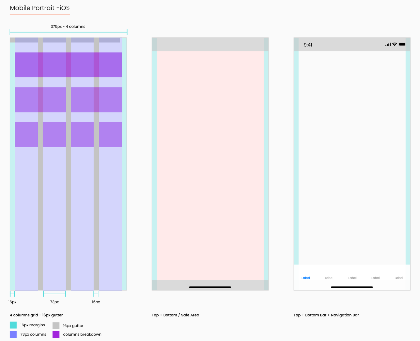
Grid: The basic principle of the 8pt Grid is that you use multiples of 8 (8, 16, 24, 32, 40, 48 etc…) to margins, padding, and sometimes dimensions, on elements inside of your design. You simply measure 8pt increments between individual elements in your design.
When it comes to Type, using the 8pt Baseline Grid alongside the 8pt Grid gives you a much more harmonious vertical rhythm throughout your designs.
Using a 8pt Baseline helps you fit texts in the grid and works easily with all the components. Find more info here.
Layout: Layout basically means the arrangement of predetermined items such as images, text and components on a screen. Layouts use uniform elements and spacing to encourage consistency across platforms and screen sizes.A responsive grid allows a layout to change dynamically based on the size of the screen. This also guarantees consistent layouts across the website’s pages. Find more info here.
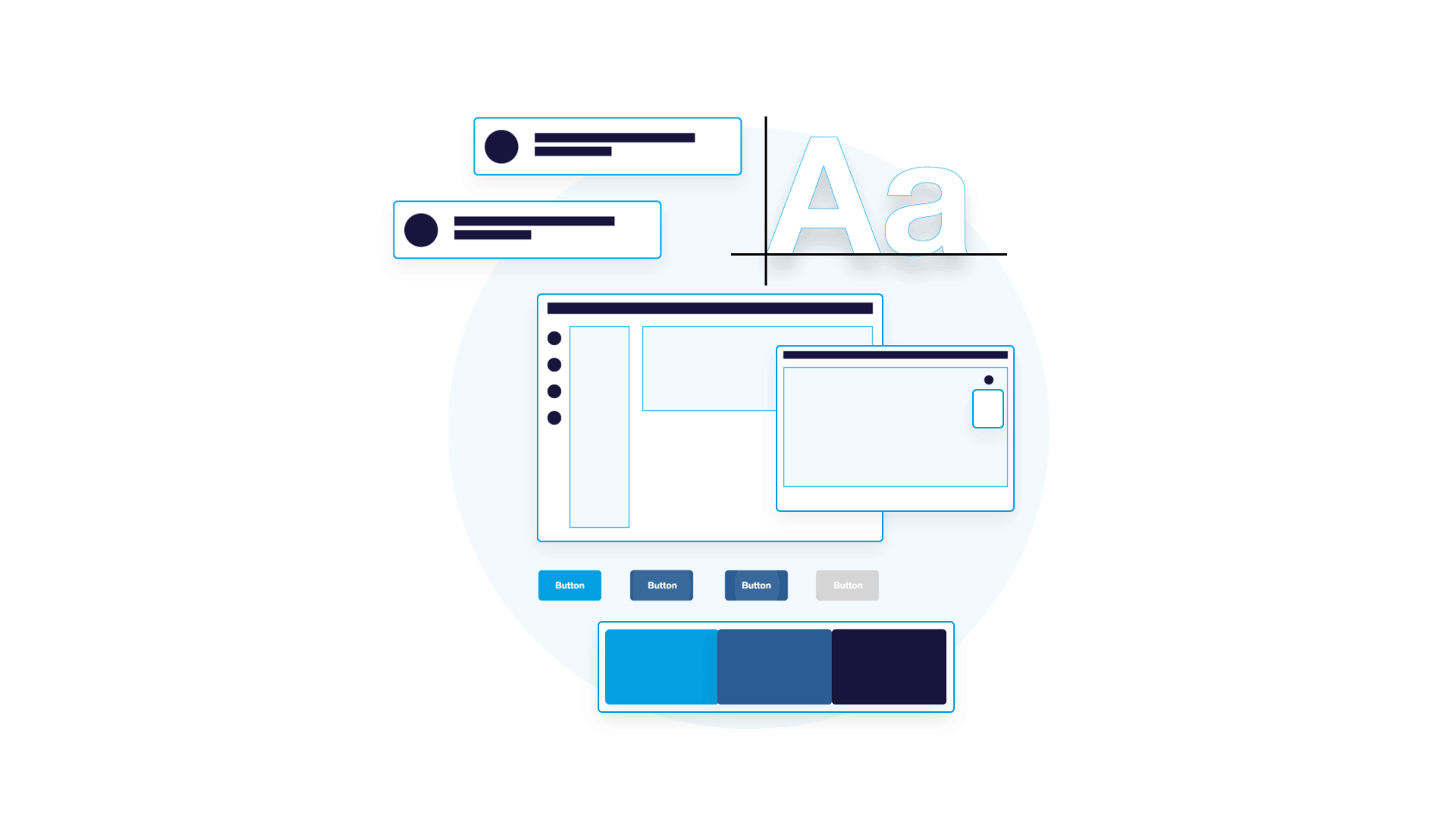
A component is a standalone UI element designed to be reusable across many projects. Its goal is to do one thing well while remaining abstract enough to allow for a variety of use cases. Developers can use them as building blocks to build new user experiences. A key benefit quickly becomes clear: not having to worry about the core design and functionality of each component every time they use them. Examples include buttons, links, forms, input fields, and modals.
Type of components
Following the learning of the Atomic Design the components can be more simple or more complex. I would recommend to classify your components in three types depending on the complexity of them:
Simple components: A button may be an example of a simple components, formed by a shape and text, but the simplest component would be an icon.
Compound components: A component made of minimum two simple components. A good example would be a search bar, one component is the search bar and the second component is the button to search.
Complex components: Build with multiple components, minimum three simple or compound components. A good example would be a header with a search bar, a logo, a navigation and so on.
List of components
- Buttons
- Icons
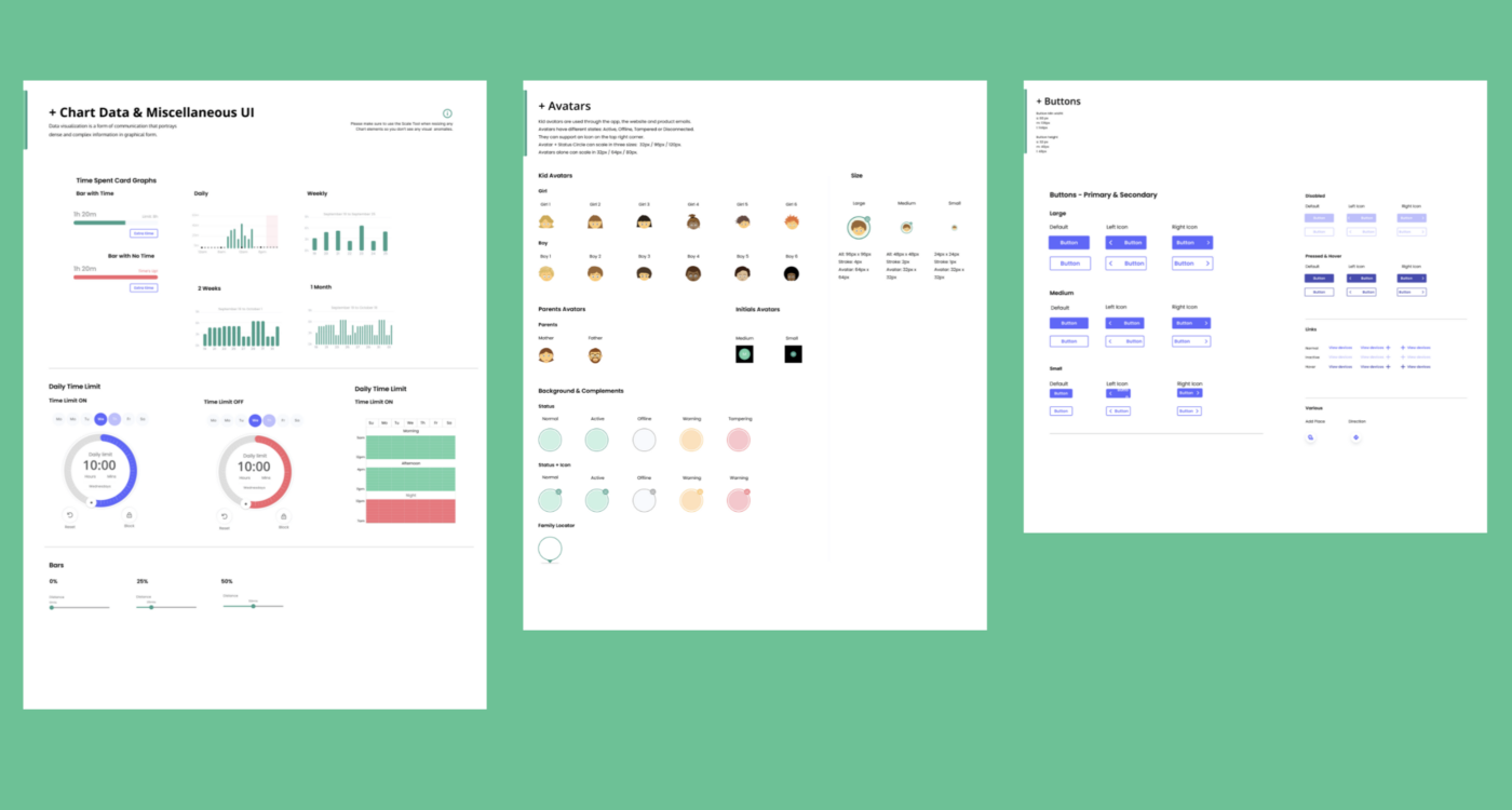
- Avatars
- Cards
- Modals
- Dropdown menus
- Fields and Inputs
- Calendars and date pickers
- Top bars and menu navigation
- Chart Data
- Data Tables
- Maps
- Others…
Some stakeholders are reluctant of creating a design system because it means time and money, but when in place the true value is revealed. The product team won’t need to focus on creating over and over components and they will be able to focus on what matters the most; solving problems. All teams will use the same source of truth avoiding the fact that each team is recreating the same UI elements, that will reduce time and save money.
Having a team dedicated to create and maintain a design system will benefit the entire company. It only requires a minimum of one designer and one developer, but the entire product team can benefit as fas as nobody else will need to create anything, designers and developers will apply the existing components and styles to the new screens. When the product changes the interface, the changes will be automatically applied throughout the product without needing to change and review page to page. The final result is beneficial for both, the company and the user.