If you’re of a certain age, you might have noticed that you no longer read as quickly as you once did. This may be due to vision loss or cognitive changes. Or it might be due to something else: ageist fonts.
A major new study has found that fonts matter in determining how quickly a person is able to read on screens. But they matter more if you’re over 35.
Shaun Wallace, a doctoral candidate in computer science at Brown University, set out to glean “what gains in reading effectiveness are possible by manipulating font choice alone,” according to the study. Wallace’s team tasked 352 participants, ages 18 to 71, with reading text on their own personal devices to mimic a natural reading environment. Sixteen fonts were tested based on their popularity online, in newsprint, in PDFs, and among readability experts. They were Avenir Next, Arial, Avant Garde, Calibri, Franklin Gothic, EB Garamond, Helvetica Neue, Lato, Montserrat, Noto Sans, Open Sans, Oswald, Poynter Gothic Text, Roboto, Times, and Utopia.
The biggest finding is dissatisfying in a way, as usability expert Jakob Nielsen points out in a summary of the research. There is no one font to rule them all. Some people read better with Arial. Others read better with Avant Garde. Individual differences were more significant than any overall effect. Intriguingly, the fonts people claimed they preferred weren’t necessarily the ones that helped them read the fastest. You might love the look of text set in Helvetica, for example, but Open Sans is more likely to turn you into a speed reader.
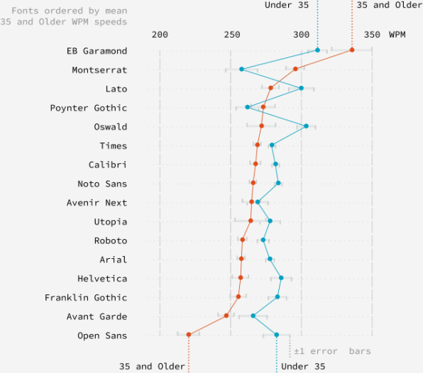
One finding was clear: Older participants, or those 35 and over, read more slowly on average compared to younger participants with every font, except EB Garamond and Montserrat. This chart says it all. The red line represents participants who are 35 and older; the blue line represents those younger than 35.

What is it about Garamond EB and Montserrat that work so well for older readers? Of all the typefaces studied, Montserrat has the tallest x-height (which refers to the height of a lowercase “x”). “Typographers have designed fonts with taller x-heights to increase readability in the past,” Wallace tells Co.Design, pointing to popular web fonts like Georgia and Verdana. “A larger x-height can improve readability at smaller font sizes. As we age and need larger font sizes, Monsterrat’s design might help with this.”
But the study attempted to control for font size, so Monsterrat must have other attributes that help older users. As for EB Garamond: It has serifs, which give it a classic look, but it’s “a modern design compared to other serif fonts in our study,” Wallace says. So perhaps it resonates with older readers who are familiar with serif fonts but benefit from more contemporary features, like a taller x-height.
The study’s findings underscore a design problem that stretches far beyond typography: There is no such thing as an “average” user. Even if there were, designing for that person would exclude countless others.
For reading on screens, Wallace suggests that the answer lies in custom experiences. “We believe everyone should have a digital design token that developers and publishers can integrate into apps and websites to support personalized readability,” he says. It’s an ambitious idea, one with sensitive privacy implications, which Wallace readily admits, noting, “An alternative is to explore tools users can install and control that will reflow or reformat the text they read.”
Until then? If you’re over 35 and you find yourself slogging through a block of text, don’t blame yourself. Blame the typeface.

You must be logged in to post a comment.