
To outsiders, it seemed like a straightforward sale.
On Sept 15, Monotype, the world’s largest font seller, acquired Hoefler&Co (H&Co), a New York-based foundry perhaps best known for a font called Gotham, famously used by Barack Obama’s 2008 US presidential campaign. With the deal, Monotype acquired the intellectual property rights to the studio’s entire library of typefaces, along with the highly desirable URL typography.com, and a team of designers and support staff.
H&Co’s name might ring a bell for those who saw the episode of the Netflix series Abstract featuring its founder, Jonathan Hoefler. And lawyers and graphic design nerds may recall the 2014 million-dollar legal battle (and settlement) between Hoefler and his former business partner Tobias Frere-Jones—still the most publicized controversy in the relatively mellow world of digital font-making.
Now, the acquisition of H&Co by an industry giant with private-equity owners is lighting up the industry, and raising existential concerns for others in the field.
H&Co was a bastion of independent type design, a practice that was as innovative as it was profitable amid competition from giants like Monotype and Adobe Fonts, as well as the proliferation of free typefaces on Google Fonts. To see H&Co gobbled up by Monotype was a great blow felt by solo practitioners and small studios, who worry that a profit-driven corporation is increasingly dictating the terms and conditions of how their work is priced and distributed.
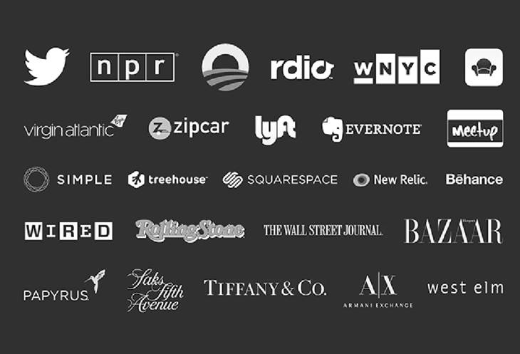
Courtesy of Monotype
Charles Nix, a creative type director at Monotype, says that bringing H&Co’s assets under the company’s e-commerce umbrella simplifies the process of browsing and buying fonts. “It just makes it easier for the customer,” he explains, drawing an analogy between font use and software licensing. “A small foundry writes its own end-user license agreement, sometimes with legal counsel, sometimes without. They all differ wildly, which is crazy.”
Perhaps so. But the prospect of seeing the industry’s licensing practices streamlined was of little comfort to designers who flocked to social media and online fora like Type Drawers to process the shock of the H&Co sale. Some commiserated with Hoefler’s longtime staffers who heard about the sale at the same time the public did; others debated the scruples of Hoefler and his wife, Carleen Borsella, H&Co’s CEO, who left the company as soon as the deal was finalized to “explore new creative endeavors,” as the press release indicated. There were also some who defended Hoefler’s prerogative to steer his business however he pleases.
Beyond the sale, many font makers voiced concerns about an impending Monotype monopoly—a “kraken eating up the industry,” as designer Nina Stössinger puts it. H&Co is hardly the first type foundry to be absorbed by Monotype. Last year, the company acquired URW and the London-based studio Fontsmith. Prior to that, it bought FontShop, the International Typeface Corporation, Bitstream, and Linotype, which was its main competitor for years.
Belief in the value of type

Netflix
In the press release about the sale, Hoefler explained that he and Borsella believed Monotype was the best home for their 32-year-old business. “For us, it was critical to partner with an organization that fundamentally believes in the value of type,” Hoefler said. “Monotype is the most experienced foundry in the world, who today cares for many of the world’s most important typefaces, making them the natural home for the work we’ve created at Hoefler&Co.” He declined to comment for this story.
Frere-Jones declined to comment on the sale or speculate about his former partner’s motives but also wondered about his profession’s future as Monotype becomes an even more dominant force.
“The name ‘Monotype’ is a little too on the nose for what’s happening,” he observes. “Imagine if 70% of movie studios and TV production companies were owned by the same parent company. What do you think we would be watching? How much experimentation would there be? Would there be any pressure at all for this company that owns so much? It pokes right at the heart of what motivates so many of us, yet it’s exactly the thing that’s not part of their business model.”
The impact of H&Co’s acquisition cannot be overstated, says Nadine Chahine, a celebrated Lebanese type designer and Monotype’s former UK type director. Chahine, who earned her PhD from Leiden University and a masters degree in International Relations from the University of Cambridge, is a legibility expert and a pioneer of Arabic typography. She designed the official font for the city of Dubai, which is bundled in Microsoft Office. “I think it’s about time that I can speak more openly about this. It’s the future of our industry at stake and it’s never been this bad,” she tells Quartz. “With every new acquisition, it gets worse for the rest of us.”
How fonts are made and sold
To understand the gravity of H&Co’s decision to sell to Monotype, a primer on how digital typefaces are made and sold may be useful. Beyond the tired jokes about Comic Sans and Papyrus is a serious industry that takes to heart the responsibility of shaping culture pixel by pixel.
Fonts are conceived, drawn, and produced by skilled designers who study art, computer programming, languages, and history. The best ones possess twin geniuses in art and engineering, in addition to an enormous amount of foresight and patience. A type family can take months if not years to complete. A single typeface is redrawn in multiple styles—text, italics, condensed, bold, and variations in between. Quality typefaces are tweaked to ensure legibility when used in large billboards to the tiniest screens. Gotham, for instance, has 66 styles; the sans serif Mallory that Frere-Jones designed has 110 weights, five widths, and supports a range of languages, from Acehnese to Zulu.
Don’t ask a type designer estimate how long it takes to make a font; they’ll finesse a character—moving vector points and adjusting bézier curves pixel by pixel—until it looks just right. “You can describe our work as making really small decisions and projecting the implications of how every last thing that we do plays on each other,” explains Frere-Jones. “If you’re not into nuance, this really isn’t your business.”
The financial rewards for designers are rarely commensurate with their effort, and their work is often invisible in the blur of marketing campaigns and the oceans of text they’re used in—until a detail like letter spacing goes awry. “Love for the craft sustains a lot of this,” Frere-Jones says.
Designers sell their work through various channels. They can sell directly to customers through their website or sign up with independent sellers like I Love Typography, Fontstand, or Village. But most solo operators will at least consider entrusting their work to large e-commerce platforms like Adobe Fonts or Monotype, who have armies of sales and marketing people on staff. Type designers also earn money from custom commissions. Big brands, newspapers, magazines, and large corporations have the budgets to order bespoke typefaces.
Nick Shinn, a veteran type designer who runs a leading Canadian type foundry, has tried it all. “If you’re an independent, you can’t help but feel like you’re being screwed by the system in some way,” says Shinn, the creator of fonts like Merlin, Bodoni Egyptian, and Brown. Big third-party resellers, he says, can take up to 50% of profits and dictate the terms of the sale.
On the other hand, those who sign up with large foundries can reach many more customers. “You now have exposure to the entire world,” Shinn says. “And it’s not just desktop fonts. It’s ebooks, it’s websites, it’s all these different licensing points and opportunities.” The marketing of fonts has become more competitive over the years, he adds. “You used to just put the font on your website, maybe include a specimen sheet [a sampler], and maybe a banner ad. But as more foundries have entered the game, marketing has become more and more sophisticated and aggressive.” After fonts are sold, there’s the ordeal of monitoring licenses and delinquent applications. “That’s an area that Monotype is very strong on,” he explains.
Inside Monotype, the company
Founded in 1887 as a manufacturer of printing equipment, Monotype transformed its operations to keep pace with the evolution in communications and media over the decades. At one time it was publicly traded; today it’s owned by HGGC, a middle-market private equity firm co-founded by American football legend Steve Young and based in Palo Alto, California.
Monotype has amassed the world’s largest collection of digital typefaces—about 30,000 to date; it owns licenses to popular typefaces like Helvetica, Times New Roman, Gill Sans, and Arial. Monotype also owns the popular e-commerce sites Fonts.com and MyFonts.com, the latter being a kind of free-market platform where classics like Linotype’s Avenir and House Industries’s Neutraface are listed alongside more homespun display fonts like Off Duty or The Last Tango.
Monotype
Monotype has been heavily promoting a subscription-based model that gives users access to a library of fonts for a flat fee. It also makes a significant chunk of its earnings from brokering enterprise licenses with big corporations and brands. IBM, for instance, told Quartz that it used to pay Monotype over a $1 million every year to license Helvetica Neue for its global workforce. It finally created its own “bespoke typeface,” called IBM Plex, in 2017.
Monotype’s marketing touts the company’s commitment to type design. But during her tenure from 2005 to 2015, Chahine says she found that Monotype’s leaders only cared about six letters: EBITDA. Earnings before interest, taxes, depreciation, and amortization is one of Wall Street’s favorite ways to measure a company’s performance, and 40% EBITDA growth is a metric that Monotype liked to cite to investors when it was a publicly traded company.
In his August 2019 assessment of Monotype, published shortly after the company accepted the buyout offer from HGGC, industry consultant Mark Hahn wrote:
This is not a story of a distressed company, far from it. Rather, Monotype has been so successful in the consolidation of the font licensing business that the company has run out of significant acquisitions in its chosen market segment… Gross profit has been reported hovering around 85% of revenues, most of which are recurring and predictable, which explains the relatively high enterprise value (viewed from the perspective of those of us in the printing industry).
But Chahine explains why Monotype’s wild profitability is an indicator that something might be amiss. “The primary function of a foundry is to release quality typefaces and there’s a lot of blood, sweat, and tears involved,” she says. “This is not a profitable field—at least not on the scale that Monotype wants.”
Who manages the world’s largest font company?
The composition of Monotype’s C-suite hints at its priorities. Today, not a single designer sits on Monotype’s leadership team. Ninan Chako, its newly appointed CEO, is a tech executive who ran a travel-services company before he was hired by Monotype. He replaced Scott Landers, an accountant, who managed Monotype for 13 years.
Chahine, who began as an intern in the font department, says Monotype has become the Wal-Mart of typography—with MyFonts as the industry’s equivalent of the dollar store. “It’s sad because when I started my career at Linotype, my job was to talk about how amazing Helvetica, Frutiger, Avenir, and Palatino were,” she says. “These were the gems of the type world and now they sit with people who don’t care about them and only see them as cash cows.”
When Chahine was promoted to the role of UK type director, she was “at the highest level of design at Monotype, but there were still layers and layers of middle management between me and the executive team,” she recalls.
To reach its profit targets, Chahine explains that Monotype’s leaders undermined the work of its designers, subjecting them to quarterly quotas for the sake of reporting. And sacking tenured employees was considered a cost-savings measure. “I always knew I would have to leave Monotype because I did not trust how they treated their employees, especially after a certain age,” she says. “If you’re over 50 and working at Monotype, you are doomed.”
Asked to respond, Monotype didn’t go into the details of its rounds of layoffs but said it does “not make decisions on employment status based on age, race, gender or similar criteria”.
Toshi Omagari is among the Monotype type designers who were laid off last year. Omagari describes his eight years at the company as “overall positive,” but says he had been mulling the idea of leaving the company for a while. “I’ve had more than enough of the corporate stuff,” he says.
Omagari believes that the company’s sales-focused ethos will prove to be its downfall. He recounts a clip of Steve Jobs in a 1995 interview explaining how the reign of sales personnel (a.k.a. “tonerheads”) at Xerox killed innovation and eventually led to the company’s stagnation.
“In my opinion, this perfectly captures what’s happening at Monotype,” he says. An expert in video game fonts, Omagari occasionally picks up freelance assignments from his former employer but is glad to be out on his own.
Will H&Co’s staff stay on?
Omagari says that hearing the circumstance of H&Co’s acquisition affirmed his hunch about his former employer. “I noticed that Monotype isn’t interested in people; they were always just interested in their assets,” he says. Chahine echoes Omagari’s observation. “When they acquire a foundry, they will eventually lay off most of the staff. They’ll keep the fonts and gut the company,” she says.
In a statement emailed to Quartz, Monotype says H&Co’s staff will remain employed. It reads:
Hoefler&Co employees have already begun working closely with the Monotype team to integrate their talent and capabilities. For now, the Hoefler&Co brand will continue to exist as it has, along with typography.com. The team has some exciting design releases upcoming, which we’re excited to help them finish and share with the industry. Of course, we will work together to determine the best long-term opportunity for integrating the Hoefler&Co brand into the Monotype family. Each acquisition is different, and we have been fortunate to benefit from [a] myriad of talent that have come to us as part of previous acquisitions.
Based on its history, “for now” may prove to be a crucial phrase in the statement.
Monotype says it doesn’t have a defined policy regarding the fate of employees of the foundries it buys. “Each acquisition is unique, and we take time to thoughtfully integrate the new foundry’s talents, IP, and capabilities into the existing Monotype business,” a spokesperson for the company told Quartz.
Surveying the current composition of Monotype’s 14-person creative unit, only four—Phil Garnham (formerly of Fontsmith), Akira Kobayashi (formerly of Linotype), and Tom Rickner and Terrance Weinzier (both from Ascender Corporation)—worked at a studio bought by Monotype. None of the studio founders has stayed on.
Challenging the monopoly
As convenient as it may be for customers to default to the big industry players, there’s a dedicated coterie of type designers who are running their own e-commerce platforms and embracing the business and administrative challenges this comes with. Among them is I Love Typography, a webshop that Chahine co-founded as a counterpoint to Monotype.
“The future of the industry depends on the creative output of hardworking type designers and if we want them to flourish, we need to create an ecosystem that rewards them,” she asserts. “Monotype has not shown any indication of that. If we want to support creativity and type design, we need to support the independent foundries wherever they are.”
Similarly, Village, a “font co-op” of 12 independent foundries, is vying to create a model that more closely evokes the “collegial” sensibility of the type design community. “There is a feeling of shock and aversion when the ‘rougher’ forms of brute capitalism shake up our industry,” says Tracy Jenkins, co-founder of Village. She argues that corporations can even use a designer’s dedication to hold them back. “In my early days as an art director at a New York branding firm, a creative director told me that the firm’s executives called the designers ‘exotic menials,’” Jenkins recalls. “It takes years of hard work and a dose of luck to break out of a menial pay and involvement level as a designer. Part of the bargain is that we love what we do. We’re willing to work extremely long hours for low pay because we love to make our work.”
Retirement options for designers: Monotype or bust?
Ultimately H&Co’s acquisition has made many type designers turn inward and reflect on their career paths.
Peter Biľak, who runs the Dutch studio Typotheque and co-founded Fontstand, says the news has made him think about succession. “In the old days, businesses were usually inherited and stayed in families. Today it is not realistic to expect that my daughter will run my business, ” he says.
“Type foundries need to consider what their end game is, not just in terms of selling the business but also the legacy they leave behind,” he adds. “Sadly, the consensus appears to be that if you work with type, you sell to Monotype. I hope to see different models when people are ready to retire or move on.”
Meanwhile Shinn, the Canadian type designer, is ready to sell to Monotype. “I’m 69 and I hope to be working, you know, for another 20 years at least,” he explains. “But if someone said, ‘Hey, Nick, we’ll give you a large sum of money for the rights to your existing typeface library and intellectual property,’ I’d have no qualms.…We might criticize the concentration [monopoly] in the industry and the negative effects of it, but ultimately, if you’re a small operator, you’d sell out if the money was right.”
Frere-Jones, for his part, shares Biľak’s sensibility. “It seems a little too ‘scorched earth’ to think that selling to Monotype and walking completely away from my work might be the only option at the end of my career,” he says. “I can’t really fathom doing that when the time comes.”