
Line plot into area chart
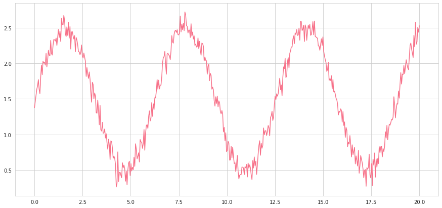
Consider the following standard line plot, created with seaborn’s lineplot, with the husl palette and whitegrid style. The data is generated as a sine wave with normally distributed data and elevated above the x-axis.
With a few styling choices, the plot looks presentable. However, there is one issue: by default, Seaborn does not begin at a zero baseline, and the numerical impact of the y-axis is lost. Assuming that the x and y variables are named as such, adding plt.fill_between(x,y,alpha=0.4) will turn the data into an area chart that more nicely begins at the base line and emphasizes the y-axis.
Note that this line is added in conjunction with the original lineplot, sns.lineplot(x,y), which provides the bolded line at the top. The alpha parameter, which appears in many seaborn plots as well, controls the transparency of the area (the less, the lighter). plt represents the matplotlib library. In some cases, using area may not be suitable.
When multiple area plots are used, it can emphasize overlapping and intersections of the lines, although, again, it may not be appropriate for the visualization context.
Line plot to stacked area plot
Sometimes, the relationship between lines requires that the area plots be stacked on top of each other. This is easy to do with matplotlib stackplot: plt.stackplot(x,y,alpha=0.4). In this case, colors were manually specified through colors=[], which takes in a list of color names or hex codes.
Note that y is a list of y1 and y2, which represent the noisy sine and cosine waves. These are stacked on top of each other in the area representation, and can heighten understanding of the relative distance between two area plots.
Remove pesky legends
Seaborn often uses legends by default when the hue parameter is called to draw multiple of the same plot, differing by the column specified as the hue. These legends, while sometimes helpful, often cover up important parts of the plot and contain information that could be better expressed elsewhere (perhaps in a caption).
For example, consider the following medical dataset, which contains signals from various subjects. In this case, we want to use multiple line plots to visualize the general trend and range across different patients by setting the subject column as the hue (yes, putting this many lines is known as a ‘spaghetti chart’ and is generally not advised). One can see how the default labels are a) not ordered, b) so long that it obstructs part of the chart, and c) not the point of the visualization.
This can be done by setting the plot equal to a variable (commonly g), like such: g=sns.lineplot(x=…, y=…, hue=…). Then, by accessing the plot object’s legend attributes, we can remove it: g.legend_.remove(). If you are working with a grid object like PairGrid or FacetGrid, use g._legend.remove().
Manual x and y axis baselines
Seaborn does not draw the x and y axis lines by default, but the axes are important for understanding not only the shape of the data but where they stand in relation to the coordinate system.
Matplotlib provides a simple way to add the x-axis by simply adding g.axhline(0), where g is the grid object and 0 represents the y-axis value at which the horizontal line is placed. Additionally, one can specify color (in this case color=’black’) and alpha (transparency, in this case alpha=0.5). linestyle is a parameter used to create dotted lines by being set to ‘--’.
Additionally, vertical lines can be added through g.axvline(0).
You can also use axhline to display averages or benchmarks for, say, bar plots. For example, say that we want to show the plants that were able to meet the 0.98 petal_width benchmark based on sepal_width.
Logarithmic Scales
Logarithmic scales are used because they can show a percent change. In many scenarios, this is exactly what is necessary — after all, an increase of $1000 for a business that normally earns $300 is not the same as an increase of $1000 for a mega-corporation that earns billions. Instead of needing to calculate percentages in the data, matplotlib can convert scales to logarithmic.
As with many matplotlib features, logarithmic scales operate on the ax of a standard figure created with fig, ax = plt.subplots(figsize=(x,y)). Then, a logarithmic x-scale is as simple as ax.set_xscale(‘log’):
A logarithmic y-scale, which is more commonly used, can be done with ax.setyscale(‘log’):
Honorable mentions
- Invest in a good default palette. Color is one of the most important aspects of a visualization: it ties it together and expressed a theme. You can choose and set one of Seaborn’s many great palettes with
sns.set_palette(name). Check out demonstrations and tips to choosing palettes here. - You can add grids and change the background color with
sns.set_style(name), where name can bewhite(default),whitegrid,dark, ordarkgrid. - Did you know that matplotlib and seaborn can process LaTeX, the beautiful mathematical formatting language? You can use it in your
x/yaxis labels, titles, legends, and more by enclosing LaTeX expressions within dollar signs$expression$. - Explore different linestyles, annotation sizes, and fonts. Matplotlib is full of them, if only you have the will to explore its documentation pages.
- Most plots have additional parameters, such as error bars for bar plots, thickness, dotted lines, and transparency for line plots. Taking some time to visit the documentation pages and peering through all the available parameters can take only a minute but has the potential to bring your visualization to top-notch aesthetic and informational value.
For example, adding the parameterinner=’quartile’in a violinplot draws the first, second, and third quartiles of a distribution in dotted lines. Two words for immense informational gain — I’d say that’s a good deal!