Image: By Author
Recently, I was scrolling through my Facebook feed. I came across an interesting post talking about the web design mistakes small businesses make and how to avoid them.
It caught my attention!
This is something I can connect to as someone who owns a small business. I believe it is critical to continually upgrade and work on your business, especially when competition is high.
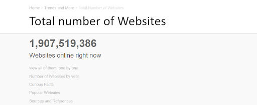
Currently, there are over 1,907,519,500 websites! And only a select few are in the top 10 results of Google. (Source: InternetLive Stats)
In short, creating a website that stands out and improves over time is more vital than ever.
As it is said:
“No matter how much experience you have, there’s always something new you can learn and room for improvement.”
― Roy T. Bennett, The Light in the Heart
Around the same time, I came across an article by PixelCrayons-Web Designing Tips To Make Your Website A Success, which made some excellent points about the things small businesses need to think of when it comes to their website.
I would recommend checking out this article.
After getting the knowledge from both articles and Fb posts, I decided to make a list of what I found to be the most common web designing mistakes made by small businesses when it comes to their website.
And, if you’re interested in your own business, then maybe this might help you avoid making these mistakes too!
1O Web Design Mistakes Small Businesses Make and How To Avoid Them
Mistake #1: Not having a clear call-to-action
Clear call-to-action means that a customer knows what they have to do next. For example, if you’re offering free shipping, there should be a clear “free shipping” call-to-action on your website.
If the customer doesn’t know what to do next, then it’s like you’re throwing them into the ocean without any oars or life jackets. And that’s what some businesses are doing.
These businesses don’t give customers a clear call to action to push them over the edge and make the sale. Some of these businesses even have “buy now” buttons that aren’t visible on their web pages!
Such mistakes can let potential customers go.
How to avoid it:
-
# Make it clear what you expect your clients to do. Ensure that you have a clear call to action that shows your customers what they need to do next.
# Don’t make them search for it!
You need smart CTAs, according to HubSpot. Conversion rates for default and multivariate CTAs were a little over 1%, with smart CTAs coming in at approximately 3.5 percent.
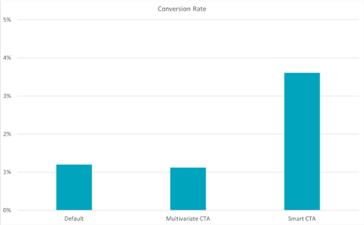
Image Source: HubSpot
Mistake #2: Not allowing enough whitespace
This is the biggest mistake that businesses make with their web design. They simply don’t give it enough whitespace!
Why can getting more space on your website be so beneficial?
According to web designing companies, here are some of the reasons why whitespace is essential to get right:
-
# It minimizes clutter and makes it easier to consume information.
# It establishes a hierarchy of content.
# Improves the flow and productivity of a website or application.
Although whitespace is an integral part of your web design, it’s also tough to get right as not everyone sees it as beneficial as others do. People tend to want more information on their screens instead of less.
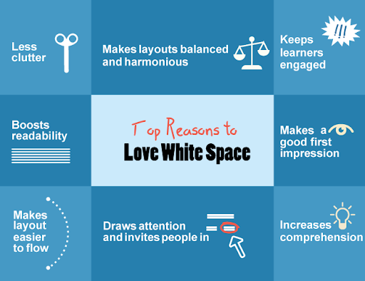
Image Source: Shiftelearning
How to avoid it:
Simply put, don’t overfill your website with information or ads! Leave some white space for your visitors’ eyes to rest on. It makes everything feel much more natural and easier to read.
Mistake #3: Hiding your navigation
Have you ever visited a website and thought, where do I go from here?
I bet you have.
And, I bet you were frustrated because of it!
People coming to a website expect to read the information and go from one page to another without being confused or overwhelmed. According to the Clutch survey, easy navigation is the most useful website feature for 94 percent of respondents.
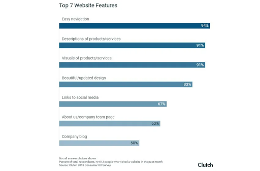
Image Source: Clutch
In fact, according to Richard Byrne’s The Psychology of Navigation:
Users “don’t want friction when navigating your site. They want to go from point A (start page) to B (specific destination) as quickly and easily as they possibly can”.
Allowing frustration in the process of navigation is simply a mistake that many businesses make. And, you must not avoid web design mistakes like this.
How to avoid it:
-
# Give your visitors no reason to doubt their navigation. Don’t make them guess where they’re going or where they are now.
# Keep it simple, prominent, and just let them browse!
Mistake #4. Not including a favicon
It’s a tiny little image that provides an easy way to recognize your website on their browser.
Having no favicon is like not having any company logo on your business card. It may work if you’re famous, but otherwise, it doesn’t make for an excellent first impression.
For example, the Google Chrome browser displays this tiny image on the browser tab for every website. So, not having a favicon is like not having a logo on your business card.
How to avoid it:
A favicon just helps visitors identify which website they’re currently browsing and narrows down their choices without them even searching for it. Make sure you have one and that it’s consistent across all of your devices!
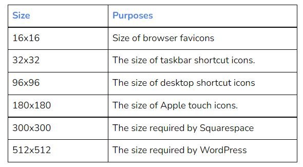
Here are some of the most common sizes and purposes of favicons.
Mistake #5: Not having enough contrast between your text and background color
The only thing users hate more than lengthy and tedious texts is straining their eyes when reading them.
This is something that we have all witnessed and experienced throughout our lives. After a lengthy period of staring at a text with weak contrast to the backdrop color, the eye becomes tired and irritated.
How to avoid it:
Here’s a quick tip for ensuring your website has adequate contrast.
-
# Every time you pick a color for your text, look at the pair of colors next to it. Can you read that? If not, your contrast is probably too low, and users will have difficulty reading on their screens.
# Ensure that your contrast is high enough, so it doesn’t harm the reading experience. Make sure everything is readable and easy on the eyes!
Mistake #6: Using a font size that’s too small
Similar to the preceding tip, if you use a font size that is too small, visitors will have to give time and strain their eyes just to read it.
This is a terrible mistake, and you should avoid it at all costs, as users will hate you and your website for causing them eye pain.
The size of the text should be relative to the rest of the page. It’s what makes things look natural and easy to read. If you make everything huge, then everything seems too big. If you make everything small, then nothing stands out.
How to avoid it:
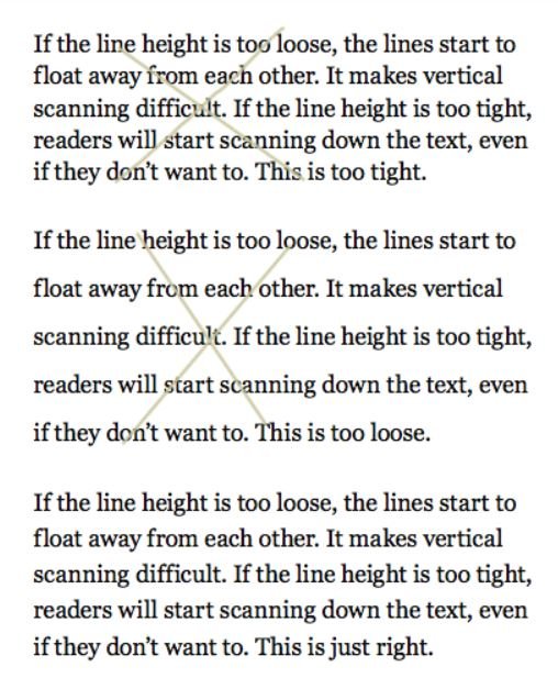
To have a readable font size on your website, measure the size with this simple trick: add up the height and width of your text box in pixels. Make sure your total is around 25-35 pixels for body copy. If you want more space between lines, then add another 5-10 pixels.
Mistake #7: Choosing a generic image can ruin your effort
Did you ever see a photo online and immediately understand what the website is about?
If not, they’ve made one of the worst mistakes in web design: using generic stock photos. According to a survey, 40% of consumers said images are an element that they value on a company website,
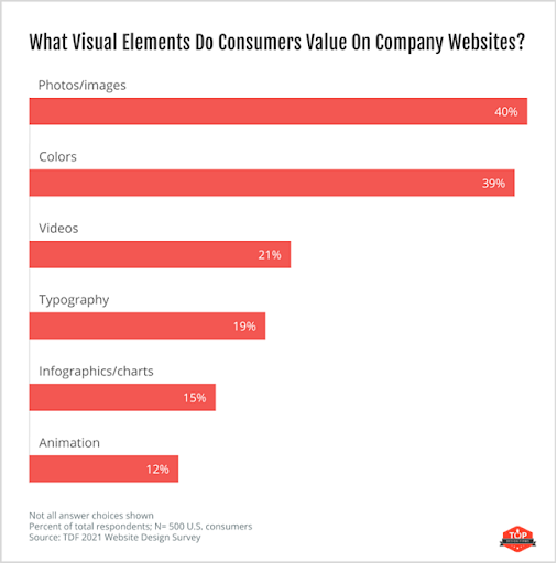
Image Source: HubSpot
This is done by businesses that don’t want to spend any money on professional photos because the assumption is that stock images are good enough.
However, generic images can ruin your website’s image online.
How to avoid it:
Instead of using stock photos, spend some money and hire a professional graphic designer. You’ll see the difference it makes when you get high-quality images on your website that fit with your message and target audience.
Mistake #8: Missing image metadata & having blurry images
Image metadata (or image information) stores the photo’s location on a map, camera model & serial number used to shoot it, and any associated keywords.
It’s crucial because people use this information when searching for photos online. When they type in a keyword, and your website with that exact picture pops up, you’re in business.
If your metadata is incomplete or you don’t have it at all, then the photo will never show up when someone searches for it – this is a big mistake on many websites out there.
Having blurry images makes things worse because users will assume the image has no use and leave right away. This happens more than you think!
How to avoid it:
Just make sure that your metadata is complete, so people can find your photos by entering relevant keywords. If you have an image on your website that is blurry or looks terrible, go back to the photographer and request a new one.
Mistake #9: Having excessive hover animations on the homepage
This is one of my biggest pet peeves because I just can’t stand them.
Hover animations are cool, but if you overdo it with an excessive amount of different effects, then your website loses its professionalism. Too many playful effects ruin the credibility and quality of your website. It makes users wonder why they even visited the page in the first place.
How to avoid it:
Instead of adding tons of effects, keep it simple by having just one or two. This will also help your site load faster, so you should always strive for this when building a business website.
Some websites that get away with having too many hover animations are Facebook and Google. You can’t just throw everything on the homepage and have it work, but they are websites that users visit daily. So don’t take my word for it; test different types of effects to see how your visitors respond to them.
Mistake #10: Skipping on social media buttons & sharing boxes
I hope this doesn’t surprise you. If it does, then maybe you’re the one making a mistake!
Did you know? One of the most popular online activities is the use of social media. Over 3.6 billion people used social media globally in 2020, which is expected to rise to nearly 4.41 billion by 2025.
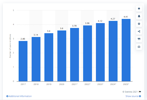
Image Source: Statista
Social media buttons are like sunglasses – they make your website more attractive.
People love sharing good things with their social networks, so why not give them all options? Having social media buttons on your website will allow your visitors to share your site with a single click.
Social media buttons also help increase the credibility of your website because it shows that you’re willing to reach out to social networks and interact with people in any way possible, including sharing stuff from their profiles.
How to avoid it:
Figure out where you want the buttons placed, then add them to your website. There are different options to choose from, so just go with whatever appeals to you the most.
Wrapping up
Now that you know what mistakes to avoid, it’s time to start creating a well-designed website for your business. Keep these tips in mind as you work on your next project to help you deliver better results.
Besides, you can consult any web designing company in India or other countries to get your website designed that fits the requirements of the web visitor and web crawler.
Good luck!
FAQs
Q1: What are the seven common issues you must avoid in your performance design?
A1: They are:
1. Not having a good homepage design
2. Using cheesy stock photos on the homepage
3. Having too many hover animations
4. Not having complete image metadata (or having blurry images)
5. Skipping on social media buttons & sharing boxes
6. Focusing too much on one page instead of designing your site in a way that users can easily navigate
7. Having too many advertisements on your website (I’m talking more than 2 or 3 ads on the entire site)
Q2: What are the benefits of having proper web design?
A2: Great web design will make your website more appealing to visitors, which will make them stay longer and return in the future. It can also increase email subscriptions if you create a sense of urgency, like offering a discount for signing up before a specific date.
Q3: What is the formula for good web design?
A3: I would say that good web design has three key elements:
1. It must look professional (avoid cheesy stock photos)
2. It must be user-friendly and have excellent navigation
3. It must match your company’s branding

You must be logged in to post a comment.