
Layout Definition
Layout basically means the arrangement of predetermined items such as images, text and components on a screen. Layouts use uniform elements and spacing to encourage consistency across platforms and screen sizes.
We want the layout to have the following principles:
- Balanced: Use Grids to arrange the visual elements.
- Responsive: Arrange the visual element depending on the screen size.
- Standardised: Use standardised elements spatially organised.
A responsive grid allows a layout to change dynamically based on the size of the screen. This also guarantees consistent layouts across the website’s pages.
8px grid definition
A best practice is to build your layout with an 8px Grid, a geometric foundation of all the visual elements that include typography and iconography as well. We’ll review this 8px grid later on another article.
A layout is made of a group of columns divided by gaps that are named gutters. Layout margins are the outer margins of the grid. Finally the layout anatomy are the blocks of content such as the header, the navigation or the footer; the content can span over any number of columns and resize with the grid.
Columns
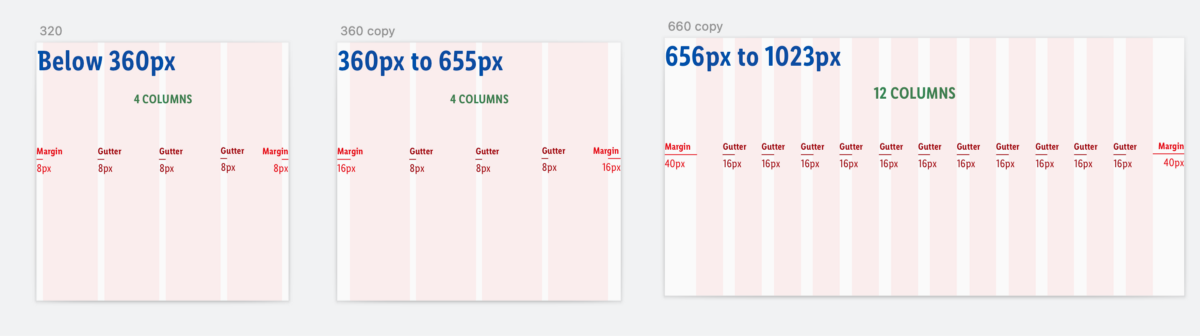
There are 12 or 4 columns in this responsive grid system. Column widths change with the size of the grid. The columns are always aligned to the center of the screen.
MOBILE: 4 Columns: There are 4 columns on screen views from 320px to 655px width. Column widths change with the size of the screen.
TABLET & DESKTOP: 12 Columns: There are 12 columns in the responsive grid system on screen views starting at 656px width. Column widths change with the size of the grid.
Margins
Grid margins are the outer margins of the grid. They can be the same width as the gutters or greater. We have two types of margins, fixed or fluid.
Fixed Margins:
The margins at the outer edge of the grid are a fixed size within a breakpoint when the Grid is fluid.
Fluid Margins:
When we encounter a Fixed Grid on screens bigger than 1440px width we will use Fluid Margins, meaning the Grid will be always 1264px width and the margin will be the same size on both sides, right and left, and the size will differ depending on the screen size.
Calculation Example:
On a screen size of 1920px we will apply a Fixed Grid of 1264px. The Fluid Margin will be a result of the division on the Screen Size less the Fixed Grid Size: 1920px-1264px= 656px. Then we need to divide the result by 2: 656/2=328px. So we will apply a margin of 328px on each side.
Gutters
Gutters are the gaps between the columns. Gutter widths are fixed values (8px , 16px or bigger) based on breakpoints.
I recommend to use the 8px gutter for screens from 320px width to 655px width and the 16px Gutter applies for screens from 656px and up. You can also use a bigger gutter for wide screens.
Layout anatomy
Areas of the layout that contain the content. Layout regions can span over any number of columns and resize with the grid.
Layout regions can span over 12 columns and resize or keep fixed with the grid. I recommend to use a 4 column layout for small screens (mobile) and a 12 column layout for standard screens (tablet and desktop).
We can use the layout on two different ways, we can either use all the columns of the layout (spanning column) or we can use some of the columns (offset).
1. Spanning Column layout
On the spanning model we use all the columns available and we group them to create groups of “column spans”. The page content spans across the 4 or 12 columns, using all the space provided. The content resizes as long as the screen size changes.
Example of Layout usage:
- MOBILE COLUMN SPAN OF 4/4: 1 column made out of 4 grid columns.
- DESKTOP COLUMN SPAN OF 6/12: 2 columns made out of 6 grid columns.
- DESKTOP COLUMN SPAN OF 4/12: 3 columns made out of 4 each.
2. Offset layout
The page content does not always need to span across 12 columns; it can occupy a smaller region in the center of the page. This example shows a 12-column grid layout region with an offset of 2 columns on both sides, resulting in a column span of 8.
This layout is quite flexible.
Fluid
The fluid grid is designed for web applications as it uses almost a 100% of the screen’s width (except margins). Within a breakpoint, the column count is constant, and unit size scales with screen size.
Usage:
The Fluid Grid will be used for screens from 320px to 1440px width.
Fixed
The fixed grid has a maximum width. The width allows for maximum readability of page content in large and high-definition screens.
Usage:
The Fixed Grid will be used for screens bigger than 1440px; from this width and up we’ll use a Fixed Grid of 1264px width.
Use a set of standard breakpoints to maintain layout integrity across screen sizes.
Here I propose a table that Designers and Front End Engineers use to work on the website. You can change the numbers accordingly to the needs of your product, but keep in mind the standard screen sizes.
Breakpoints are defined as min-width attributes. This means that screen sizes in between two defined breakpoint dimensions will inherit all dimensions of the breakpoint of smaller size.
- 12 Column widths are fluid and equate to 8.33% width of the grid.
- 4 Column widths are fluid and equate to 25% width of the grid.