
In the world of type design, most any font or typeface you see falls into one of two camps. It’s either a serif or sans serif. The serifs (e.g., Times New Roman, Georgia, and Garamond) are the classics, featuring extra hooks and curves at the end of letters, for legibility and style. The sans serifs (e.g., Helvetica, Futura, Roboto) are the modernists, with letterforms based upon simpler geometries and no extra flourishes.
There is no law proclaiming that all typefaces must fall into the bucket of either serif or sans serif, yet that’s how we categorize them all the same.
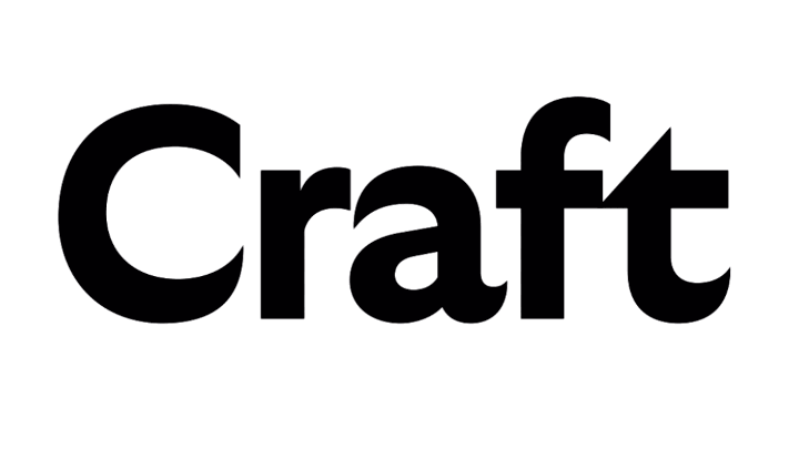
A new font called GT Ultra is different. It’s half serif, half sans serif. It’s what the AIGA calls “A Real Fence-Sitter of a Typeface.” And you know what? It is, and it’s great.
“The project grew out of a desire to explore the possibilities of finding an aesthetic that can’t be easily categorized,” says designer Noël Leu. “We are all creatures of habit and tend to be more comfortable with things we can clearly identify.”
You can probably see that GT Ultra is inspired by the rich typefaces from the 1970s and ’80s, which were hand-drawn letterforms full of all the chunky curves of a Doc Martin shoe. Such retro typefaces have most certainly had a comeback in the last few years, as we saw with projects like Burger King’s recent rebranding. But GT Ultra is not just a retro remake.
Leu spent four years developing GT Ultra to create the anachronistic effect he was looking for. “I really took the time to step back every now and then to let the project rest, reflect on the concept and where to take the design,” he says.

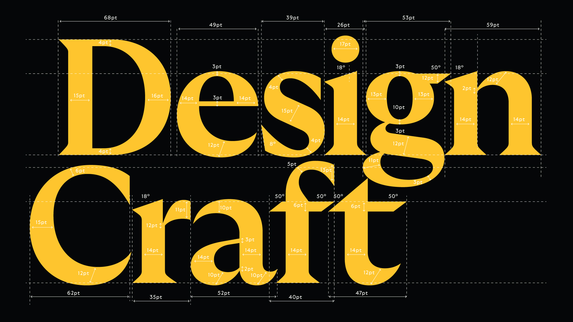
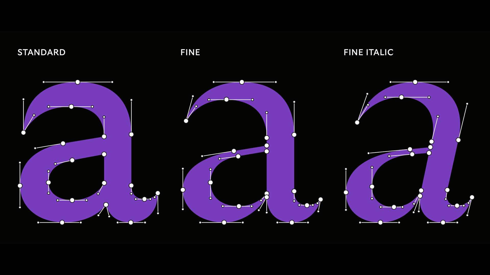
On one hand, it has all the curvy elements of hand-drawn calligraphy. (Have you ever seen a printed letter as opulent as that lower case “a”—it might have been designed by Bacchus himself.) On the other, it’s buttoned-up and modernist. When looking at the typeface, pay special attention to the terminals: Those are the ends of letters. At times, Leu ends them with a flared tip to lighten the weight of the letter, like the rudder of an airplane. At other times, Leu ends them with a squared edge, planting them firmly into the page, like a trusty sans serif.
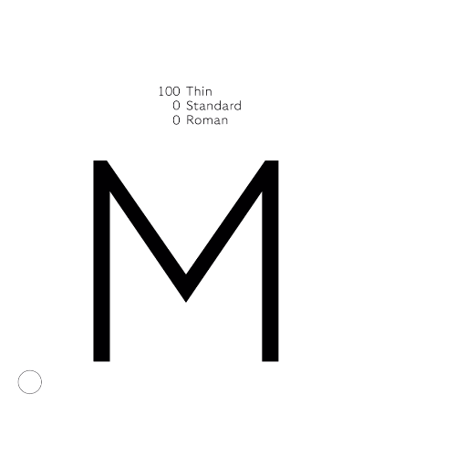
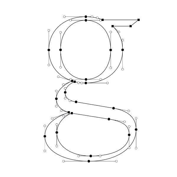
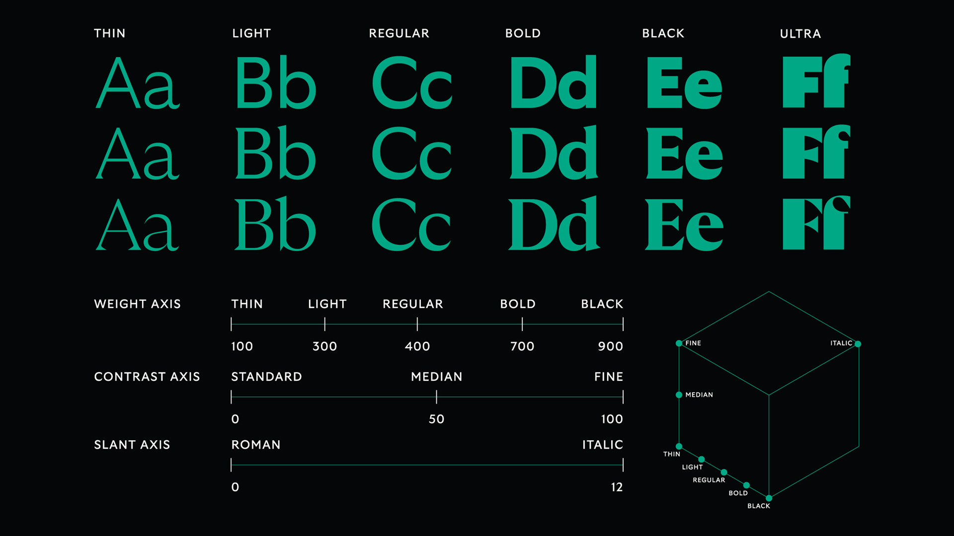
But a big reason that GT Ultra works as a functional font, Leu concedes, is due to modern technology. Variable Font Technology—a supersize font file codeveloped by Google, Apple, Microsoft, and Adobe in 2016—stores far more information about individual glyphs than old font files did, which allows a designer to essentially program a font to not just scale its geometry big or small, but also optimize its bits and pieces for constant visual balance. For a font that pushes the limits on thin and thick parts, sharp corners, and curved edges, having extra levels of control was crucial to making it render properly—plus this extra code offers the option to render it thin, bold, or even in a version with heightened geometric contrast, pushing its visual identity to the limits.
In the meantime, just what do we call GT Ultra? Is it a serif, or a sans serif or . . . something else? “I’d say GT Ultra is neither a sans or a serif typeface,” says Leu, throwing coals on the fire. “But it’s also both a sans and a serif typeface.”
You must be logged in to post a comment.