


In the era of information explosion, more and more data piles up. However, these dense data are unfocused and less readable. So we need data visualization to help data to be easily understood and accepted. By contrast, visualization is more intuitive and meaningful, and it is very important to use appropriate charts to visualize data.
In this post, I will introduce the top 16 types of chart in data visualization, and analyze their application scenarios to help you quickly select the type of chart that shows the characteristics of your data.
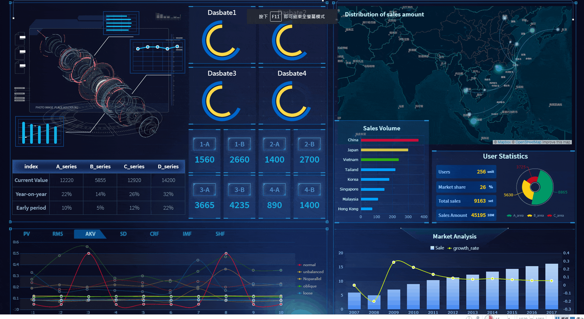
NOTE: All the charts in the article are taken from the data visualization tool FineReport.
1. Column Chart
Column charts use vertical columns to show numerical comparisons between categories, and the number of columns should not be too large (the labels of the axis may appear incomplete if there are too many columns).
The column chart takes advantage of the height of the column to reflect the difference in the data, and the human eye is sensitive to height differences. The limitation is that it is only suitable for small and medium-sized data sets.
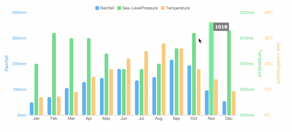
Application Scenario: comparison of classified data
2. Bar Chart
Bar charts are similar to column charts, but the number of bars can be relatively large. Compared with the column chart, the positions of its two axes are changed.
Application Scenario: comparison of data (the category name can be longer because there is more space on the Y axis)
3. Line Chart
A line chart is used to show the change of data over a continuous time interval or time span. It is characterized by a tendency to reflect things as they change over time or ordered categories.
It should be noted that the number of data records of the line graph should be greater than 2, which can be used for trend comparison of large data volume. And it is better not to exceed 5 polylines on the same graph.
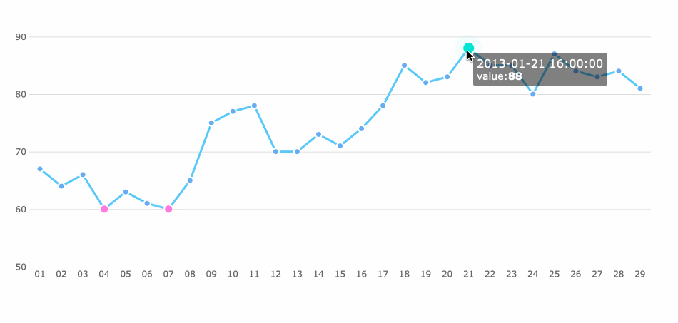
Application Scenario: trend of data volume over time, comparison of series trends
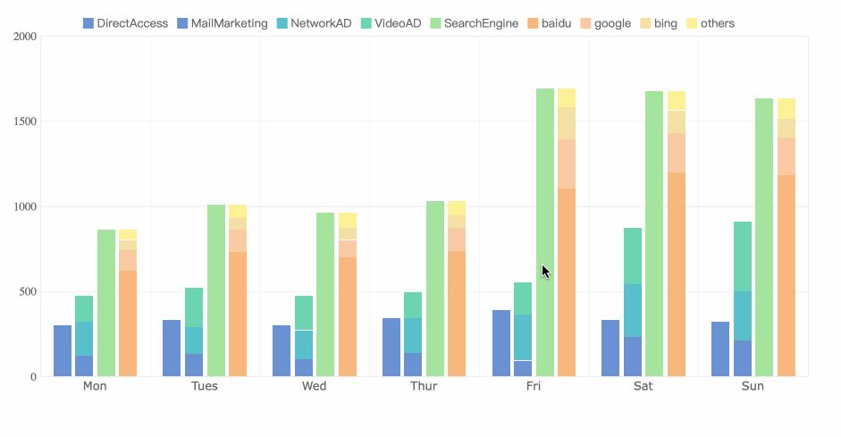
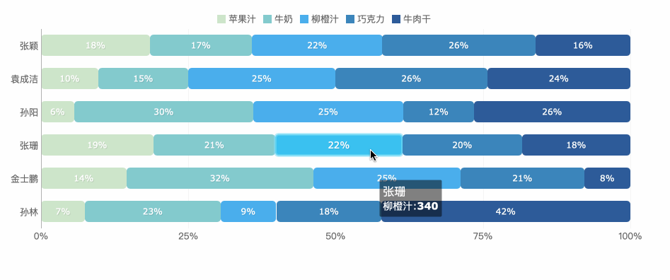
4. Area Chart
The area chart is formed on the basis of the line chart. It fills the area between the polyline and the axis in the line chart with color. The filling of the color can better highlight the trend information.
The fill color of the area chart should have a certain transparency. The transparency can help the user to observe the overlapping relationship between different series. The area without transparency will cause the different series to cover each other.
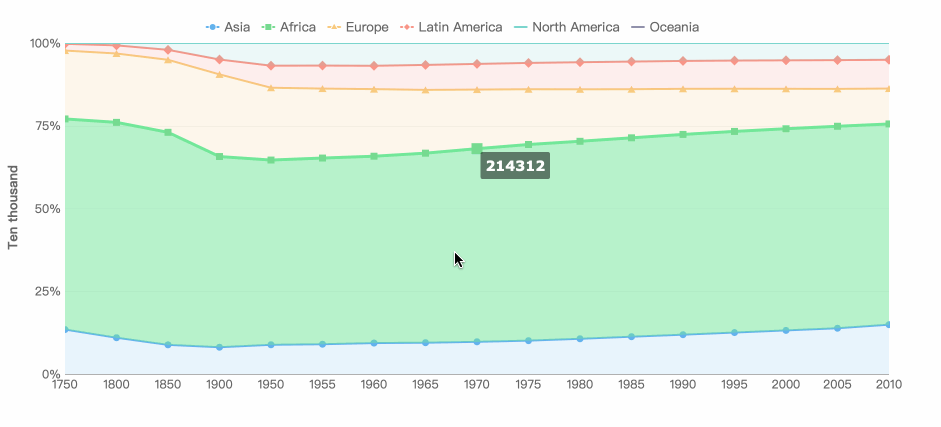
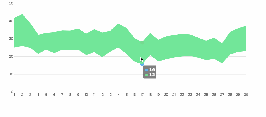
Application Scenario: series ratio, time trend ratio
5. Pie Chart
Pie charts are widely used in various fields to represent the proportion of different classifications, and to compare various classifications by the arc.
The pie chart is not suitable for multiple series of data, because as the series increase, each slice becomes smaller, and finally the size distinction is not obvious.
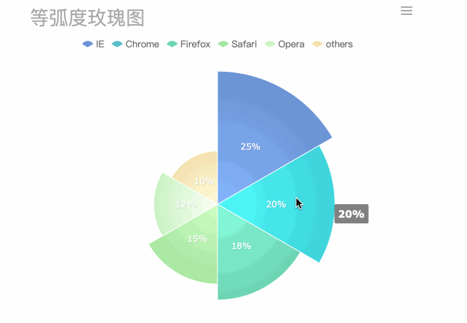
A pie chart can also be made into a multi-layer pie chart, showing the proportion of different categorical data, while also reflecting the hierarchical relationship.
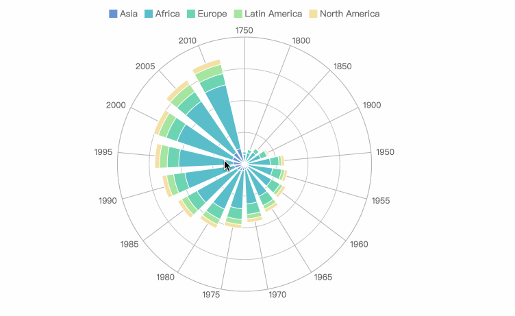
Application Scenario: series ratio, series size comparison (rose diagram)
6. Scatter Plot
The scatter plot shows two variables in the form of points on a rectangular coordinate system. The position of the point is determined by the value of the variable. By observing the distribution of the data points, we can infer the correlation between the variables.
Making a scatter plot requires a lot of data, otherwise the correlation is not obvious.
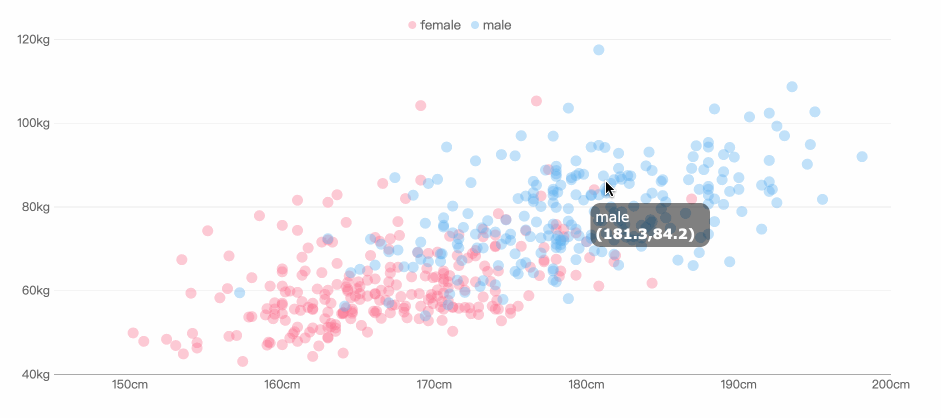
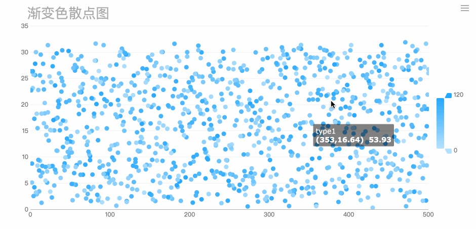
Application Scenario: correlation analysis, data distribution
7. Bubble Chart
A bubble chart is a multivariatechart that is a variant of a scatter plot. Except for the values of the variables represented by the X and Y axes, the area of each bubble represents the third value.
We should note that the size of the bubble is limited, and too many bubbles will make the chart difficult to read.
Application Scenario: comparison of classified data, correlation analysis
8. Gauge
A gauge in data visualization is a kind of materialized chart. The scale represents the metric, the pointer represents the dimension, and the pointer angle represents the value. It can visually represent the progress or actual situation of an indicator.
The gauge is suitable for comparison between intervals.
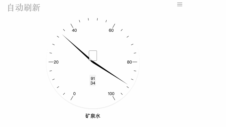
It can also be made into a ring or a tube type, indicating the ratio.
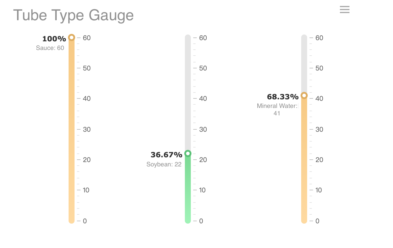
Application Scenario: clock, ratio display
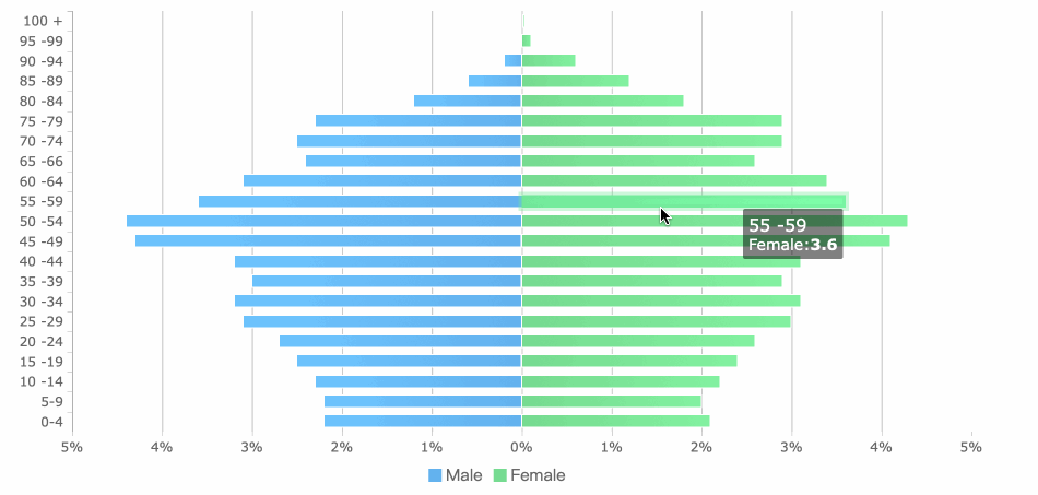
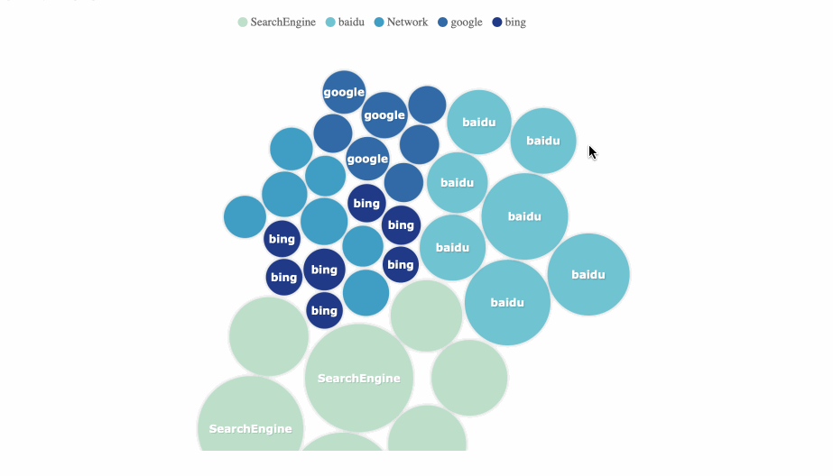
9. Radar Chart
Radar charts are used to compare multiple quantized variables, such as seeing which variables have similar values, or if there are extreme values. They also help to observe which variables in the data set have higher or lower values. Radar charts are suitable for demonstrating job performance.
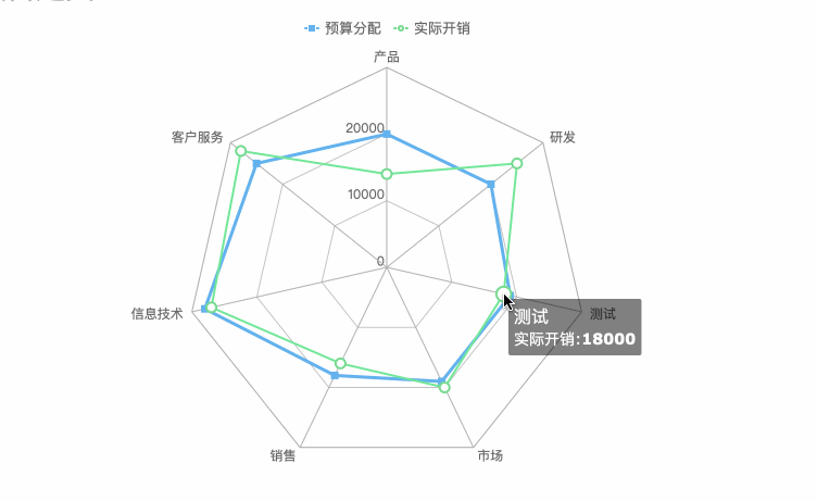
The radar chart also has a stacked column style that can be used for two-way comparison between classification and series, while also representing the proportion.
Application Scenario: dimension analysis, series comparison, series weight analysis
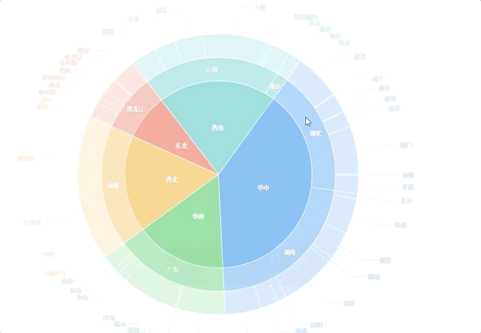
10. Frame Diagram
The frame diagram is a visual means of presenting the hierarchy in the form of a tree structure, which clearly shows the hierarchical relationship.
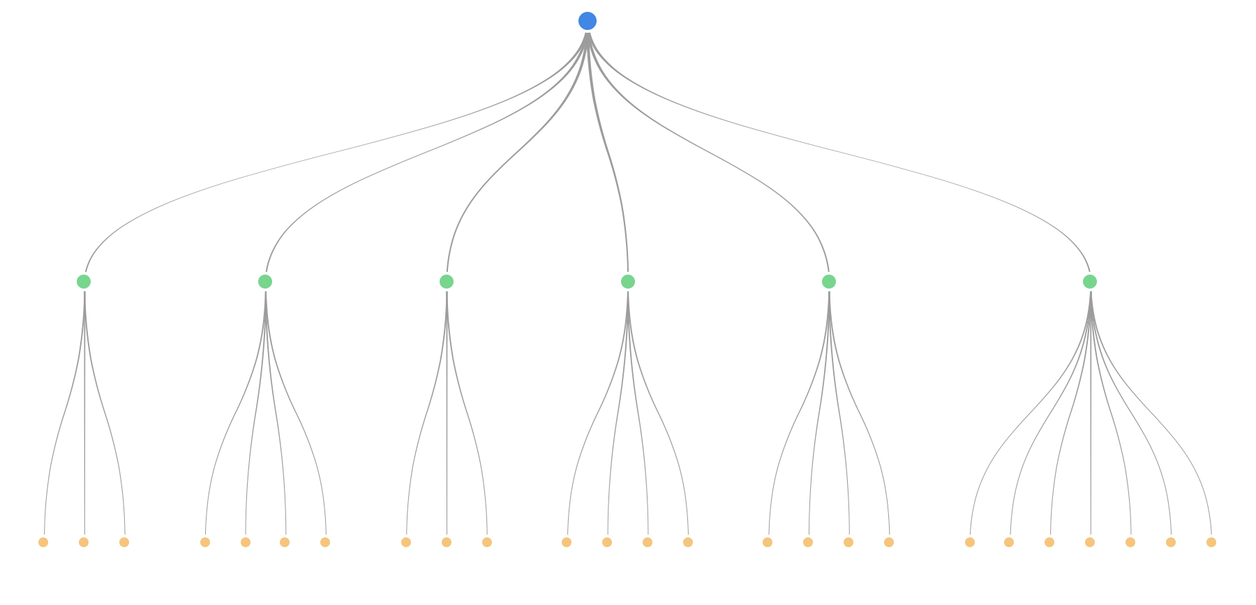
Application Scenario: hierarchy display, process display
11. Rectangular Tree Diagram
The rectangular tree diagramis suitable for presenting data with hierarchical relationships, which can visually reflect the comparison between the same levels. Compared with the traditional tree structure diagram, the rectangular tree diagram makes more efficient use of space and has the function of showing the proportion.
Rectangular tree diagrams are suitable for showing the hierarchy with weight relationships. If it is not necessary to reflect the proportion, the frame diagram may be clearer.
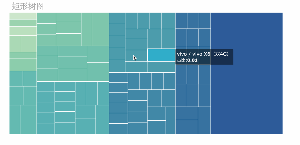
Application Scenario: weighted tree data, proportion of tree data
12. Funnel Chart
The funnel chart shows the proportion of each stage and visually reflects the size of each module. It’s suitable for comparing rankings.
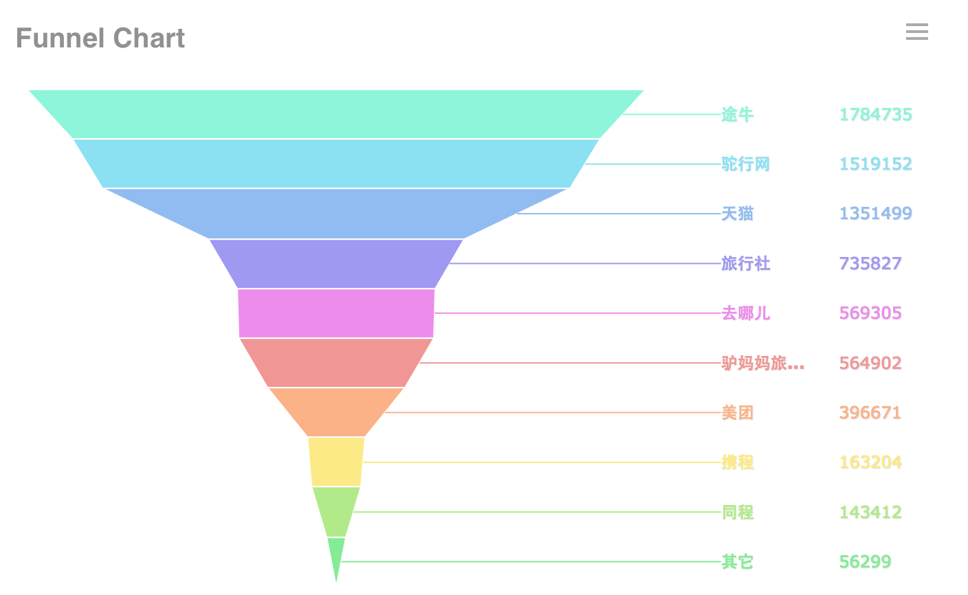
At the same time, the funnel chart can also be used for comparison. We arrange multiple funnel charts horizontally and the data contrast is also very clear.
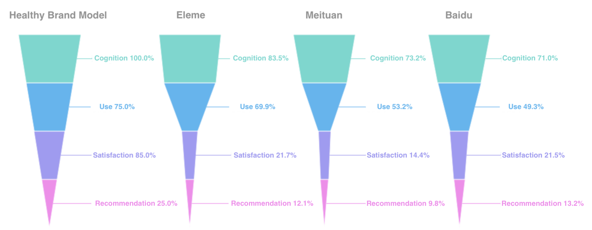
Application Scenario: data ranking, ratio, standard value comparison
13. Word Cloud Chart
The word cloud is a visual representation of text data. It is a cloud-like color graphic composed of vocabulary. It is used to display a large amount of text data and can quickly help users to perceive the most prominent text.

The word cloud chart requires a large amount of data, and the degree of discrimination of the data is relatively large, otherwise the effect is not obvious. And it is not suitable for accurate analysis.
Application Scenario: keyword search
14. Gantt Chart
The Gantt chart visually shows the timing of the mission, the actual progress and the comparison with the requirements. So managers can easily understand the progress of a task (project).
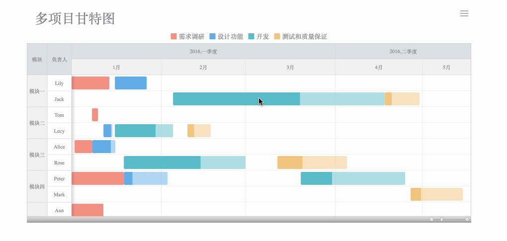
Application Scenario: project progress, state changes over time, project process
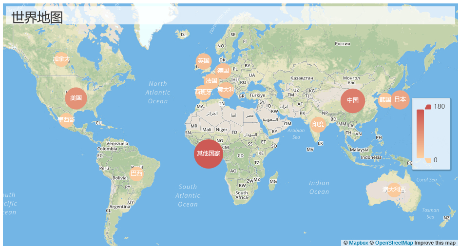
15. Map
The map is divided into three types: regional map, point map, and flow map.
(1) Regional Map
A regional map is a map that uses color to represent the distribution of a certain range of values on a map partition.
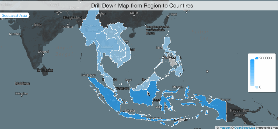
Application Scenario: comparison and distribution of data
(2) Point Map
A point map is a method of representing the geographical distribution of data by plotting points of the same size on a geographical background.
The distribution of points makes it easy to grasp the overall distribution of data, but it is not suitable when you need to observe a single specific data.
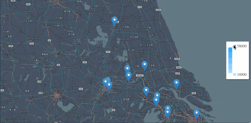
Application Scenario: distribution of data
But if you replace the point with the bubble, then the point map can not only show the distribution but also roughly compare the size of the data in each region.
(3) Flow Map
The flow map displays the interaction data between the outflow area and the inflow area. It is usually expressed by the line connecting the geometric centers of gravity of the spatial elements. The width or color of the line indicates the flow value.
Flow maps help to illustrate the distribution of geographic migration, and the use of dynamic flow lines reduces visual clutter.
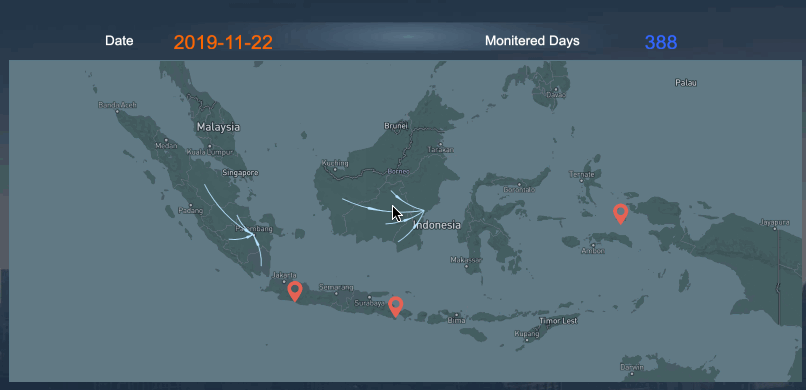
Application Scenario: flow, distribution and comparison of data
16. Heatmap
The heatmap is used to indicate the weight of each point in the geographic area. In addition to the map as the background layer, you can also use other images. And Color in a heatmap usually refers to density.
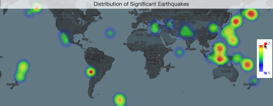
Application Scenario: regional visits, heat distribution, distribution of various things
At Last
All of the above are the 16 frequently used types of chart in data visualization. If you want to get started with data visualization, I suggest you start by learning to make these basic charts and practice with an easy-to-use tool.
Some people may think that the basic charts are too simple and primitive, and they tend to use more complicated charts. However, the simpler the chart, the easier it is to help people quickly understand the data. Isn’t that the most important purpose of data visualization? So please don’t underestimate these basic charts. Because users are most familiar with them. They should be considered for priority as long as they are applicable.
Disclosure: The author does not have any vested interest in the projects mentioned.
Tags
Create your free account to unlock your custom reading experience.