
The funny font from vintage Microsoft Word has an unbelievable past and great influence on today’s culture
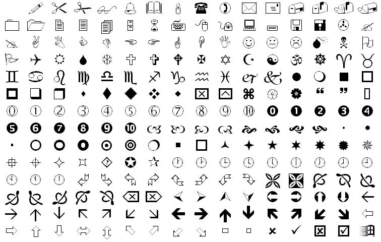
Wingdings, the iconic font composed by… well, icons; became widely popular for being included in many Microsoft Word versions in the ’90s is quite intriguing. It has even been the subject of some conspiracy theories.
Why do we need a font exclusively composed of symbols, such as the Celtic cross, the Zodiac signs, and the star of David? Who came up with that idea? Do people really use it?
Wingdings history ties back to the very beginning of printing. Printing was originally a manual process, that existed before typing. It involved setting every letter, word, line on every page manually and individually. It was a long and tedious process.
Therefore, setting a fancy text was a complex process. Creating detailed templates for fonts was time-consuming and expensive, so printers invented a shortcut: dingbats. Dingbats were reusable sets of symbols and special characters arranged in ornamental pieces to frame and/or embellish printed pages. The trick was slotting plain text in a dingbat instead of hand-carving and laying out every ornament.
The use of digital dingbats was motivated by the same reason why they were originally created — to save time. Just as printers wanted to save time using dingbats, a new generation of computer typographers saved time with dingbat fonts.
It was in the ’70s that the main inspiration for Wingdings fonts was created: Zapf Dingbats, a digital dingbat font designed by the acclaimed calligrapher Hermann Zapf.
Zapf’s protegés, Charles Bigelow and Kris Holmes, were inspired by him to create their own digital dingbat fonts, namely Lucida Icons, Lucida Arrows and Lucida Stars.
The inspiration sources were diverse. Lucida Icons, for example, contained elements that spanned several eras — such as hands and pointing fingers, gestures used by the ancient Romans featured in manuscripts from the Middle Ages; but also printers, keyboards and computers, which were an integral part of the ’90s office culture. In other cases, the symbols came from more direct references, like the flowers in Bigelow’s garden.
Microsoft bought the rights to use all three fonts — Lucida Icons, Arrows, and Stars — selected their favorite symbols and assembled everything in a single package in 1992— which was included in a beta version of Windows.
Wingdings was the name given by Microsoft, combining the words Windows, Dingbats, and the party-like feel of a “wingding.”
Wingdings was never intended to be typed. Contrary to what happens today, when we can just select one picture from many available online, and copy and paste it on a document; in the ’90s was not easy to find pictures that could be used in an uncomplicated way with the text. In addition, image files were too large for the simple HDs of computers at the time. Therefore, Wingdings offered an alternative for anyone who wanted to use icons in high resolution and that could be resized, but without taking up a lot of space on the machines.
This way, the font can be considered the offline predecessor of the emoji, an alphabet that is now an integral part of modern communication.
Unfortunately, Wingdings was, in a way, before its time, because people missed the point from the beginning.
In 1992, the New York Post spread the panic the font contained anti-Semitic messages against New York’s Jewish community, because typing NYC would result in a skull and crossbones, followed by a star of David and a thumbs up. This originated the conspiracy theory the font contained subliminal messages.
Microsoft denied any malicious intentions and assured this was nothing but a coincidence. The company took the controversy seriously, by carefully selecting the symbols in the later-released Webdings font. The choice for the character sequence “NYC” was an eye, heart, and city skyline, referring to the I Love New York logo and intentionally delivering a positive message.
A later theory appeared following the 9/11 attacks. An e-mail was circulating with the claim that entering the sequence “Q33 NY” in Wingdings— alleging Q33 was the flight number of the first plane to hit the World Trade Center— would return a character sequence of a plane followed by two rectangular paper sheet icons (which resemble skyscrapers) and by the skull symbol and the Star of David. However, this was nothing but a hoax, since none of the flight numbers of the planes involved in the tragedy were Q33.
One of the font authors, Bigelow, assured Vox magazine that “It was entirely accidental,” and “a vivid lesson in the emerging social psychology of mass-market computer use”. The truth is those conspiracy theories consecrated Wingdings as part of pop culture.
Wingdings is one of the most recognizable fonts ever. It carries the legacy of dingbats, an innovative practice from the 19th century. It is also the grandfather of the popular emoticons and the center of a curious coincidence that inspired conspiracy theories in the modern world. Who would say the funny font from vintage versions of Microsoft Word would have such an interesting past and be so influential in the current culture?