(For those who have feedback, comments or questions: the easiest way to get in touch with me is via Twitter. I am also always happy to mentor anyone who is looking for help).
Did you know that there are over 300 million color blind people in the world? To visualize that amount, imagine that that is almost as many people as the entire population of the USA. Approximately 1 in 12 men (8%!) and 1 in 200 women have some sort of color vision deficiency.
There are different causes of color blindness. For the vast majority of people affected by color blindness the condition is genetic and has been inherited from their mother. However, some people become color blind as a result of other diseases such as diabetes and multiple sclerosis or they acquire the due to the aging process, medication etc.
Red–green color blindness is the most common form or color vision deficiency followed by blue–yellow color blindness and total color blindness.
I have recently ordered something online. When the product came there was a note (some sort of a warning) in the box. Here is a screenshot of a part of that note:
Red on green. That warning would be completely invisible to a high percentage of those with color vision deficiency (not to mention it is just not a very easy on the eyes color combination for… well, anyone). Thank Goodness, the product I ordered was just a woven basket and nothing potentially dangerous.
It is our responsibility as user experience designers to create designs that are optimal if not for all then for a majority of our users. Designing websites with that color-blind people (along with other types of disabilities and situational limitations) in mind contributes to creating equal possibilities for everyone using our product.
While designing for color blind users user experience designers have to always keep a few things in mind.
- Is the color contrast of text, images and other graphic elements high enough?
- Are we using color alone to indicate clickable links, required fields, errors, sale prices etc?
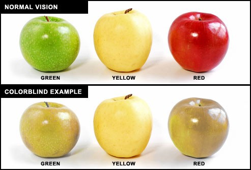
- Are we heavily using red-green color combinations? Both colors would probably look brown to color-blind users.
- Are we labeling the color swatches with the names of the colors to make product choice easier?
It is important to note that many of our color blind users don’t rely on any particular tools or assistive technology. That means that creating a smooth and pleasant user experience for such users is a user experience designer’s job.
At the very minimum…
…use more than just color!
The easiest, quickest and safest design trick is to make sure that “color is not used as the only visual means of conveying information, indicating an action, prompting a response, or distinguishing a visual element” (w3.org). For instance, it is important that we use other graphic cues and symbols in addition to (or instead of) using color to indicate a hover effect on a button or link. Providing labels with the names of the colors along with the color swatches on e-commerce websites can help color blind people choose the product they want. Using textures in addition to color can also be quite helpful.
Bonus tip: don’t mark the required fields of a form with an asterisk. Better yet, don’t ask your users to fill out any information that isn’t absolutely necessary. Make all the fields mandatory and specify an optional field (if you absolutely must ask anything optional) instead.
To make your designs even more accessible for color blind users make sure to pay attention to the following in your designs:
High contrast
Always make sure that there is sufficient contrast between the background and all the other elements on the page including text, images, buttons, hover effects and graphic elements. Needless to say that optimal contrast not only benefits color blind users but also provides for better readability and consequently more pleasant user experience for everyone else. It’s just good practice.
A contrast ratio of at least 4.5:1 is required for most of the text and images that serve a purpose or convey meaningful information. Large-scale text and images of large-scale text must have a contrast ratio of at least 3:1. Text or images of text that are pure decoration and don’t convey any meaningful information or text that is a part of a logo have no contrast requirement. (Source: w3.org) To easily check the contrast of elements in your designs you can use this tool.
Careful color selection
At the minimum, avoid using bad color combinations, such as, for example, combining green and red or blue and yellow. That doesn’t mean you have to always rely on black and white in your designs. Any high contrast color palette can make your design more readable for those with color vision deficiency.
Bonus tip: using fewer colors in your design will not only help you avoid mistakes while designing for color blindness but also can contribute to creating a more polished, clean and uncluttered user interface.
Finally, here is what you can go an extra mile and create the ultimate color-blindness-friendly design. Give your users the…
…ability to adjust colors and contrast.
In case the default design, despite your efforts, still doesn’t provide sufficient contrast or an optimal color combination, allow your users to adjust contrast settings and/or color palette from within the interface or browser. You can let your users select the foreground and background colors and/or give them the ability to switch from a light to dark mode and vice versa.
Conclusion
To sum it up, there are several things that a user experience designer can do to help color blind users flow through a design as smoothly as possible. While some of these things require quite a lot of time and effort, others are very straightforward. It is our responsibility as UX designers to have empathy design with all types of users in mind.
Sources:
https://www.colourblindawareness.org/colour-blindness/
https://www.w3.org/WAI/people-use-web/abilities-barriers/#visual
https://www.getfeedback.com/resources/ux/how-to-design-for-color-blindness/
