
Last Sunday, I went for my vaccination at the RBC Convention Centre. From my parking spot on Edmonton Street all the way to the chair where I sat to get my jab, I was guided by a series of signs, directional arrows, desks with numbers, stanchions with dividers and — a recent COVID-19 design feature — paths on the floor made by circles indicating a two-metre distance.
Urbanists, architects and designers call this process wayfinding: It involves using sensory cues and design features in the built environment to help people figure out where they are and how to get where they’re going.
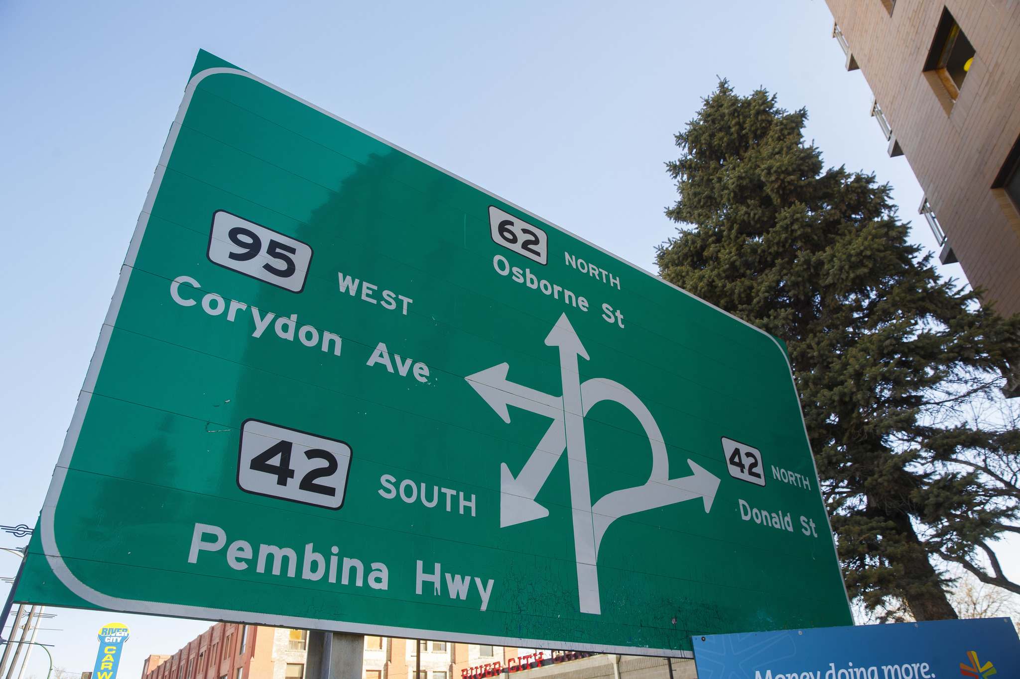
Signage is the most obvious aspect of wayfinding. It seems like a poignant and particularly Winnipeg-ish phenomenon that one of our town’s best-known signs — the iconic mess of lines at Confusion Corner — is useless for wayfinding but still much-loved. In fact, Winnipeggers love the Confusion Corner sign precisely because it’s useless.
Located on South Osborne as you head toward the traffic tangle of Pembina, Osborne and Corydon, the sign is not much help as a Point-A-to-Point-B navigational tool. If you need to know how to get onto southbound Pembina Highway from northbound Osborne while driving past this sign at 50 clicks, then good luck to you.
But if the Confusion Corner sign is a wayfinding fail, it has found unlikely grassroots success as a civic symbol. An affectionate tribute to our crazy, mixed-up town, it’s a cheerfully defiant celebration of confusion.
Officially called Osborne Junction, Confusion Corner itself is a hub located between some of the city’s southwest neighbourhoods and downtown, funnelling traffic from several main thoroughfares while also juggling dedicated transit lanes.
The iconic sign on South Osborne Street just before the underpass attempts to explain the routes through Confusion Corner where Pembina Highway, Corydon Avenue, Donald Street and Osborne Street intersect.
“>
MIKE DEAL / WINNIPEG FREE PRESS
The iconic sign on South Osborne Street just before the underpass attempts to explain the routes through Confusion Corner where Pembina Highway, Corydon Avenue, Donald Street and Osborne Street intersect.
While we think of traffic in the Junction as a modern problem, Winnipeggers have been complaining about the area since the 1920s, a fact that could either be seen as exasperating or strangely reassuring. According to an article in the Real Estate News by Christian Cassidy, “it has been the bane of motorists for over a century,” when the long-established Pembina route sliced into a recently imposed street grid and then had to curve around Gladstone School.
There have been several attempts to ameliorate this jumble of structures and streets as our city has grown and changed, but Confusion Corner has just become more complex.
Contemporary wayfinding is meant to help drivers — and cyclists and pedestrians — navigate this kind of 21st-century environment. It relies on the work of designers and traffic engineers, who use extensive research and scientific data to create signs that convey necessary information without being overly distracting. There are typefaces specifically designed for traffic signs. (Currently, there’s a pitched battle among sign wonks over the relative merits of the classic Highway Gothic and the upstart Clearview.) Factors such as the colour contrast between lettering and background, the size of the font, the spaces between letters and words, are all tested to ensure they provide maximum legibility under a range of weather and driving conditions.
The Confusion Corner sign may meet the industry’s technical specs, but that only goes so far. Maybe one of the reasons we love the sign is that it seems burdened by a tragic-comic weight, expected to convey far more information than any one sign should have to carry.
One blogger, writing on the scourge of confusing street signs, describes it as a “the roadside equivalent of abstract art.
“You’d have to stand there for a while to truly grasp what it’s telling you.”
According to Andrew Boardman, a designer who runs the Manoverboard studio, “I would say that Winnipeg suffers from a dearth of good wayfinding signage. It seems to have forgotten that people visit the city — or at least did pre-pandemic. The lack of well-maintained pedestrian and bike infrastructure in the city is an issue (lines and lanes) — but wayfinding always feels like an afterthought.”
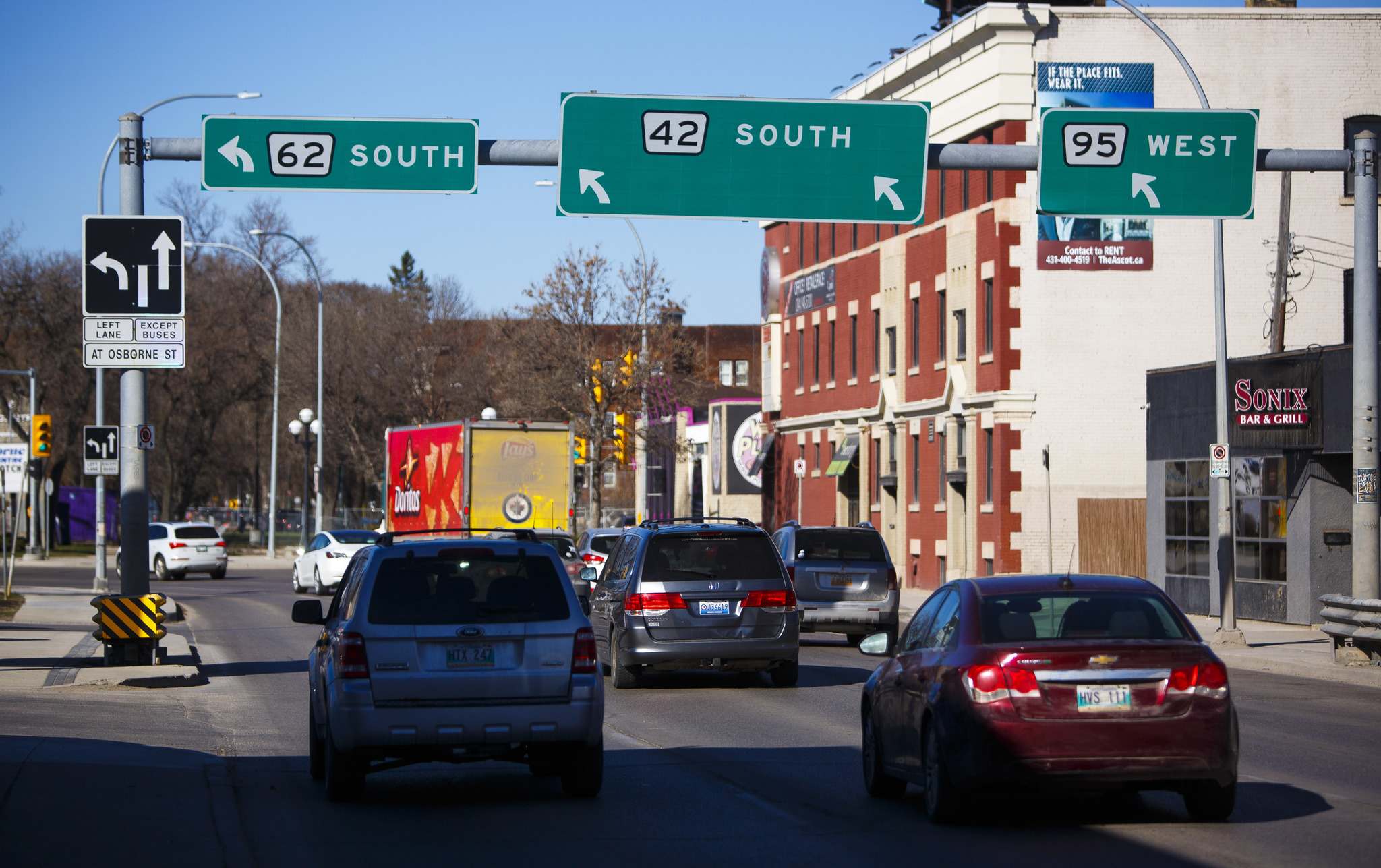
Traffic signs attempt to direct vehicles travelling westbound through Confusion Corner.
“>
MIKE DEAL / WINNIPEG FREE PRESS
Traffic signs attempt to direct vehicles travelling westbound through Confusion Corner.
Boardman admits that signage for Confusion Corner presents a sticky challenge. “I think if there were some more detail provided that more accurately represented the schematic, the logic of Confusion Corner, it probably could be made better,” he says. “There’s one sign, and on the one side of the sign, you don’t know how to anticipate where you’re going, and then on the other side, there’s not a lot of continuity.”
There could be more followup signs, Boardman suggests, to help drivers navigate the area’s unexpected twists.
Still, if the sign isn’t working at a practical level, it has poetic power to spare.
The Confusion Corner sign supplied the logo — recognizable to Winnipeggers, enigmatic to everyone else — for the criminally underrated Winnipeg-set TV series Less Than Kind, created by former Winnipegger Marvin Kaye. This rueful human comedy, which ran from 2008 to 2013, featured Maury Chaykin as an irascible family patriarch who runs a failing driving school.
Roy Liang, artist, crafter and owner of Winnipeg North of Fargo, points to the Confusion Corner sign as a longtime customer favourite. Since 2006, Liang has used the motif for fridge magnets, tree ornaments, totes, tees and hoodies. “I think it’s like Winnipeg’s inside joke,” he suggests. “It’s something tourists wouldn’t normally get. It’s something you’ve driven by hundreds of times, and you don’t realize how it’s engraved in your mind.”
Liang says the company’s wearable Confusion Corner merch has prompted “Hey, are you from Winnipeg?” conversations with strangers as far away as London, England. “Feedback on hoodies and T-shirts suggest it’s something people pick up on even if they’ve moved away. They still recognize it.”
And for those who really want to commit, there are always Confusion Corners tattoos. I’ve seen a few around town, including on my own son.
Clearly, the sign, for all its traffic-directing flaws, has an immediate, iconic, underdog appeal that connects with a lot of Winnipeggers. As Boardman says, “It’s quirky, and Winnipeg is quirky. It kind of just feels right.
“Maybe you don’t want to change the sign to reflect a more logical approach. It’s like, ‘Keep Winnipeg weird.’”
alison.gillmor@freepress.mb.ca
Alison Gillmor
Writer
Studying at the University of Winnipeg and later Toronto’s York University, Alison Gillmor planned to become an art historian. She ended up catching the journalism bug when she started as visual arts reviewer at the Winnipeg Free Press in 1992.